StreetEasy, NYC’s leading real estate marketplace, makes some fantastic housing data freely available through its data dashboard. Among the datasets available for download is a monthly breakdown of housing inventory by borough and neighborhood over the last 8 years. In this post I’ll use the gganimate package in R to visualize the ebb and flow of rental housing availability in NYC. If the law of supply and demand holds, this should inform ideal times for apartment hunting.
Rental Inventory Over Time
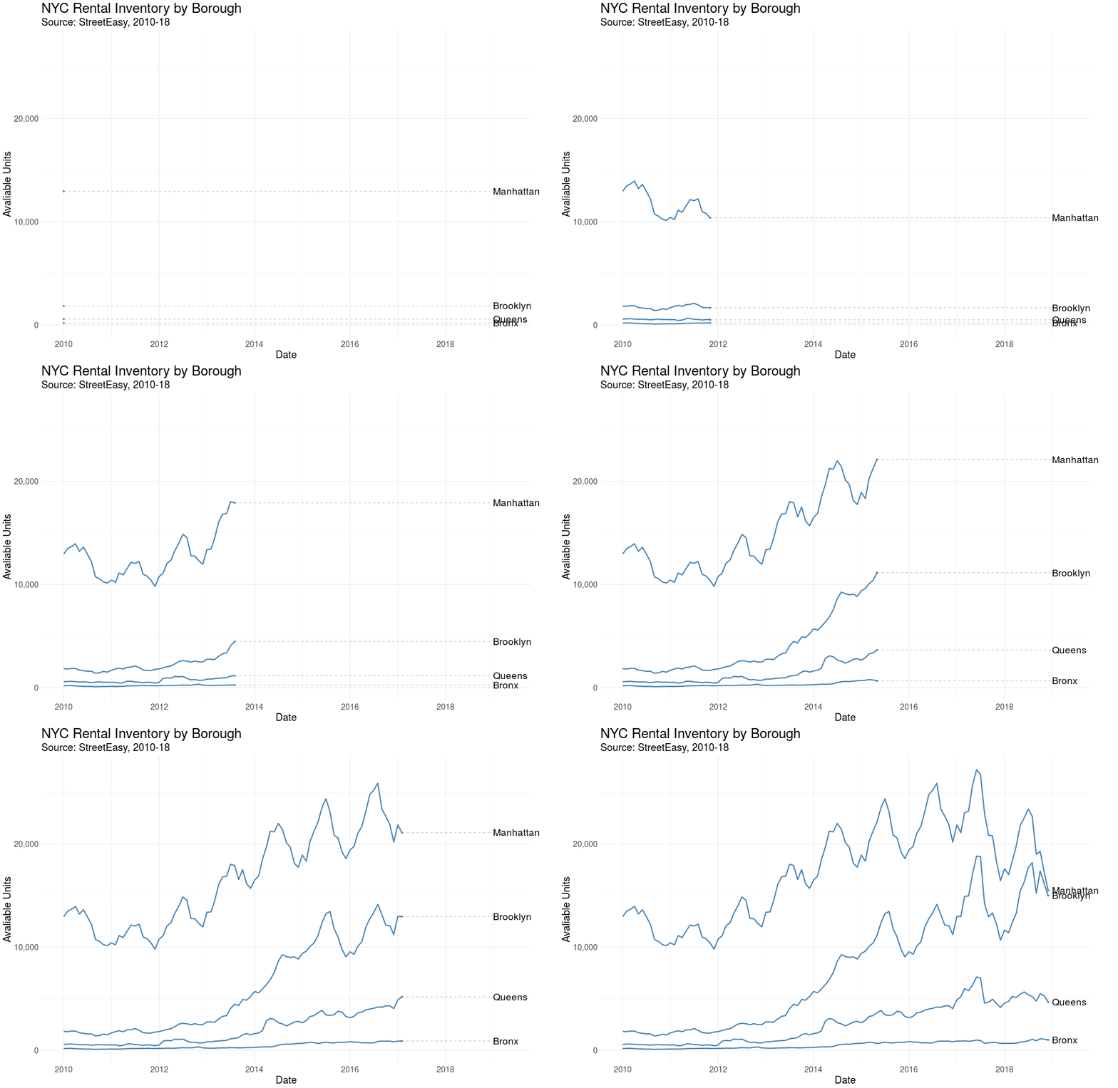
Let’s first visualize the number of rental units on the market over time by borough. This is a monthly view, from January 2010 – December 2018.

Here we see StreetEasy’s growth as marketplace year over year, together with distinct seasonal variation. Let’s explore seasonality next.
Average Rental Inventory by Month
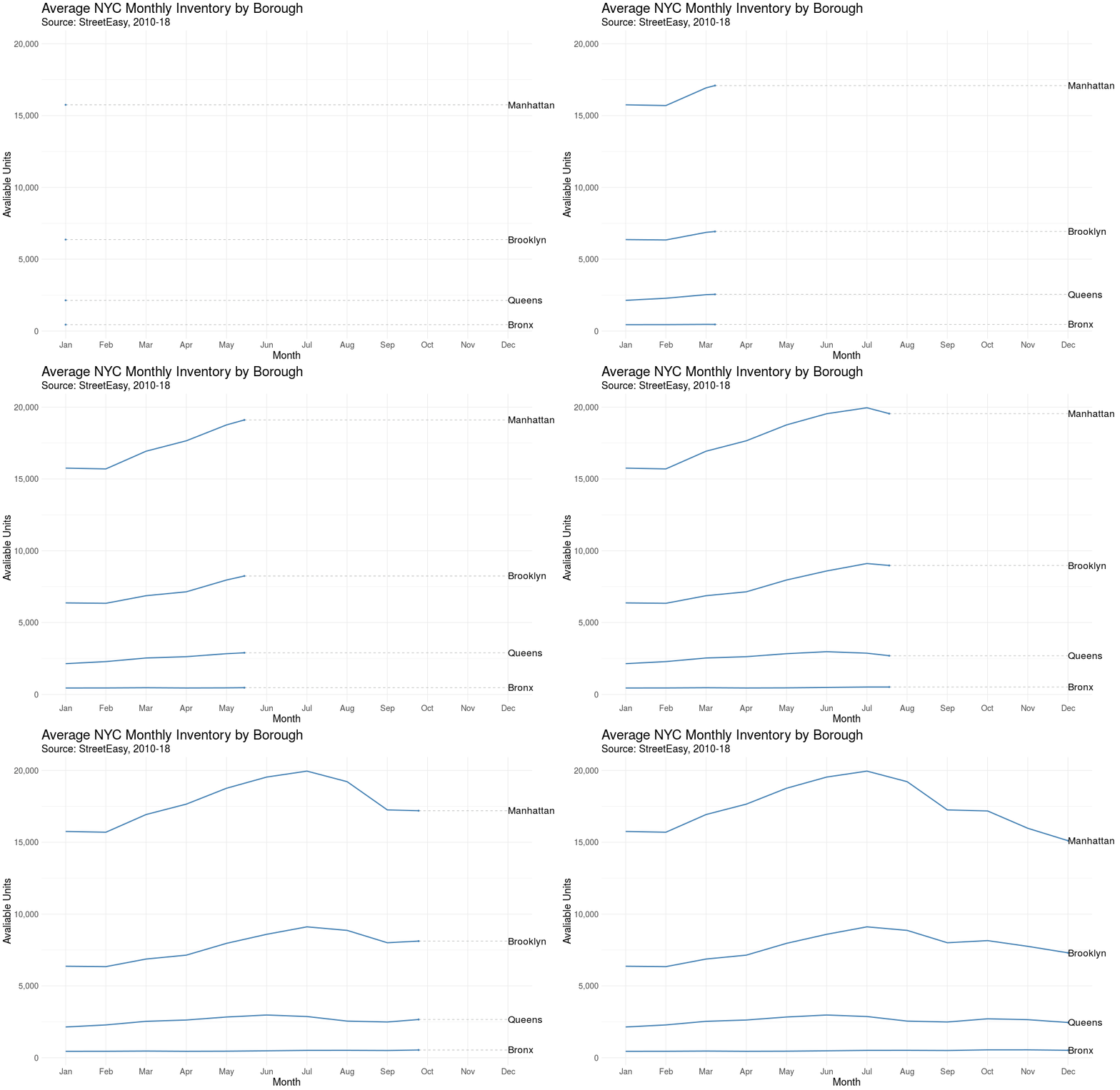
We’d expect some flavor of seasonality with real estate. In the US it’s estimated that 80% of moves occur between April and September. Let’s see if the same pattern is true in NYC.

Sure enough, we observe a “peak season” with an influx of rental units coming onto the market from May to September, although the trend is strongest in Manhattan.
Rental Inventory in Brooklyn’s Neighborhoods
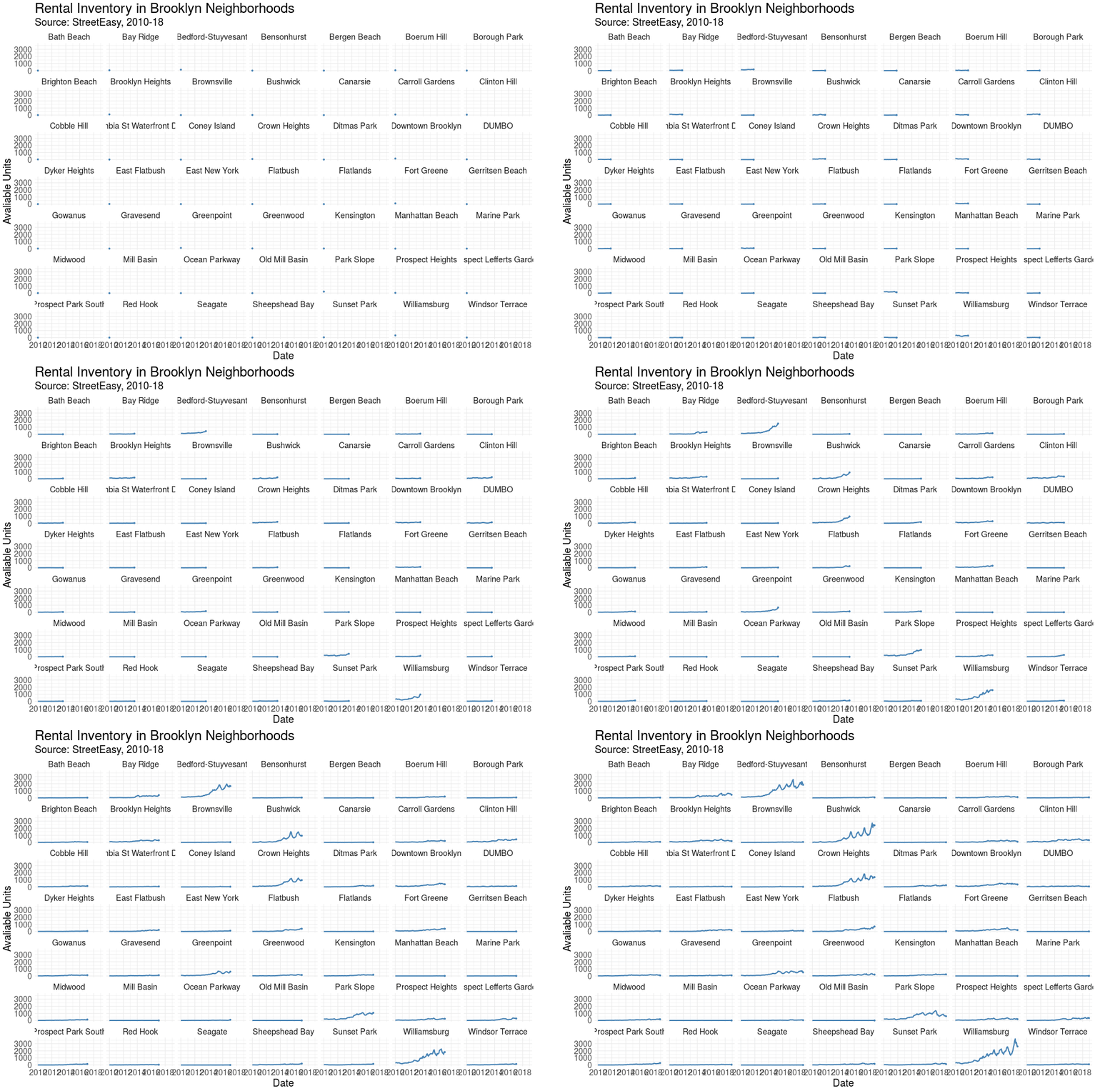
Finally, let’s visualize how housing availability has fluctuated on StreetEasy’s marketplace in each of Brooklyn’s neighborhoods over time.

Using face_wrap from ggplot2, we can easily observe the trend in each neighborhood simultaneously.
Conclusion & Appendix
Kudos to StreetEasy for making this dataset open to the public. There’s certainly more to explore and analyze in their data dashboard. Also, I find gganimate a really useful addition to any data storyteller’s toolkit, and I hope to find more opportunities to leverage this package in the future. Thanks for reading!

It’s an interesting post. Thanks for sharing. Really loved this.