The Rise of Rap: A Genre Popularity Analysis

Today it feels like rap is bigger and more mainstream than ever. A casual scan of the charts reveals that many of today’s biggest music icons are rappers. How long has it been this way? I remember a time when pop legends like Katy Perry, Lady Gaga, and Rihanna ruled the charts.

Looking for more than anecdotal evidence of the rise of rap as a genre in the mainstream music landscape, I developed a data-driven methodology to measure the high-level trend in music genre popularity over time.

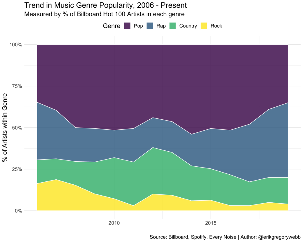
Using Billboard’s Hot 100 Artist data, and mapping each artist to a genre using the Spotify API, I calculated what percent of the artists were represented within each genre over time, from 2006 to the present.

Here’s the trend:

Here’s another view with the same data, as a line chart:

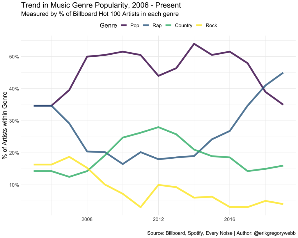
It seems like the data supports my observation that rap has gone mainstream, with the percentage of rap artists in the Billboard Hot 100 growing steadily since 2014, and surpassing pop artists in 2018.

According to Rolling Stone, much of rap’s growth can be attributed to its reactivity on streaming services, with 92% of the genre’s total consumption coming from streaming channels. The timeline fits, with streaming giants like Apple launching in 2015, and Spotify hitting ~40 MAU in 2016.

While pop and country have maintained a relatively stable level of popularity, rock appears to be trending down, with rock artists composing less than 5% of the Billboard Hot 100 artist list in 2019.

What does the future hold? As the lines between genres continue to blur, with artists like Post Malone and Lil Nas X cutting across pop, rap, country, and even rock, it stops making sense to box artists into a single genre. In the age of the playlist, it’s easier than ever to rebel against the very idea of genre.

Walkthrough

The first step of the project was scraping the historical list of Hot 100 Artists from Billboard. Using the tidyverse and rvest packages in R, I quickly looped over the 13 years of available data:

Below is a preview of the first few rows of the resulting dataset:

Next, using a Python script and the Spotify API, I looped through each of the artists from the Billboard Hot 100 dataset and collected a list of their corresponding sub-genres. For example, Spotify associates Sean Paul with the sub-genres of dance pop, dance hall, and pop rap.

Here’s a preview of what the resulting data looks like:

The next step took some thought. I needed a way to map back each of the thousands of sub-genres labeled by Spotify into a few core genres, like pop, rap, country, and rock. Tapping into the work of the Every Noise project, which attempts to create “an algorithmically-generated, readability-adjusted scatter-plot of the musical genre-space”, I developed logic to assign a single genre to each of the artists in the original Billboard Hot 100 artist table:

Using this logic, each artist was assigned to a single genre bucket:

The last step was to merge the billboard artist and artist genre tables and calculate the genre percentage breakdown over time, from 2006 to 2019.

This R code produces the chart below that visualizes relative genre popularity over time:

You can find the GitHub repo for this project here.

Building a Scripture Search Tool with R Shiny

Many religions have texts that contain beliefs, ritual practices, or commandments. The Quran is the central religious text of Islam, believed by Muslims to be a revelation from Allah. The Bible is a collection of religious texts sacred to Christians, Jews, and others. Unique to the Latter Day Saint movement is the Book of Mormon.

The study of these texts is a core religious practice of believers. Looking for a way to quickly understand what the scriptures say on a given topic, I developed a simple Shiny app using R as a study tool:

When a user enters a search term (e.g. “faith”, “gospel”, “sacrifice”, etc.) and clicks “Search”, the app returns a summary table and a detail table. The summary table shows the number of verses that contain the search term by book of scripture. The detail table shows the actual text of all the verses containing the search term.

You can find a full-screen version of the web app here.

In the future, I’d like to enhance the app by adding the ability to search for a phrase (e.g. holy ghost), instead of just a single word. I’d also like to add functionality to compare the presence of multiple words and phrases in different volumes of scriptures. For example, comparing the frequency of the appearance of words like “man” and “woman”.

Hopefully this simple scripture search app can be a helpful tool in your own study. You can find the R code for this project here and access the Shiny app directly here.

Web Scraping: NBA Salaries

Inspired in part by Python’s Beautiful Soup, the R package rvest makes it delightfully easy to scrape data from the web. As part of the Tidyverse collection of packages, rvest fits nicely within the broader data workflow:

The Tidyverse data science workflow (source)

In this post I’ll walk through an example of using rvest to compile a dataset of NBA player salaries. To follow along, create a free RStudio Cloud account to write and run R code and bookmark the SelectorGadget tool to help identify HTML/CSS tags.

Background

Professional athletes are paid handsomely for their highly-specialized skill sets, and NBA players are no exception. Take Steph Curry, the highest-paid player during the 2018-2019 season. During that season he brought in a cool $37M in salary.

The NBA is the professional sports league with the
highest player wages worldwide (source, image source)

ESPN publishes annual salary data going back to the 1999-2000 season. Rather than manually copying this data, which is spread across hundreds of web pages, we can write a script to compile the data automatically using rvest. The data can then be used to explore variation in salary over time, by team, and by position.

Page Structure

The first step in any web scraping project is to become familiar with the target site URL structure. In this case, ESPN has a different page for each season. For example, the link below contains the player salaries for the 2018-2019 season:

http://www.espn.com/nba/salaries/_/year/2019

Screenshot of the ESPN NBA Player Salaries page for the 2018-19 season

Within each season, the salaries are spread across several sub-pages, with 40 players listed on each sub-page:

http://www.espn.com/nba/salaries/_/year/2019/page/2

This means our code will need to dynamically determine the number of sub-pages to loop through when scraping the player salaries from each season.

Code Walkthrough

With that background, let’s dive into the code! To get started, we’ll need three packages: rvest, tidyverse, and stringr:

Next, we’ll define a vector of season URLs to loop over:

Next comes the bulk of the code required to perform the scraping. Here we loop over each of the season URLs. By extracting the text from the .page-numbers element on each page, we can dynamically determine the number of sub-pages for each season.

The html_table() command from the rvest package detects and extracts the table of salaries from each sub-page.

The last step is to clean the raw scraping output by adding column names, removing extra rows, and splitting the “name” and “position” fields into two columns, since they were stored as a single column in the ESPN tables, separated by a comma.

The final dataset has 9,456 rows. Below are the first 10:

ranknamepositionteamsalaryseason
1Shaquille O'NealCLos Angeles Lakers171420002000
2Kevin GarnettPFMinnesota Timberwolves168060002000
3Alonzo MourningCMiami Heat150040002000
4Juwan HowardPFWashington Wizards150000002000
5Scottie PippenSFPortland Trail Blazers147950002000
6Karl MalonePFUtah Jazz140000002000
7Larry JohnsonFNew York Knicks119100002000
8Gary PaytonPGSeattle SuperSonics110200002000
9Rasheed WallacePFPortland Trail Blazers108000002000
10Shawn KempCCleveland Cavaliers107800002000

Visualization

With the hard part out of the way, let’s quickly explore the trend in player salaries. We’ll visualize the distribution of salary by season:

Notice how the right tail has grown over time. It appears that most of the growth in average player salary is being drive by salaries paid to superstars. This observation is consistent with a similar analysis of NBA salaries done by Dimitrije Curcic.

“The average salary in the NBA has increased more than 7x since the 1990-91 season. Median salary has slower growth than the average; this could suggest that the financial gap between the top talents and the rest is getting larger.”

Here’s the code used to create the chart.

Web scraping is an important tool for data analysis because it enables data collection at scale. Rvest streamlines the process, allowing you to quickly create novel datasets for analysis, like NBA player salaries.

Complete R Script: link
Final Dataset: link

Which programming language should I learn first?

Aspiring programmers and data scientists often ask, “Which programming language should I learn first?” It’s a valid question, since it can take hundreds of hours of practice to become competent with your first programming language. There are a couple of key factors to take into consideration, like how easy the language is to learn, the job market for the language, and the long term prospects for the language.

In this post, we’ll take a data-driven approach to determining which programming languages are the most popular and growing the fastest in order to make an informed recommendation to new entrants to the developer community.

Common Programming Languages (Source)

Quantifying Popularity

There are several ways you could measure the popularity or growth of programming languages over time. The PYPL (PopularitY of Programming Language Index) is created by analyzing how often language tutorials are searched on Google; the more a language tutorial is searched, the more popular the language is assumed to be.

Another avenue could be analyzing GitHub metadata. GitHub is the largest code host in the world, with 40 million users and more than 100 million repositories (source). We could quantify the popularity of a programming language by measuring the number of pull requests / push requests / stars / issues over time (example, example).

Finally, the popularity proxy I’ll use is the number of questions posted by programming language on Stack Overflow. Stack Overflow is a question and answer site for programmers. Questions have tags like java and python which makes it easier for people to find and answer questions.

We’ll visualize how programming languages have trended over the last 10 years based on use of their tags on Stack Overflow.

Data Explorer

So, how are we going to source this data? Should we scrape all 18 million questions or start hitting the Stack Exchange API? No! There’s an easier way: Stack Exchange (Stack Overflow’s “parent”) exposes a data explorer to run queries against historical data.

Screenshot of the Stack Exchange Data Explorer

In other words, we can review the Stack Overflow database schema and write a SQL query to extract the data we need. Before writing any SQL, let’s think about how we’d like the query output to be structured. Each row should contain a tag (e.g. java, python), a date (year / month), and count of the number of times a question was posted using that tag:

Year | Month | Tag | Question Count

The SQL query below joins the Posts, Tags, and PostTags tables, counts the number of questions by tag each month, and returns the top 100 tags each month:

Below are the first ten rows returned by the query:

YearMonthTagCountRank
20101c#51161
20101java37282
20101php34423
20101javascript26204
20101.net23405
20101jquery23386
20101iphone22467
20101asp.net22138
20101c++20029
20101python194910

Great, now we have the data we need. Next, how should we visualize it to measure programming language popularity over time? Let’s try an animated bar race chart using Flourish. Flourish is an online data studio that helps you visualize and tell stories with data.

In order to get the data into the right format for Flourish visualization, we’ll use R to filter and reshape the data. To smooth the trend, we’ll also calculate a moving average of tag question count.

After uploading the reshaped data to Flourish and formatting the animated bar race chart, we can sit back and watch the programming languages fight it out for the top spot over the last decade:

It’s hard to miss the steady rise of Python, hovering in fourth and five place from 2010 to 2017 before accelerating into first place by late 2018.

Why has Python become so popular? First, it’s more concise and requires less time, effort, and lines of code to perform the same operations as languages like C++ and Java. Python is well-known for its simple programming syntax, code readability and English-like commands. For those reason, not to mention its rich set of libraries and large community, Python is a great place to start for new programmers and data scientists.

The story our animated bar chart tells is validated by the reporting published by Stack Overflow Insights, where we see Python growing steadily over time, measured as a percentage of questions asked on Stack Overflow in a month:

Conclusion

Using question tag data from Stack Overflow, we’ve determined that Python is probably the best programming languages to learn first. We could have saved ourselves some time and done a simple Google search or consulted Reddit to come to the same conclusion, but there’s something satisfying about validating the hype with real data.

css.php