Visualizing NYC Housing Trends with gganimate in R

StreetEasy, NYC’s leading real estate marketplace, makes some fantastic housing data freely available through its data dashboard. Among the datasets available for download is a monthly breakdown of housing inventory by borough and neighborhood over the last 8 years. In this post I’ll use the gganimate package in R to visualize the ebb and flow of rental housing availability in NYC. If the law of supply and demand holds, this should inform ideal times for apartment hunting.

Rental Inventory Over Time

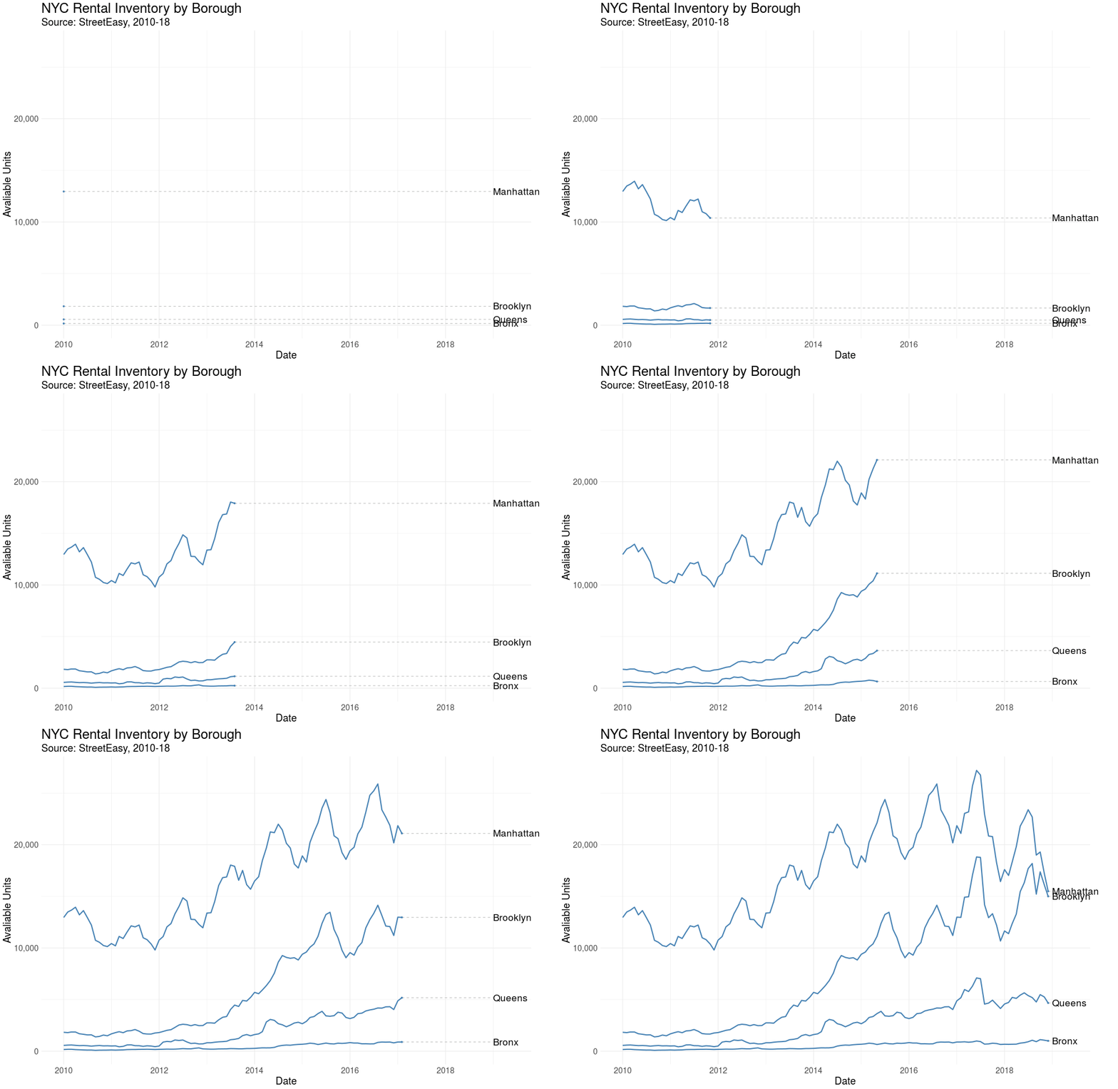
Let’s first visualize the number of rental units on the market over time by borough. This is a monthly view, from January 2010 – December 2018.

Here we see StreetEasy’s growth as marketplace year over year, together with distinct seasonal variation. Let’s explore seasonality next.

Average Rental Inventory by Month

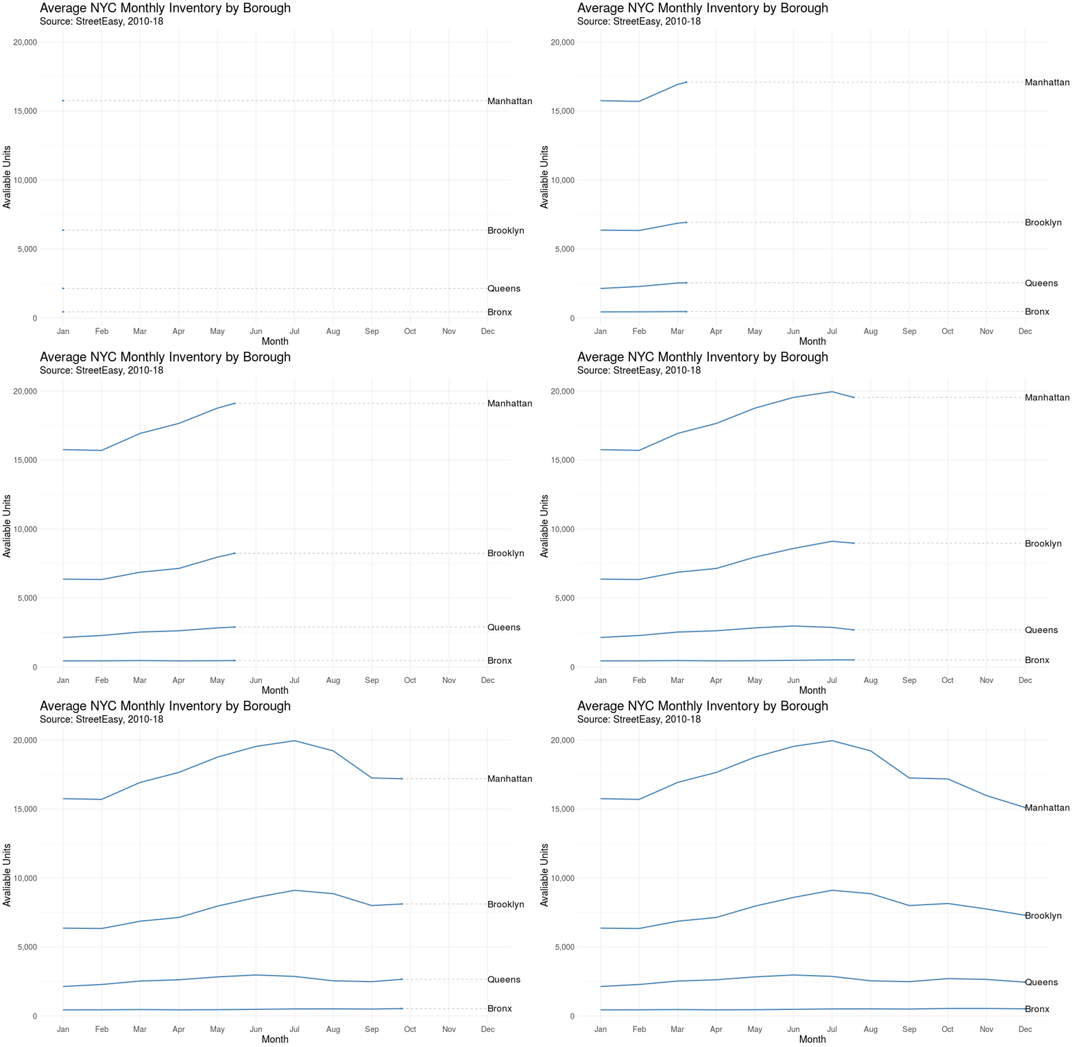
We’d expect some flavor of seasonality with real estate. In the US it’s estimated that 80% of moves occur between April and September. Let’s see if the same pattern is true in NYC.

Sure enough, we observe a “peak season” with an influx of rental units coming onto the market from May to September, although the trend is strongest in Manhattan.

Rental Inventory in Brooklyn’s Neighborhoods

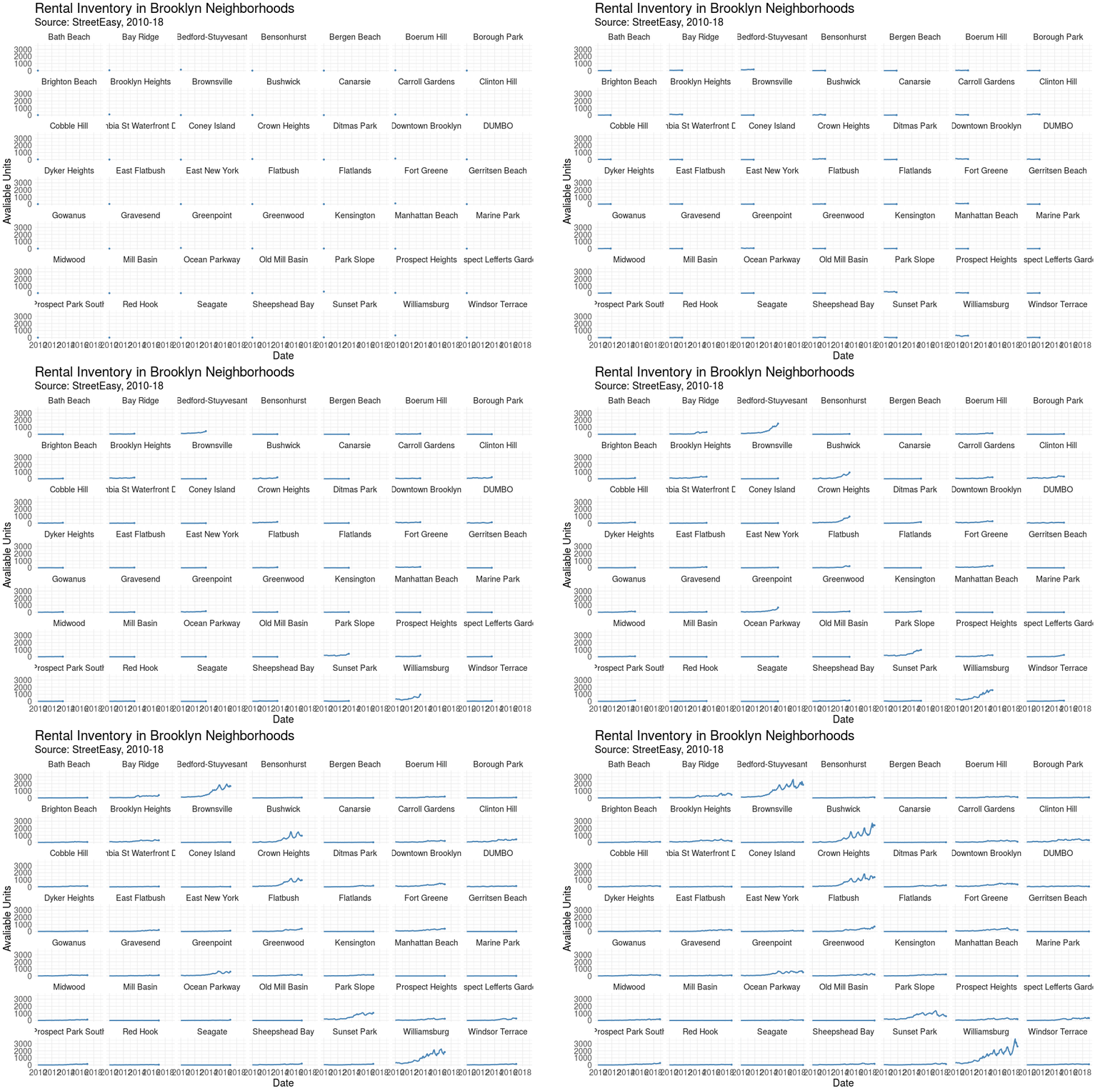
Finally, let’s visualize how housing availability has fluctuated on StreetEasy’s marketplace in each of Brooklyn’s neighborhoods over time.

Using face_wrap from ggplot2, we can easily observe the trend in each neighborhood simultaneously.

Conclusion & Appendix

Kudos to StreetEasy for making this dataset open to the public. There’s certainly more to explore and analyze in their data dashboard. Also, I find gganimate a really useful addition to any data storyteller’s toolkit, and I hope to find more opportunities to leverage this package in the future. Thanks for reading!

R Script: Link
Data Source: Link [Rental Inventory]

Mapping Scarsdale Real Estate Data with Python

This year my wife and I moved to New York for the start of a new job. Initially overwhelmed by the scope and pace of the NYC housing market, we were given the very generous and unexpected opportunity by a family friend to live in a house north of the city in Westchester County. Built in the early 1930s, the historic home is situated in central Scarsdale, an affluent suburban town known for high-achieving schools and extravagant real estate.

As a graduate student of historic preservation, my wife has been especially enthralled by the rich styles and architecture of the houses within the Scarsdale village limits. Naturally, we frequently discuss and analyze the homes we pass on walks and runs, her comments generally centered around history and architecture, mine on economics and valuation.

Sourcing the Data

Wishing to analyze the houses of Scarsdale in a more systematic way, I began to experiment with the Zillow API. Disappointed by both accessibility and content, I continued to search for a superior data source. Soon after, I discovered a tool developed by the Village of Scarsdale to search property information by road name and wrote a Python script to scrape the data. Curious to know if additional variables were available, I contacted the Scarsdale Village administration and was sent an Excel file with the complete set of residential properties, rich with detail and with few missing values (5,000+ rows, 100+ columns).

The dataset includes the address of each residential property, but for visualization purposes, I needed geographic coordinates (latitude, longitude). Luckily, the Google Maps API provides this exact functionality, known as geocoding. Having some experience with this API, it was simple to write a Python script to retrieve the geographic coordinates for each of the 5,000 properties.

After writing an R script to scrub the data (creating more descriptive variable names, filtering, removing duplicates), I was ready to visualize the real estate data of America’s most affluent town.  You can find both the raw and cleaned datasets here.

Mapping the Data

After considering the many potential ways to map the properties, I settled on three key views: Year Built, Total Assessed Value, and Sales Date.

After some research, I discovered the folium library, which leverages the mapping strengths of the leaflet.js library within the Python ecosystem to provide Tableau-like functionally. The timing was ideal considering my free Tableau college subscription recently expired!

1. Year Built

With (a few) homes built as early as the 1600s and (some) as recently as 2018, this view shows clusters of homes built in similar time periods and paints a picture of development over time.

Here, the color spectrum plots blue for older houses and red for newer houses. Drag to interact with the map and click on a dot to view the address and year built.

Note the layers of development along the Saxon Woods Golf course border and the concentration of older homes in the Greenacres area.

Full Page Map: Link

2. Assessed Value

In this heatmap, the brighter the dot the higher the assessed value. Clicking on a circle reveals the total assessed value for the current tax year as well as the square footage of the home.

Full Page Map: Link

Sales Date

Which neighborhoods are hot on the market? This view maps the data according to sales date, with more recent sales colored in green. No clear trend emerges here, with a fairly equal distribution across the village. Clicking on a dot reveals the latest sales date and the number of years since sale.

Full Page Map: Link

Code Appendix

We’ll now dive into how these maps were created. As usual, we start by calling the necessary libraries. Beyond the essential pandas and numpy libraries, I use folium for map creation and matplotlib.cm for color assignment.

In order to visualize a feature such as assessed value or years since last sales date, I needed to be able to bucket the values and assign each bucket a color.

The function below achieves that need, allowing the user to specify the number of buckets and a color spectrum. BI software such as Tableau replicates this kind of functionality, but with superior algorithms that scale for large datasets.

Finally, below is the framework used to create each of the maps. A dot is created for each of the properties, colored according to the bucket assigned and labeled by year built, total assessed value, square footage, or sales date.

You can find the complete code to replicate these maps here and the dataset here. Thanks for reading!

Visualizing Pocket Articles with R

Every day I see dozens of things online I don’t have time to read or view in the moment. With Pocket I save news articles, blog posts, talks, or tutorials for later viewing. Pocket allows me to organize things I’ve saved with tags and eliminates the need to send links to myself or bookmark web pages.

Pocket downloads the content for offline reading and presents the text in a reader mode free of ads. I usually save several articles a day and then read them on my commute home out of the city. Simply said, Pocket is the best way to store and catalog anything you read on your phone or computer.

Over the last 2 years I’ve saved just shy of 2,000 links, encompassing a variety of content. Luckily, Pocket has a handy export interface, generating an HTML file with a list of saved links. In this post I’ll extract insights from these links in R, using link domain and topic frequency to assess my interests.

Getting Started

To start, let’s call the required packages.

As an overview, I use rvest to extract the HTML page content, urltools to transform the links to a working dataset, dplyr to manipulate the data, tidytext to tokenzen the link content, stringr to filter out numbers from the links, and wordcloud2 to visualize the word frequencies.

Next, I import the HTML file and extract the links. The url_parse function easily transforms the list of links into a data frame, with columns like scheme, domain, and path. For example, the Wired article below is broken into scheme (https), domain (www.wired.com), and path (2017/03/russian-hacker-spy-botnet/).

https://www.wired.com/2017/03/russian–hacker-spy-botnet/

Top Domains

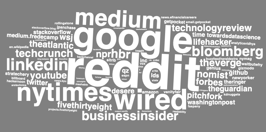
Now the fun begins. I’m first interested in knowing which domains I read and save the most. In the snippet below, I group and count by the domain, and select the top 20%.

To visualize the result, I use the wordcloud2 package, developed by Dawei Lang, to create a word cloud.

Looks about what I expected, a good mix of business and technology content sources, such as Wired, Medium, NY Times, and Business Insider. Although I’d like to understand how the content I save has changed over time, the Pocket export doesn’t include a timestamp of when the article was saved.

Topic Frequency

Next up, I take a tidytext approach to the list of link paths to analyze the topics I seem to be interested in. Using the unnest_tokens function, I create a data frame where each row is a word. With anti_join, I quickly remove common “stop” words, such as “the”, “of”, and “to”.

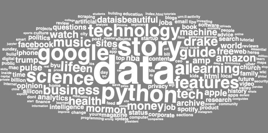
In order to create the word cloud to visualize topic prevalence, I first need to count word frequencies. Here I also removed several “noisy” words common in link paths, such as “click”, “news”, and “comments”.

Data comes out on top! Here technology terms and topics like Python and AI are clearly visible, along with a sprinkling of other interests and hobbies like music (Drake, Spotify).

This was a fun and simple way to implement the principles I’ve learned reading Julia Silge and David Robinson’s book, Text Mining with R.

Extracting Public Transactions from Venmo API with R

Public by default, your Venmo transactions are surprisingly accessible to anyone with an internet connection. Although Venmo has removed functionality to query historical transactions, it’s public API still provides a real-time snapshot view of transactions processed through the system, including usernames and payment subjects (though not the amount sent or received). Try it for yourself here.

With that said, it was straight-forward to collect a bit of data from this API using R. The bulk of the script was needed to parse the JSON file returned by the API to extract interesting information. In this post, I’ll highlight sample data from the API in an effort to expose the kind of information being openly shared. If you use Venmo, follow these instructions to change your transactions to private by default.

Sample Data

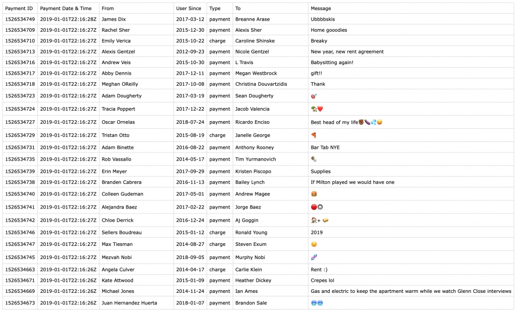
Using the API, I collected data from 1,250 payments. From each of these transactions, I was able to view the following information:

  • Payment Id
  • Payment Date, Time
  • Payment Message
  • Sender & Receiver Name, Username
  • Sender & Receiver Profile Photo
  • Sender & Receiver Venmo Account Creation Date

For example, on January 1, 2019 Scott Perkinson sent Patrick Miller an undisclosed payment for “Caroline Bachelorette Party & Wine tasting”. That same day, Kerry McCarthy paid Anna McCarthy for “Barbie dream house furniture.” You can’t make this stuff up.

Bottom line, privacy is important, and you should take any available steps to limit how your information is shared. If you use Venmo, start by making your payments private by default. You can find the datasets I compiled here and the R code to access the API here.

Visualizing Baby Name Popularity Trends with R

From the earliest days of our marriage, my wife and I talked about baby names. Your name is a core part of your identity, so choosing the right name for your child feels like a weighty affair. Now, with a baby on the way, the topic surfaces in conversation more than ever.

Like always, I turned to data to assist with the decision process. Using a dataset provided by the Social Security Administration, I created functions with R to visualize and compare the popularity of names over time.

There are two functions: the comparison of two names over time and the comparison of a name against a birth year over time. Below is sample implementation:

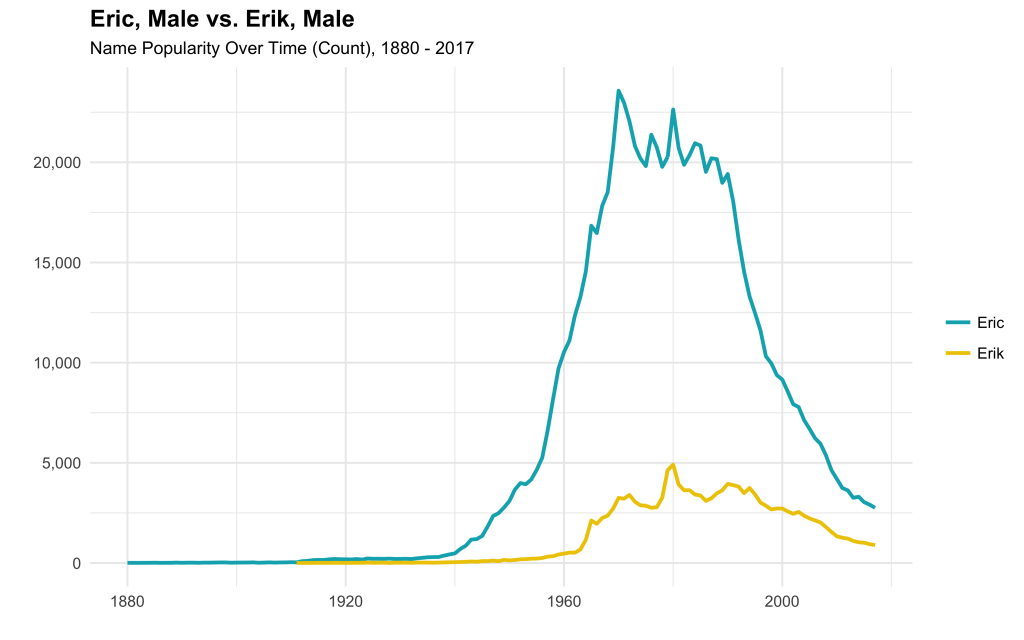
I first compared the popularity of the spelling of my name, Erik, to the more common spelling, Eric.

Erik has never been as popular as Eric, although both are currently down from their 1970 – 1990 peak.

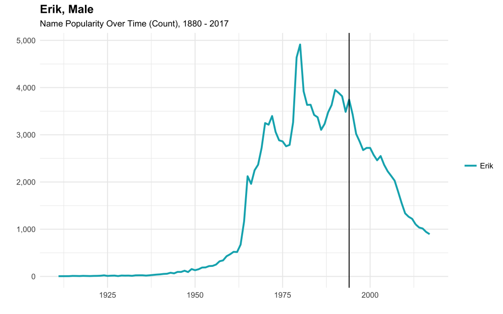
Next, I compared the popularity of my name in the context of my birth year. It looks like my parents named me around the start of the decline in popularity.

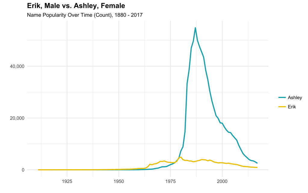
How does my name compare with my wife’s?

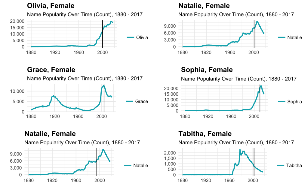
What can I say? She’s always been more popular. What about the names of my six sisters? (including sisters-in-law).

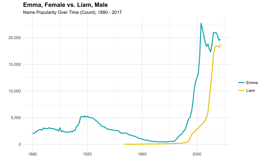
Finally, let’s take a look at the most popular boy and girl names of 2017, Liam and Emma.

This was a fun and simple way to interact with publicly available baby name data. You can find the dataset here and the code to create the functions here.

Web Photo Archiving with R

My wife and two of her sisters ran cross-country and track in high school. I recently learned that their team website, which hosts thousands of event photos from the past 10 years, is being shut down. Wanting to save my mother-in-law from the unimaginably tedious task of manually downloading each image, I wrote a script in R to automate the process. 

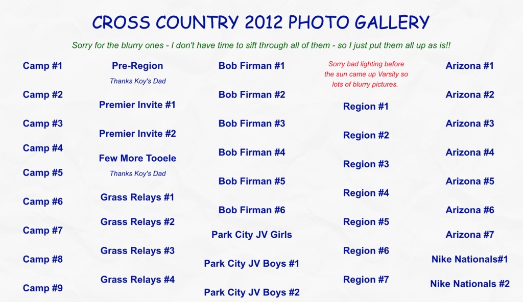
The website has a page for each season with links to event photo albums. For example, in the 2012 season, there are 81 photos albums and 10,000+ photos. 

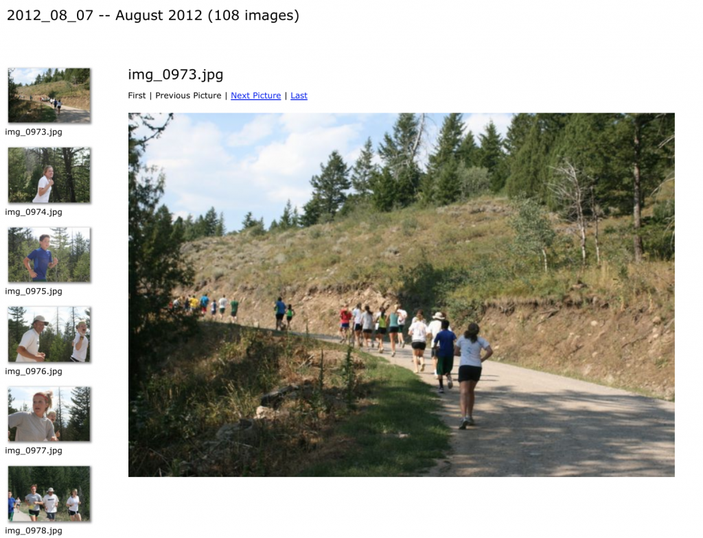
Each photo album contains somewhere between 80 and 150 photos. I needed to design the script to loop through and download each photo from each photo album.

In other words, I needed a way to pass a URL like the one below into the “file.download” function to save an image to my computer.

old.runtwolf.com/CC2012/Camp1/images/img_0973.jpg

Code Walkthrough

Let’s start by calling the two necessary packages: rvest and dplyr. These both form part of tidyverse, a collection of packages created by Hadley Wickham that share a common design philosophy. 

After downloading the season overview page with the list of photo albums, I used html_nodes and grepexpr to extract and clean the list of album names to form a list of album URLs. 

Finally, I looped through each photo album, replicating the folder structure locally, and downloading each of the .JPEG files.

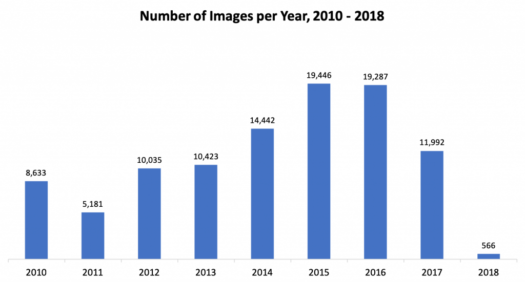
After all was said and done, I had downloaded 100,005 images from 759 photo albums across 9 XC seasons.

The final step was the upload the images to the cloud for easy sharing and storage. Luckily, the googledrive package allowed me to upload the images via a script rather than manual bulk upload.

Assuming each image would have taken 20 seconds to download, label, and upload, the manual process would have taken ~500 hours, non-stop! Writing the scripts and monitoring the download and upload process took about 8 hours, for a net time saved of ~492 hours.  

You can find the complete code here and archived photos here. 

Thank you to Jen Fitzgarrald for capturing so many wonderful images over the past decade. 

Interactive Investment Tool with R Shiny

R Shiny is a fantastic framework to quickly develop and launch interactive data applications. I recently wrote some investing advice and was looking for a way to illustrate two case studies. Building on an RStudio template, I created a tool to visualize the return of an investment over time, allowing the user to modify each parameter and observe its effect:

Click here for the full-page (non-embedded) version.

Find the full code here or below:

library(FinCal)
library(ggplot2)
library(tidyr)
library(shinythemes)
library(scales)

# Define UI for application that draws a histogram
ui <- shinyUI(fluidPage(theme = shinytheme("spacelab"),
  # Application title
  titlePanel("The Potential for Growth: Two Case Studies"),
  p('An interactive tool to accompany the ', a(href = 'https://unboxed-analytics.com/life-hacking/fundamentals-of-investing/', '"Fundamentals of Investing"'), 'post.'),
  
  # Sidebar with a slider input for number of bins
  sidebarLayout(
    sidebarPanel(
      numericInput(
        inputId = "rate",
        label = "Yearly Rate of Return",
        value = .06,
        min = .01,
        max = .15,
        step = .01
      ),
      p("Represented as a decimal."),
      p(".06 = 6%"),
      numericInput(
        inputId = "years",
        label = "Number of Years",
        value = 43,
        min = 3,
        max = 50,
        step = 1
      ),
      numericInput(
        inputId = "pv",
        label = "Initial Outlay",
        value = 2000,
        min = 1000,
        max = 100000,
        step = 1000.
      ),
      numericInput(
        inputId = "pmt",
        label = "Monthly Contribution",
        value = 0,
        min = 0,
        max = 10000,
        step = 100
      ),
      numericInput(
        inputId = "type",
        label = "Payment Type",
        value = 0,
        min = 0,
        max = 1,
        step = 1
      ),
      p("Indicates if payments occur at the end of each period (Payment Type = 0) or if payments occur at the beginning of each period (Payment Type = 1).")
      ),
    
    mainPanel(plotOutput("finPlot"),
              p("The grey line represents PRINCIPAL and the blue line represents PRINCIPAL + INTEREST."),
              p("Case 1: Suppose you have $2,000 to invest. You use that money to purchase a low-cost, tax-efficient, diversified mutual fund offering an approximate yearly return of 6%."),
              p("You purchase the mutual fund on your 22nd birthday and don’t check your account until your 65th birthday on the day of retirement. After 43 years, you would have over $26,200! Your money has doubled four times."),
              p("Case 2: Suppose again you have $2,000 today to invest. You purchase shares of the same mutual and now, in addition to the initial investment, purchase $100 of additional shares each month. [Adjust the 'Monthly Contribution' sidebar parameter]"),
              p("How much would you have at the end of 43 years? Over $268,400! You have passively created wealth through the market."))
  )
))

# Define server logic required to draw a histogram
server <- shinyServer(function(input, output) {
  output$finPlot <- renderPlot({

    # processing
    total <- fv(r = input$rate/12, n = 0:(12*input$years), pv = -input$pv, pmt = -input$pmt, type = input$type)
    principal <- seq(input$pv, input$pv + (input$years*12)*(input$pmt+.000000001), input$pmt + .000000001)
    interest <- total - principal
    df <- data.frame(period = 0:(12*input$years), total, principal)
    
    # plotting
    ggplot(df, aes(x = period)) + 
      geom_line(aes(y = total), col = "blue", size = .85) +
      geom_line(aes(y = principal), col = "black", size = .85) +
      labs(x = "Period",
           y = "") + 
      scale_y_continuous(labels = dollar) +
      theme(legend.position="bottom") +
      theme(legend.title = element_blank()) +
      theme_minimal()
  })
})

# Run the application
shinyApp(ui = ui, server = server)

Analyzing iPhone Usage Data in R

I’m constantly thinking about how to capture and analyze data from day-to-day life. One data source I’ve written about previously is Moment, an iPhone app that tracks screen time and phone pickups. Under the advanced settings, the app offers data export (via JSON file) for nerds like me.

Here we’ll step through a basic analysis of my usage data using R. To replicate this analysis with your own data, fork this code and point the directory to your ‘moment.json’ file.

Cleaning + Feature Engineering

We’ll start by calling the “rjson” library and bringing in the JSON file.

library("rjson")
json_file = "/Users/erikgregorywebb/Downloads/moment.json"
json_data <- fromJSON(file=json_file)

Because of the structure of the file, we need to “unlist” each day and then combine them into a single data frame. We’ll then add column names and ensure the variables are of the correct data type and format.

df <- lapply(json_data, function(days) # Loop through each "day"
{data.frame(matrix(unlist(days), ncol=3, byrow=T))})

# Connect the list of dataframes together in one single dataframe
moment <- do.call(rbind, df)

# Add column names, remove row names
colnames(moment) <- c("minuteCount", "pickupCount", "Date")
rownames(moment) <- NULL

# Correctly format variables
moment$minuteCount <- as.numeric(as.character(moment$minuteCount))
moment$pickupCount <- as.numeric(as.character(moment$pickupCount))
moment$Date <- substr(moment$Date, 0, 10)
moment$Date <- as.Date(moment$Date, "%Y-%m-%d")

Let’s create a feature to enrich our analysis later on. A base function in R called “weekdays” quickly extracts the weekday, month or quarter of a date object.

moment$DOW <- weekdays(moment$Date)
moment$DOW <- as.factor(moment$DOW)

With the data cleaning and feature engineering complete, the data frame looks like this:

Minute CountPickup CountDateDOW
131542018-06-16Saturday
53462018-06-15Friday
195642018-06-14Thursday
91522018-06-13Wednesday

For clarity, the minute count refers to the number of minutes of “screen time.” If the screen is off, Moment doesn’t count listening to music or talking on the phone. What about a pickup? Moment’s FAQs define a pickup as each separate time you turn on your phone screen. For example, if you pull your phone out of your pocket, respond to a text, then put it back, that counts as one pickup.

With those feature definitions clarified, let’s move to the fun part: visualization and modeling!

Visualization

I think good questions bring out the best visualizations so let’s start by thinking of some questions we can answer about my iPhone usage:

  1. What do the distributions of minutes and pickups look like?
  2. How does the number of minutes and pickups trend over time?
  3. What’s the relationship between minutes and pickups?
  4. Does the average number of minutes and pickups vary by weekday?

Let’s start with the first question, arranging the two distributions side by side.

g1 <- ggplot(moment, aes(x = minuteCount)) +
  geom_density(alpha=.2, fill="blue") +
  labs(title = "Screen Time Minutes",
       x = "Minutes",
       y = "Density") +
  theme_minimal() + 
  theme(plot.title = element_text(hjust = 0.5))

g2 <- ggplot(moment, aes(x = pickupCount)) +
  geom_density(alpha=.2, fill="red") +
  labs(title = "Phone Pickups",
       x = "Pickups",
       y = "Density") +
  theme_minimal() + 
  theme(plot.title = element_text(hjust = 0.5))

grid.arrange(g1, g2, ncol=2)

On average, it looks like I spend about 120 minutes (2 hours) on my phone with about 50 pickups. Check out that screen time minutes outlier; I can’t remember spending 500+ minutes (8 hours) on my phone!

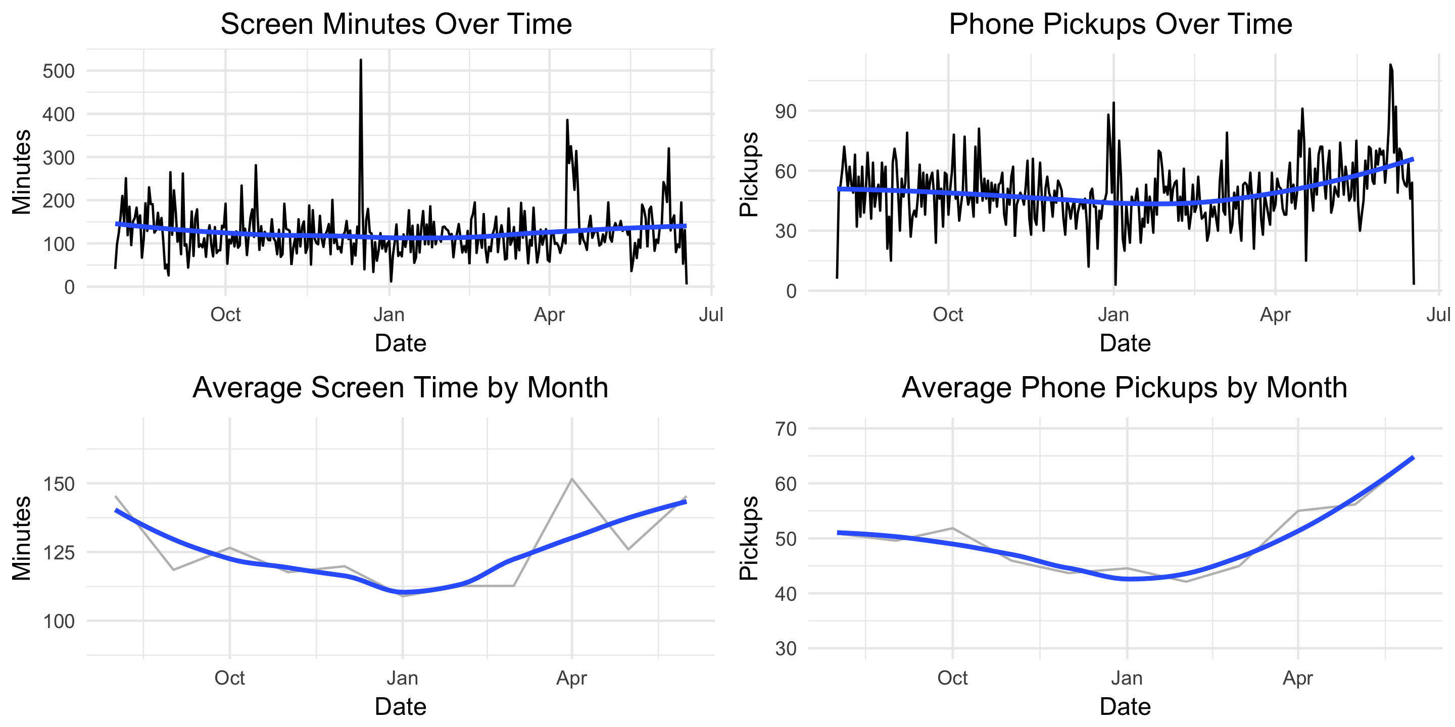
Next, how does my usage trend over time?

g4 <- ggplot(moment, aes(x = Date, y = minuteCount)) +
  geom_line() +
  geom_smooth(se = FALSE) +
  labs(title = "Screen Minutes Over Time ",
       x = "Date",
       y = "Minutes") +
  theme_minimal() +
  theme(plot.title = element_text(hjust = 0.5))

g5 <- ggplot(moment, aes(x = Date, y = pickupCount)) +
  geom_line() +
  geom_smooth(se = FALSE) +
  labs(title = "Phone Pickups Over Time ",
       x = "Date",
       y = "Pickups") +
  theme_minimal() +
  theme(plot.title = element_text(hjust = 0.5))

grid.arrange(g4, g5, nrow=2)
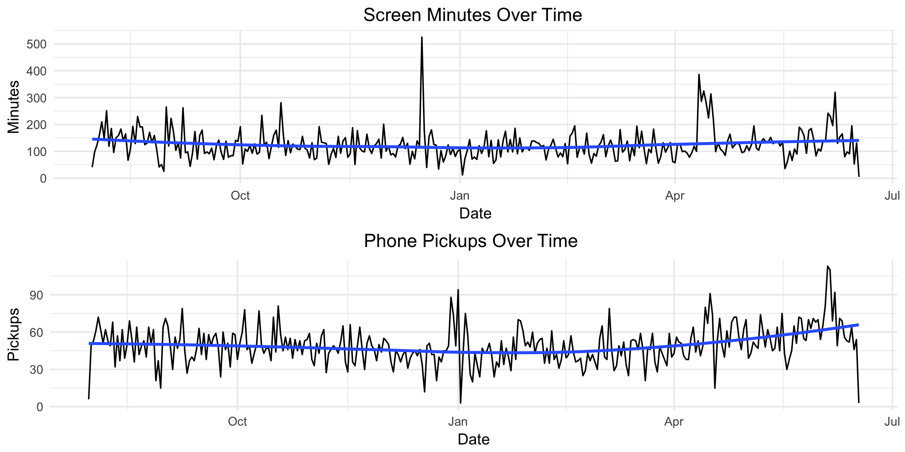
Screen time appears fairly constant over time but there’s an upward trend in the number of pickups starting in late March. Let’s remove some of the noise and plot these two metrics by month.

moment$monyr <- as.factor(paste(format(moment$Date, "%Y"), format(moment$Date, "%m"), "01", sep = "-"))

bymonth <- moment %>%
  group_by(monyr) %>%
  summarise(avg_minute = mean(minuteCount),
            avg_pickup = mean(pickupCount)) %>%
  filter(avg_minute > 50) %>% # used to remove the outlier for July 2017
  arrange(monyr)

bymonth$monyr <- as.Date(as.character(bymonth$monyr), "%Y-%m-%d")
g7 <- ggplot(bymonth, aes(x = monyr, y = avg_minute)) + 
  geom_line(col = "grey") + 
  geom_smooth(se = FALSE) + 
  ylim(90, 170) + 
  labs(title = "Average Screen Time by Month",
       x = "Date",
       y = "Minutes") +
  theme_minimal() +
  theme(plot.title = element_text(hjust = 0.5))

g8 <- ggplot(bymonth, aes(x = monyr, y = avg_pickup)) + 
  geom_line(col = "grey") + 
  geom_smooth(se = FALSE) + 
  ylim(30, 70) + 
  labs(title = "Average Phone Pickups by Month",
       x = "Date",
       y = "Pickups") +
  theme_minimal() +
  theme(plot.title = element_text(hjust = 0.5))

grid.arrange(g7, g8, nrow=2)
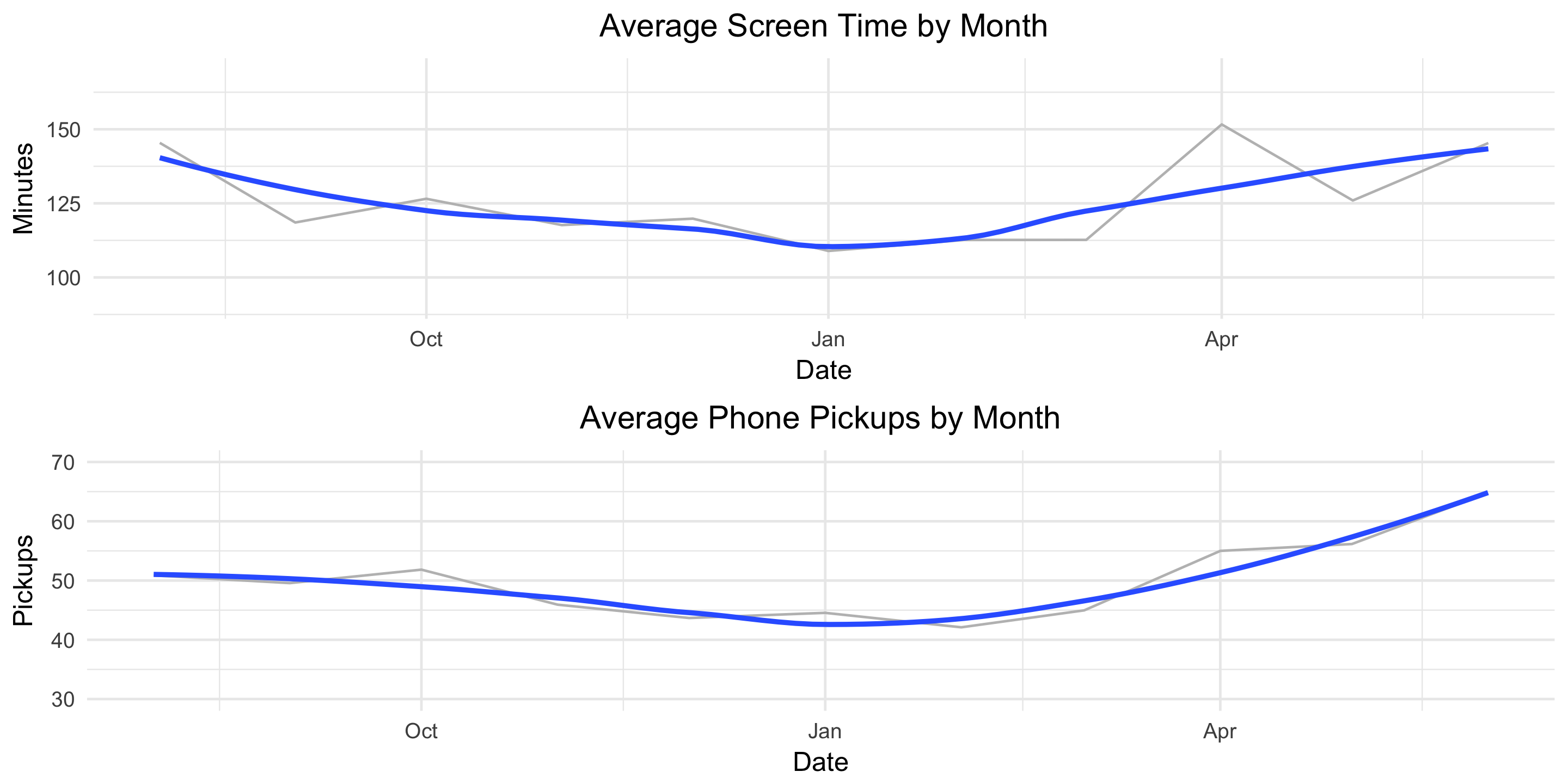
This helps the true pattern emerge. The average values are plotted in light grey and overlayed with a blue, smoothed line. Here we see a clear decline in both screen-time minutes and pickups from August until January and then a clear increase from January until June.

Finally, let’s see how our usage metrics vary by day of the week. We might suspect some variation since my weekday and weekend schedules are different.

byDOW <- moment %>%
  group_by(DOW) %>%
  summarise(avg_minute = mean(minuteCount),
            avg_pickup = mean(pickupCount)) %>%
  arrange(desc(avg_minute))

g10 <- ggplot(byDOW, aes(x = reorder(DOW, -avg_minute), y = avg_minute)) + 
  geom_bar(stat = "identity", alpha = .4, fill = "blue", colour="black") +
  labs(title = "Average Screen Time by DOW",
       x = "",
       y = "Minutes") +
  theme_minimal() +
  theme(plot.title = element_text(hjust = 0.5))

g11 <- ggplot(byDOW, aes(x = reorder(DOW, -avg_pickup), y = avg_pickup)) + 
  geom_bar(stat = "identity", alpha = .4, fill = "red", colour="black") +
  labs(title = "Average Phone Pickups by DOW",
       x = "",
       y = " Pickups") +
  theme_minimal() +
  theme(plot.title = element_text(hjust = 0.5))

grid.arrange(g10, g11, ncol=2)
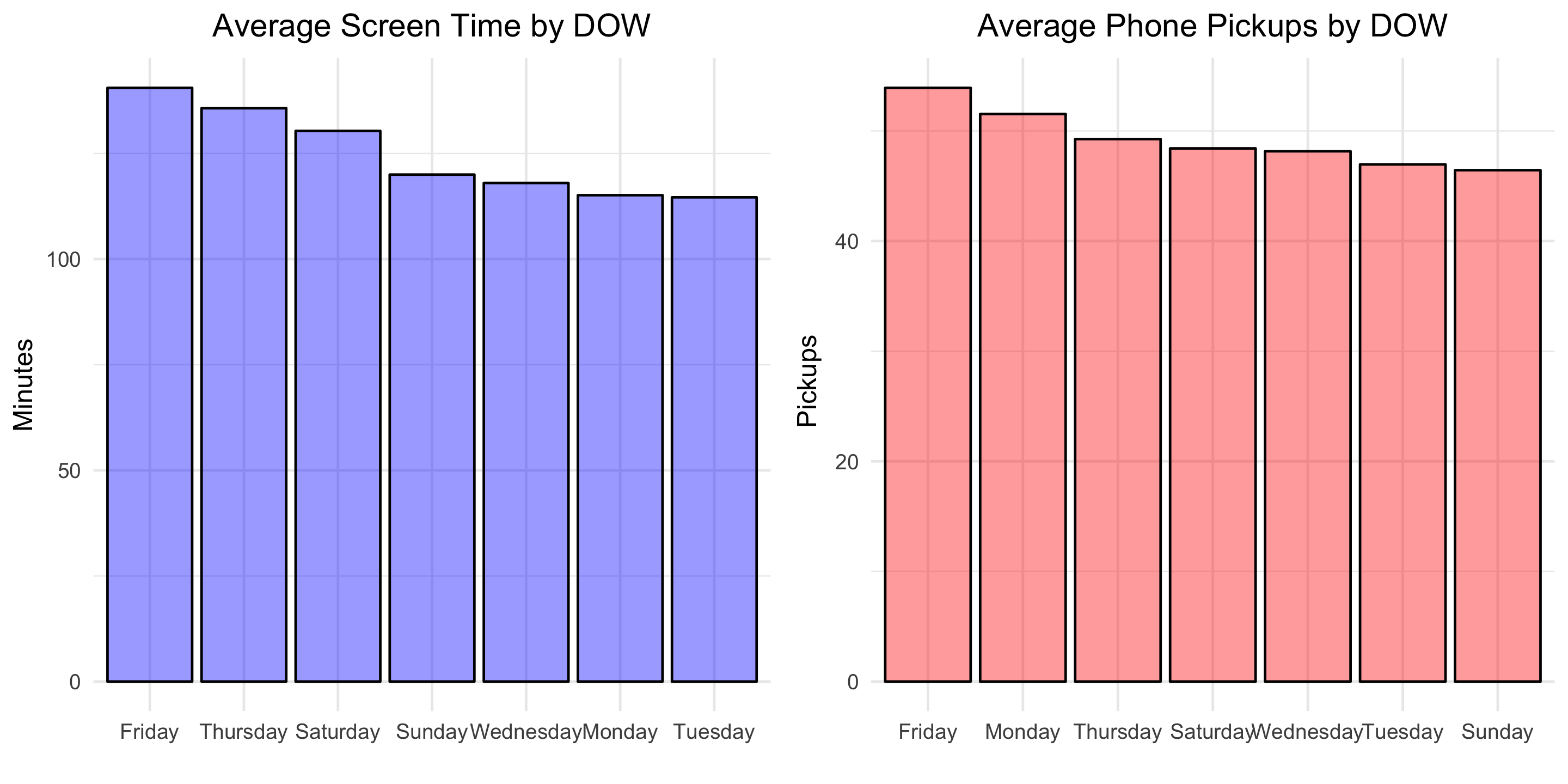
Looks like self-control slips in preparation for the weekend! Friday is the day with the greatest average screen time and average phone pickups.

Modeling

To finish, let’s fit a basic linear model to explore the relationship between phone pickups and screen-time minutes.

fit <- lm(minuteCount ~ pickupCount, data = moment)
summary(fit)

Below is the output:

Coefficients:
            Estimate Std. Error t value Pr(>|t|)    
(Intercept)  39.9676     9.4060   4.249 2.82e-05 ***
pickupCount   1.7252     0.1824   9.457  < 2e-16 ***
---
Signif. codes:  0 ‘***’ 0.001 ‘**’ 0.01 ‘*’ 0.05 ‘.’ 0.1 ‘ ’ 1

Residual standard error: 50.07 on 320 degrees of freedom
Multiple R-squared:  0.2184,	Adjusted R-squared:  0.216 
F-statistic: 89.43 on 1 and 320 DF,  p-value: < 2.2e-16

This means that, on average, each additional phone pickup results in 1.7 minutes of screen time. Let’s visualize the model fit.

g13 <- ggplot(moment, aes(x = pickupCount, y = minuteCount)) + 
  geom_point(alpha = .6) + 
  geom_smooth(method = 'lm', formula = y ~ x, se = FALSE) +
  #geom_bar(stat = "identity", alpha = .4, fill = "blue", colour="black") +
  labs(title = "Minutes of Screen Time vs Phone Pickups",
       x = "Phone Pickups",
       y = "Minutes of Screen Time") +
  theme_minimal() +
  theme(plot.title = element_text(hjust = 0.5))
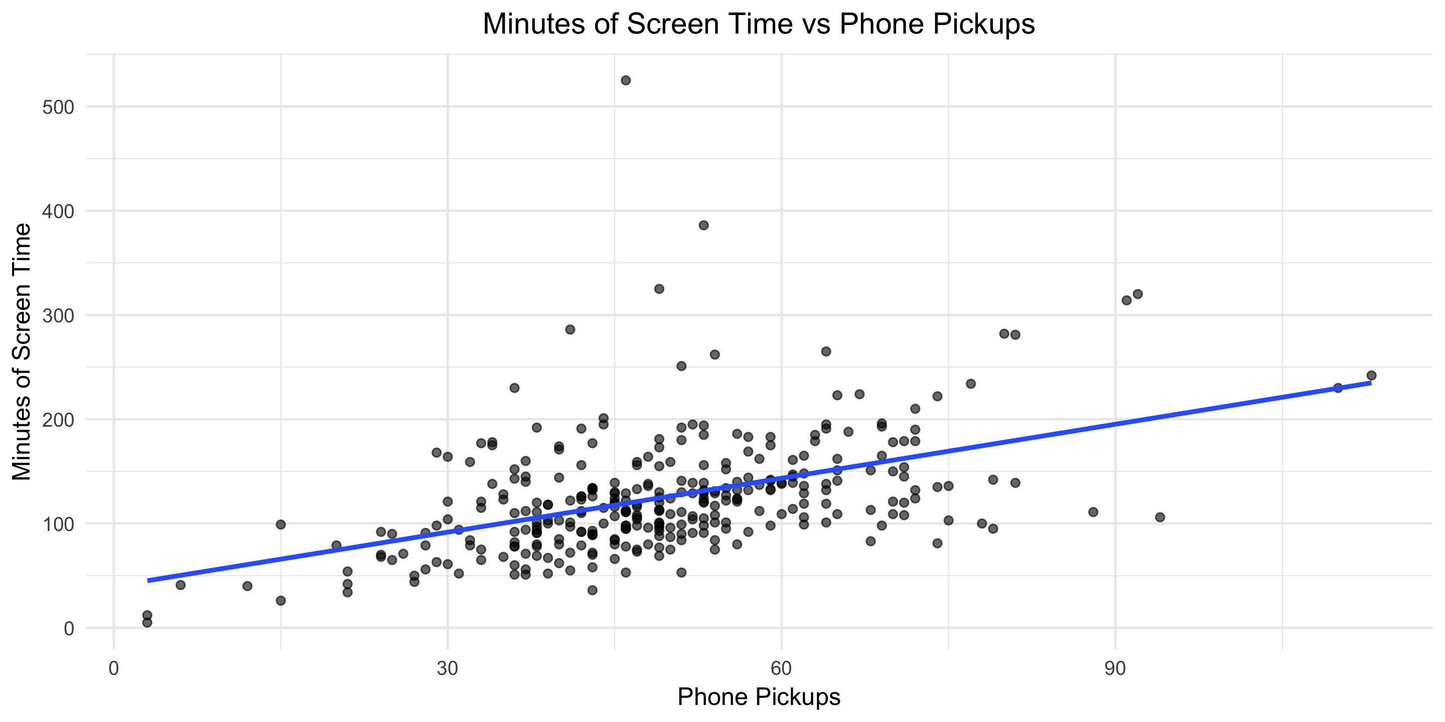
You can find all the code used in this post here. Download your own Moment data, point the R script towards the file, and Voila, two dashboard-type images like the one below will be produced for your personal enjoyment.
What other questions would you answer?
css.php