Scraping Stack Overflow Salaries with Python

I recently discovered a salary calculator on Stack Overflow. The tool takes inputs like role, location, and education and outputs salary predictions at the 25th, 50th, and 75th percentile.

Salary Calculator Interface

Based on the results of the annual developer survey, the calculator seems like an interesting way to study the marginal impact of expereince and education on earnings. As a recent undergraduate, I might be interested in understanding the impact of graduate degrees on income potential.

Calculator Output

To extract Data Scientist salary data (or extrapolated data) from the tool, I wrote a Python script using Selenium to loop through 350+ different combinations of location, education and expereince.

Results

There are many reasons to exercise skepticism when analyzing this data, like self-selection bias inherent to surveys. It’s obviously very unlikely that a data scientist responded from each location, education, and experience combination. Even if they did, salaries are likely to vary widely. To strengthen any insight derived from this analysis, I’d also collect data from sources like Glassdoor or Indeed, especially before making any significant education or relocation decisions!

With that long disclaimer in mind, below I visualize the scraped data with an interactive Tableau dashboard. You can filter by years of expereince and location to understand salary levels by education level:

One disappointment I had was realizing that much of the data returned from the calculator was the same across locations. The same salaries were also returned across expereince and education levels for graduate and postgraduate degrees. Despite the data shortcomings, this was an interesting exercise in automating data extract from web forums using Selenium. Thanks for reading!

Appendix

Python Script: Link
R Script: Link
Dataset: Link
Tableau Dashboard: Link

Visualizing Pocket Articles with R

Every day I see dozens of things online I don’t have time to read or view in the moment. With Pocket I save news articles, blog posts, talks, or tutorials for later viewing. Pocket allows me to organize things I’ve saved with tags and eliminates the need to send links to myself or bookmark web pages.

Pocket downloads the content for offline reading and presents the text in a reader mode free of ads. I usually save several articles a day and then read them on my commute home out of the city. Simply said, Pocket is the best way to store and catalog anything you read on your phone or computer.

Over the last 2 years I’ve saved just shy of 2,000 links, encompassing a variety of content. Luckily, Pocket has a handy export interface, generating an HTML file with a list of saved links. In this post I’ll extract insights from these links in R, using link domain and topic frequency to assess my interests.

Getting Started

To start, let’s call the required packages.

As an overview, I use rvest to extract the HTML page content, urltools to transform the links to a working dataset, dplyr to manipulate the data, tidytext to tokenzen the link content, stringr to filter out numbers from the links, and wordcloud2 to visualize the word frequencies.

Next, I import the HTML file and extract the links. The url_parse function easily transforms the list of links into a data frame, with columns like scheme, domain, and path. For example, the Wired article below is broken into scheme (https), domain (www.wired.com), and path (2017/03/russian-hacker-spy-botnet/).

https://www.wired.com/2017/03/russian–hacker-spy-botnet/

Top Domains

Now the fun begins. I’m first interested in knowing which domains I read and save the most. In the snippet below, I group and count by the domain, and select the top 20%.

To visualize the result, I use the wordcloud2 package, developed by Dawei Lang, to create a word cloud.

Looks about what I expected, a good mix of business and technology content sources, such as Wired, Medium, NY Times, and Business Insider. Although I’d like to understand how the content I save has changed over time, the Pocket export doesn’t include a timestamp of when the article was saved.

Topic Frequency

Next up, I take a tidytext approach to the list of link paths to analyze the topics I seem to be interested in. Using the unnest_tokens function, I create a data frame where each row is a word. With anti_join, I quickly remove common “stop” words, such as “the”, “of”, and “to”.

In order to create the word cloud to visualize topic prevalence, I first need to count word frequencies. Here I also removed several “noisy” words common in link paths, such as “click”, “news”, and “comments”.

Data comes out on top! Here technology terms and topics like Python and AI are clearly visible, along with a sprinkling of other interests and hobbies like music (Drake, Spotify).

This was a fun and simple way to implement the principles I’ve learned reading Julia Silge and David Robinson’s book, Text Mining with R.

Extracting Public Transactions from Venmo API with R

Public by default, your Venmo transactions are surprisingly accessible to anyone with an internet connection. Although Venmo has removed functionality to query historical transactions, it’s public API still provides a real-time snapshot view of transactions processed through the system, including usernames and payment subjects (though not the amount sent or received). Try it for yourself here.

With that said, it was straight-forward to collect a bit of data from this API using R. The bulk of the script was needed to parse the JSON file returned by the API to extract interesting information. In this post, I’ll highlight sample data from the API in an effort to expose the kind of information being openly shared. If you use Venmo, follow these instructions to change your transactions to private by default.

Sample Data

Using the API, I collected data from 1,250 payments. From each of these transactions, I was able to view the following information:

  • Payment Id
  • Payment Date, Time
  • Payment Message
  • Sender & Receiver Name, Username
  • Sender & Receiver Profile Photo
  • Sender & Receiver Venmo Account Creation Date

For example, on January 1, 2019 Scott Perkinson sent Patrick Miller an undisclosed payment for “Caroline Bachelorette Party & Wine tasting”. That same day, Kerry McCarthy paid Anna McCarthy for “Barbie dream house furniture.” You can’t make this stuff up.

Bottom line, privacy is important, and you should take any available steps to limit how your information is shared. If you use Venmo, start by making your payments private by default. You can find the datasets I compiled here and the R code to access the API here.

Visualizing Baby Name Popularity Trends with R

From the earliest days of our marriage, my wife and I talked about baby names. Your name is a core part of your identity, so choosing the right name for your child feels like a weighty affair. Now, with a baby on the way, the topic surfaces in conversation more than ever.

Like always, I turned to data to assist with the decision process. Using a dataset provided by the Social Security Administration, I created functions with R to visualize and compare the popularity of names over time.

There are two functions: the comparison of two names over time and the comparison of a name against a birth year over time. Below is sample implementation:

I first compared the popularity of the spelling of my name, Erik, to the more common spelling, Eric.

Erik has never been as popular as Eric, although both are currently down from their 1970 – 1990 peak.

Next, I compared the popularity of my name in the context of my birth year. It looks like my parents named me around the start of the decline in popularity.

How does my name compare with my wife’s?

What can I say? She’s always been more popular. What about the names of my six sisters? (including sisters-in-law).

Finally, let’s take a look at the most popular boy and girl names of 2017, Liam and Emma.

This was a fun and simple way to interact with publicly available baby name data. You can find the dataset here and the code to create the functions here.

Web Photo Archiving with R

My wife and two of her sisters ran cross-country and track in high school. I recently learned that their team website, which hosts thousands of event photos from the past 10 years, is being shut down. Wanting to save my mother-in-law from the unimaginably tedious task of manually downloading each image, I wrote a script in R to automate the process. 

The website has a page for each season with links to event photo albums. For example, in the 2012 season, there are 81 photos albums and 10,000+ photos. 

Each photo album contains somewhere between 80 and 150 photos. I needed to design the script to loop through and download each photo from each photo album.

In other words, I needed a way to pass a URL like the one below into the “file.download” function to save an image to my computer.

old.runtwolf.com/CC2012/Camp1/images/img_0973.jpg

Code Walkthrough

Let’s start by calling the two necessary packages: rvest and dplyr. These both form part of tidyverse, a collection of packages created by Hadley Wickham that share a common design philosophy. 

After downloading the season overview page with the list of photo albums, I used html_nodes and grepexpr to extract and clean the list of album names to form a list of album URLs. 

Finally, I looped through each photo album, replicating the folder structure locally, and downloading each of the .JPEG files.

After all was said and done, I had downloaded 100,005 images from 759 photo albums across 9 XC seasons.

The final step was the upload the images to the cloud for easy sharing and storage. Luckily, the googledrive package allowed me to upload the images via a script rather than manual bulk upload.

Assuming each image would have taken 20 seconds to download, label, and upload, the manual process would have taken ~500 hours, non-stop! Writing the scripts and monitoring the download and upload process took about 8 hours, for a net time saved of ~492 hours.  

You can find the complete code here and archived photos here. 

Thank you to Jen Fitzgarrald for capturing so many wonderful images over the past decade. 

Speaker Gender Ratios in LDS General Conference

This weekend was LDS General Conference, a semiannual meeting where leaders speak to church members worldwide. After following the Twitter #GeneralConference hashtag, I became interested in the frequency of women speakers during past conferences. Using Python, I scrapped 40+ years of speaker data from LDS.org to understand the speaker gender ratio trend over time. Below is the code used and a graphic illustrating my findings.

Over the past 47 years, on average, women have comprised about 10% of the speakers per conference.

You can find the GitHub gist here and the full dataset here.

Using the Google Maps API to Visualize Chase’s Presence in Utah

I’ve been a happy Chase customer since 2010. I’ve appreciated the investment in their mobile platform and was excited about the recent You Invest announcement, allowing customers to trade 100 stocks and ETFs a year for free. With 5,100+ branches and 16,000 ATMs+ nationwide, Chase has a strong national footprint.

In this post, I use Python to recreate the map below for my home state of Utah, scrapping branch and ATM information from Chase.com and obtaining geographic coordinates using the Google Maps geocoding API.

chase-footprint
Chase branches in the U.S. in 2010. Source: Wikipedia

Before going further, I’d invite you to read Chase.com’s Terms of Use as well as Roberto Rocha’s article about the ethics of web scrapping. To avoid excessive server demands (although an unlikely issue for Chase), we’ll explicitly space out requests, made easy with Python’s time sleep method.

Scrapping Branch & ATM Information with Selenium

As usual, we’ll begin by calling the necessary libraries.

Next, we need to pass the driver a URL. Here I’ve used the Utah URL. This could easily be adapted to other states by changing the last two letters of the link.

Also note the executable path, which is pointed to the directory where my ChromeDriver is located. You can download the driver here.

When this code finishes running, the “locations” list contains location names, such as the following Utah cities:

We then convert these locations into Chase.com URLs.

The links now look like this:

The function below represents the process of scrapping the data for each location.

We’ll apply the function to each location URL to extract the corresponding branch and ATM information.

Finally, we’ll clean the information we’ve scrapped and organize it into tidy columns.

Here a sample of what the final dataset looks like:

LocationAddressType
Bountiful510 S 200 W Bountiful, UT 84010Branch
Farmington Station Park100 N Station Pkwy Farmington, UT 84025Branch
Brigham Young University800 E Campus Dr Provo, UT 84602ATM
Fashion Place6255 S State St Murray, UT 84107Branch

Geocoding Branch Address via Google Maps API

Per Google’s Get Started article, geocoding is the process of converting addresses into geographic coordinates, like latitude and longitude. Once we have a longitude and latitude combination, we can plot the branch and ATM locations on a map using Tableau or R.

Here is the Python code used to accomplish the geocoding:

Please note that you’d need to insert your own Google Cloud API key to make the code run. Finally, let’s visualize some of the data points with R!

Here’s the code to create this visualization:

You can view the data here and the complete code here. Thanks for reading!

Analyzing Drake’s Catalog Using Spotify’s API

I’ve been a Drake fan since 2009 when I first heard “Best I Ever Had” from So Far Gone. Over the last decade, I’ve watched Drake transform into a global rap and pop superstar. This weekend I saw Drake live in Brooklyn as part of the Aubrey & the Three Migos tour. What better way to celebrate than by analyzing his catalog using Spotify’s API? I’ve broken the celebration into two parts, getting the data and analyzing the data. Click here if you’d rather skip the code and jump into the analysis.

Getting the Data

In this post, I use Spotipy, “a lightweight Python library for the Spotify Web API”. Let’s start by calling the necessary libraries.

Next, we need to authenticate and connect to the API. To do so, we need a “client id” and “client secret”. To obtain them, visit the Spotify Developer Dashboard here and create an application. In the code snippet below, replace the client id and client secret variables with your own.

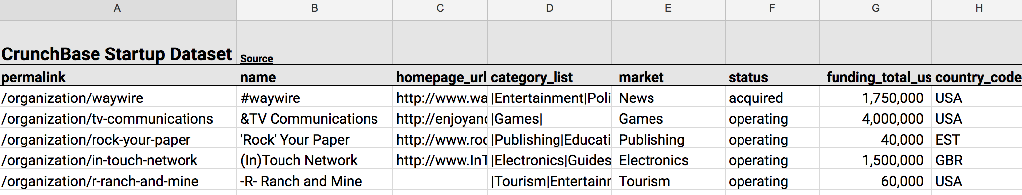
There are a few potential ways to create a dataset of Drake’s catalog. We could have first obtained a list of the artist’s albums and then looped through each album track. Instead, I used a playlist by ‘100 percent’ which claims to have, “all of Drake, all in one place.” This collection of 219 songs (15+ hours) contains “every appearance currently on Spotify updated with each new release.” Great! We’ll now write a function to retrieve the ids for each track of this playlist.

With the list of track ids, we can now loop over each id and obtain track information such as track name, album, release date, length, and popularity. More importantly, Spotify’s API allows us to extract a number of “audio features” such as danceability, energy, instrumentalness, and tempo. Without going into how these measures are determined, we’ll use them to understand how Drake’s style has evolved over time.

We’ll now loop over the tracks, applying the function, and save the dataset to a .csv file.

Here’s what the raw dataset looks like:

You can find the complete script to obtain this data here or download the dataset here.

Analyzing the Data

Let’s quickly clean a few variables in preparation for analysis. We’ll first convert the song length from milliseconds to minutes. Second, since the artist field captured the principal song artist, let’s create a boolean variable called “feature” which indicates whether or not Drake is the principal artist. Let’s also create a “year” variable using the release date for easy aggregation and grouping. Finally, we’ll reference the Drake discography Wikipedia page to create a “type” variable to distinguish between singles, extended plays (EP), mixtapes, studio albums, and feature tracks.

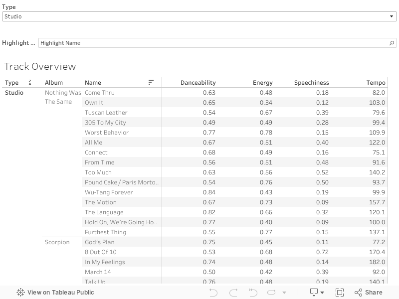
And now for some analysis. To begin, I’ve embedded a Tableau worksheet below which provides an overview of each Drake song for four core measurements:  danceability, energy, speechiness, and tempo.

This worksheet allows you to filter by type and to highlight a track within that type. I’d recommend clicking on the “expand” symbol in the lower right-hand corner for a better look.

A quick description of these four audio features, from the Spotify API Endpoint Reference:

Danceability: Describes how suitable a track is for dancing based on a combination of musical elements including tempo, rhythm stability, beat strength, and overall regularity. A value of 0.0 is least danceable and 1.0 is most danceable.

Energy: A measure from 0.0 to 1.0 and represents a perceptual measure of intensity and activity. Typically, energetic tracks feel fast, loud, and noisy. For example, death metal has high energy, while a Bach prelude scores low on the scale.

Speechiness: Detects the presence of spoken words in a track. The more exclusively speech-like the recording (talk show, audiobook, poetry), the closer to 1.0 the attribute value. Values between 0.33 and 0.66 describe tracks that may contain both music and speech, either in sections or layered, including such cases as rap music.

Tempo: The overall estimated tempo of a track in beats per minute (BPM).

Tracks Over Time

With those definitions clarified, let’s move onto a few visualizations. We’ll start with the number of tracks over time.

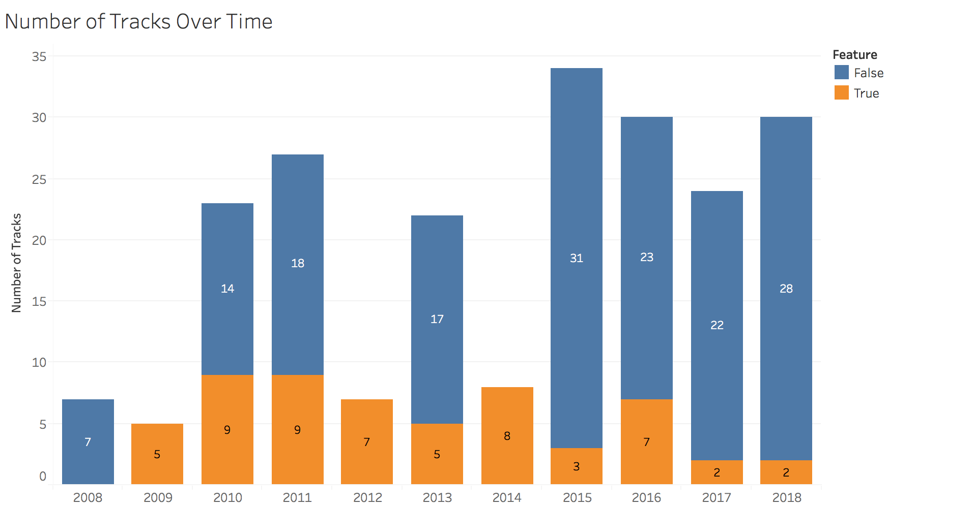
In this chart, we see that Drake has provided fans a fairly constant stream of new jams since 2008. In 2012 and 2014, Drake only jumped onto other artists’ song, releasing none of his own. In 2015, Drake blessed us with a doubleheader: If You’re Reading This It’s Too Late and What a Time to Be Alive plus additional singles and features for a total of 34 songs.

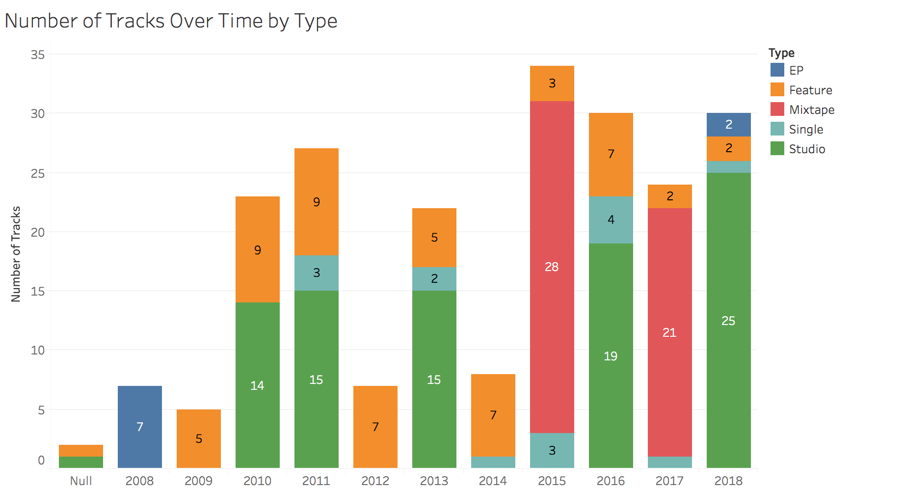
This can be seen more clearly in the next chart:

tracks-over-time-type

Track Length

I recently read a Pitchfork article (highly recommended, great visualizations) that analyzed the length of hip-hop records over the last 30 years. Drake is notorious for long albums, with his latest double-sided project coming in just under 90 minutes. Keeping in mind that there may be a strategic, streaming-oriented purpose, let’s take a look at how both album length and song length have trended over time.

The answer to the question posed in that Pitchfork article, “Are Rap Albums Really Getting Longer?” is abundantly clear here, at least in Drake’s case. His five studio albums have each progressively become longer. Some might call this a blessing, others a curse. What about average track length?

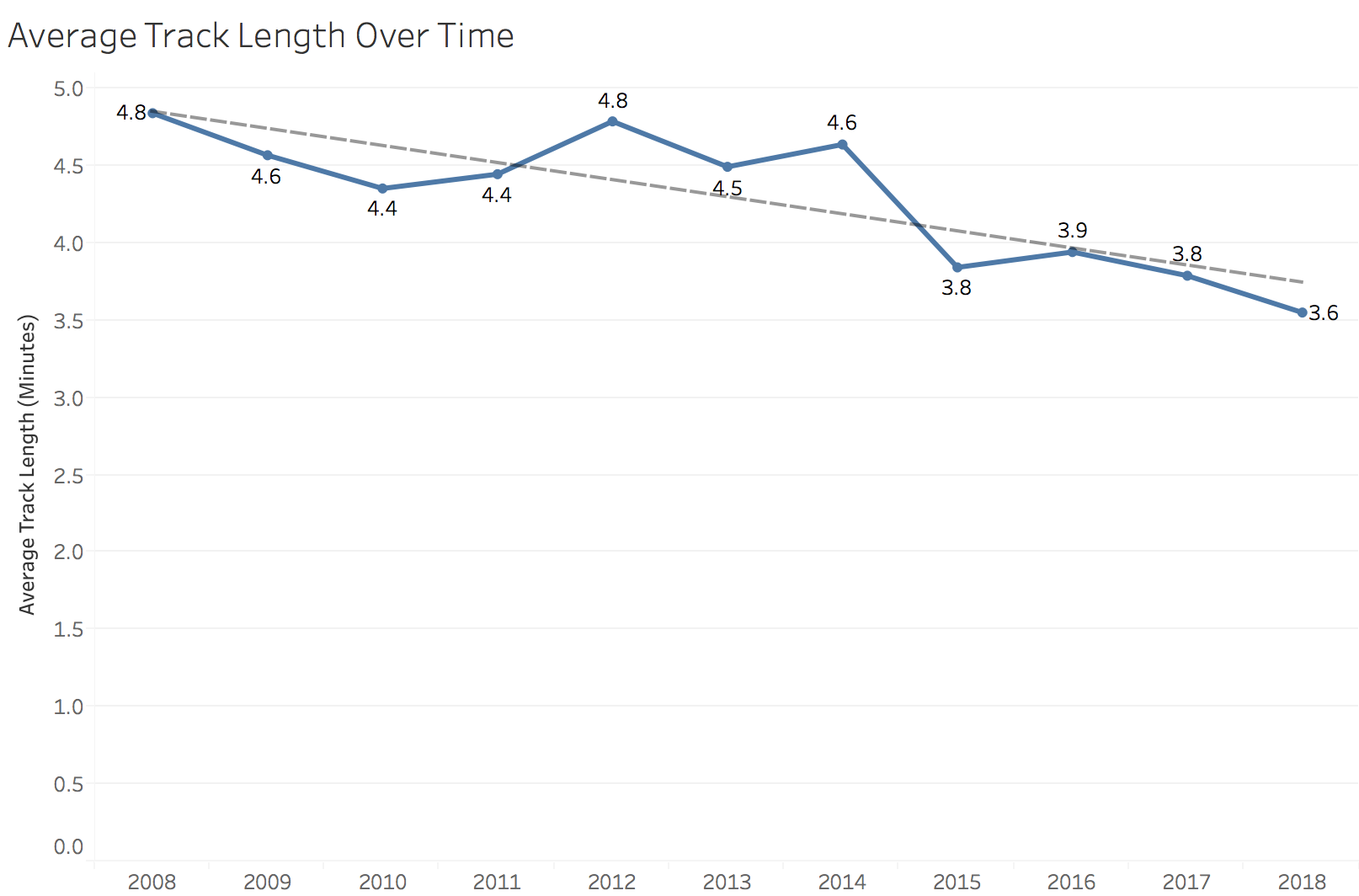
While Drake’s albums appear to be getting longer, his songs are, on average, getting shorter. Over the past decade, average song length has decreased more than a minute, from 4.8 minutes in 2008 to 3.6 minutes in 2018. Maybe this is another effect of the transition to streaming, as music streaming is now the industry’s biggest revenue source.

Danceability & Energy

It’s pretty common for artists to “go pop” on the road to wider reach and popularity. Measuring the danceability metric for Drake’s songs over time might be a good way to test for a shift towards pop appeal. Shown below is average danceability and energy over time.

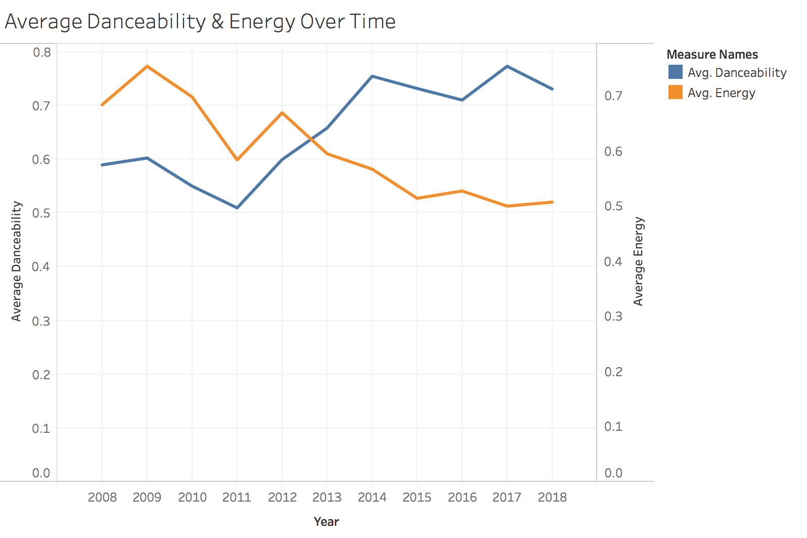
There’s a pretty clear upward trend in danceability, with a simultaneous decline in energy.

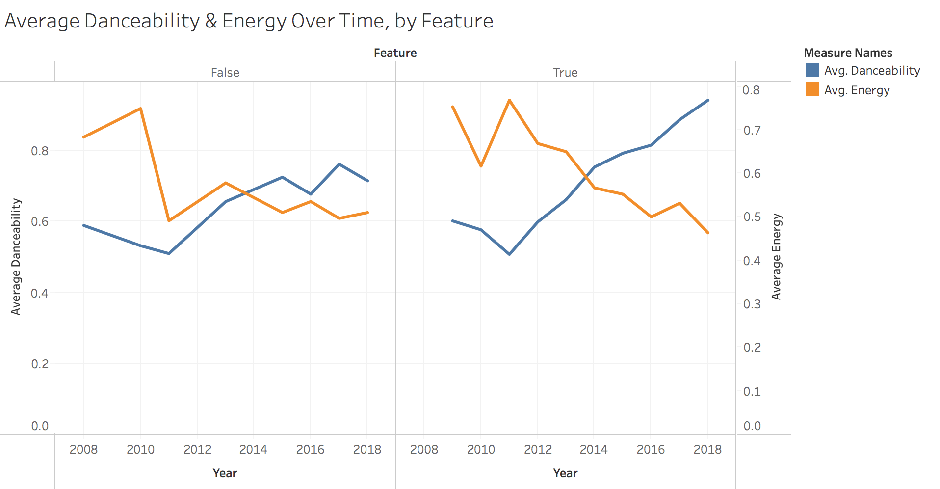
This holds true when we separate songs Drake is featured on versus his own, but his more pronounced on featured songs.

Top Collaborators

Finally, who does Drake like to work with? Here we measure the number of features by artist.

top-collaborators

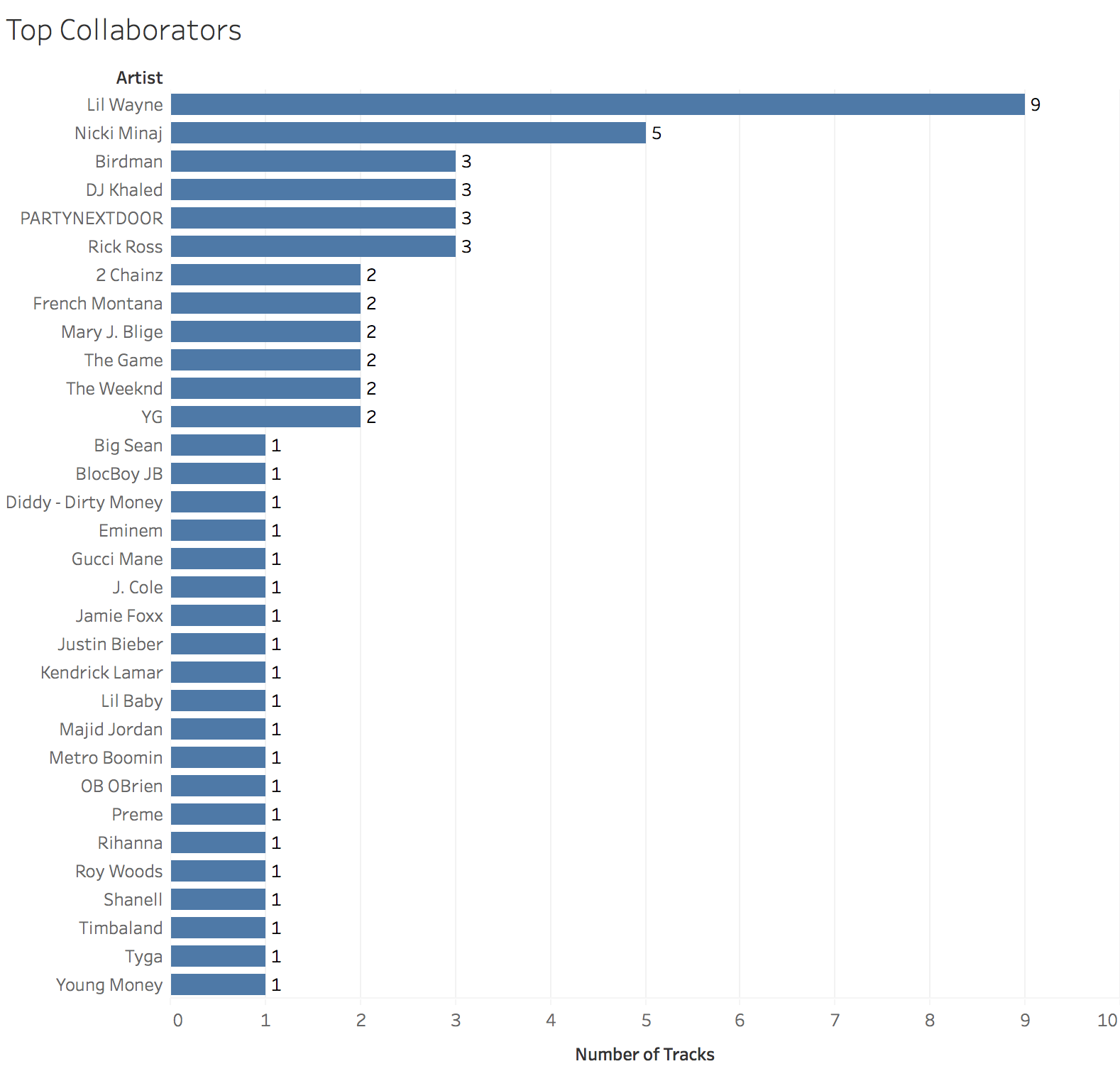
The top three artists are all current or former Young Money acts. Beyond that, it’s clear Drake has worked with artists across a large spectrum of rap and R&B artists, from Rick Ross to Jaime Foxx.

Conclusion

APIs can be a great source of unique and interesting datasets. In addition to the information presented here, I’d be interested in expanding the dataset to include song recording location, principal producer, lyrical content, and the number of streams the track has obtained.

You can find the full, interactive version of the Tableau charts here and the dataset here.

Uncovering Insights via Google Sheets Query

The Google Sheets query function brings some of the power of SQL to spreadsheets. I recently discovered the power of this tool when building some personal finance dashboards. In this post, I’ll walk through three examples of the query function to explore a CrunchBase dataset of startup companies, which I found on Tableau’s resource page. To learn the basics of this function I’d recommend reading one of the following articles:

The CrunchBase dataset contains information about 49,000+ startups including the startup name, website, market, status, funding, and location. The most recent funding in this dataset occurred in early 2015. The data, as well as the query examples below, can be found in this Google Sheet.

Note: The query statement is formed using column letters. If I want to reference the “market” column I would refer to it as “E”, as shown below.

With that in mind, here’s a list of the variables we have to work with and their corresponding column letter in the Google Sheet.

  • A: permalink
  • B: name
  • C: homepage_url
  • D: category_list
  • E: market
  • F: status
  • G: funding_total_usd
  • H: country_code
  • I: state_code
  • J: region
  • K: city
  • L: funding_rounds
  • M: founded_at
  • N: founded_month
  • O: founded_quarter
  • P: founded_year
  • Q: first_funding_at
  • R: last_funding_at
  • S: time_to_funding

In the examples below I’ll share the query, a visualization, and a brief explanation. Let’s jump into it!

1. Number of Startups by State

select I, count(A) where (H = 'USA' and I <> '') group by I order by count(A) desc label I 'State', count(A) 'Number of Startups'

As expected, California is home to by far the largest number of startups. New York trails in distant second with less than a third as many startups as California.

2. Number of CA & NY Startups Over Time

select P, count(P) where ((I = 'NY' or I = 'CA') and P > 1989 and P < 2014) group by P pivot I label P 'Year'

Has California always held the lead over New York? This query allows us to compare the number of startups founded overtime in the two states.

It appears that California has been in the lead for some time!

3. Total Funding by Market

select E, sum(G), count(G) where E <> '' group by E order by sum(G) desc label E 'Market', sum(G) 'Total Funding', count(G) 'Number of Startups'

Pro-tip for aspiring entrepreneurs: consider Biotechnology! With a staggering total of 73+ billion in funding, this market is by far the largest in this dataset.

There’s so much more to dig into with this dataset. What other things would you explore? How would you translate them into a query?

The Hunt for Housing in NYC: A Data-Driven Approach

This summer my wife and I relocated to New York City in preparation for the start of my new job. Housing in Manhattan and the surrounding boroughs is notoriously expensive, so I decided to pursue a data-driven approach to our apartment search. I wrote a Python script to scrape 9,000+ apartment listings on Craigslist for zip codes in the five boroughs: Manhattan, Bronx, Brooklyn, Queens, and Staten Island. I then visualized the median rent by zip code in Tablaeu. Check out the dashboard here!

Gathering the Data

Before digging into some housing insights, let’s walk through the process used to obtain the data. First, I obtained data about the organization of New York City’s boroughs, neighborhoods, and zip codes from a New York State Department of Health website. I then leveraged the structure of Craigslists’s URLs to construct a vector of links to search for apartments in each of the zip codes. Here’s what the URL to search for apartments with the zip code 10453 looks like:

https://newyork.craigslist.org/search/aap?postal=10453

Let’s see what that looks like in code.

The ‘nyc-zip-codes.csv’ file referenced above can be found here. Next, I wrote a function to extract the pertinent information from each listing from each of these links. I extracted the listing title, posting date, monthly rent, and the number of bedrooms, when available.

This is what the function returns when fed the sample link for zip code 10453.

At this point, we just need a way to loop through each zip code and compile the data the function returns.

After cleaning the data and removing duplicates, we have about 9,400 listings to work with.

Analyzing the Data

Let’s start with the big picture and then zoom in. Below we have the median rental price of listings by borough. Manhattan is by far the most expensive place to live, followed in distant second by Brooklyn. Queens, Staten Island, and the Bronx are actually somewhat comparable, with median rent in Queens only $250 higher than median rent in the Bronx.

How does rent vary in the five boroughs by the number of bedrooms the unit has? Filtering the data to include only units with 1 to 4 bedrooms, Manhattan is still the most expensive for each number of bedrooms.


Note that the bracketed, italicized numbers above show the number of listings for each borough and bedroom combination.

My wife and I had hoped to find a 2-bedroom apartment in a safe neighborhood with a 30-minute commute to Midtown for $2,000 or less. But, as you can see in the image below depicting median 2-bedroom rent by zip code in Queens, that may be a tough find!

Now, what else would I have liked to add to this analysis? Since one major consideration in the hunt for housing is commute time, how about a distance-adjusted median rental price metric for each zip code? This is something I’ll tackle in a future post.

Conclusion

Ultimately, my wife and I found housing in Scarsdale through a family friend and didn’t end up living in any of the five boroughs! Luckily, by feeding the script a different set of zip codes and modifying the Craigslist URL structure, I’ll be able to replicate this data-driven process in future apartment searches.

Find the complete code here, hosted as a Gist on GitHub.

Check out my other data projects here.

css.php