Sometimes rankings are useful, since they collapse many data points into a single metric, allowing for easy comparison. The problem is when rankings build on subjective methodologies or abstract criteria are taken as absolute truth, rather than a directional guide.
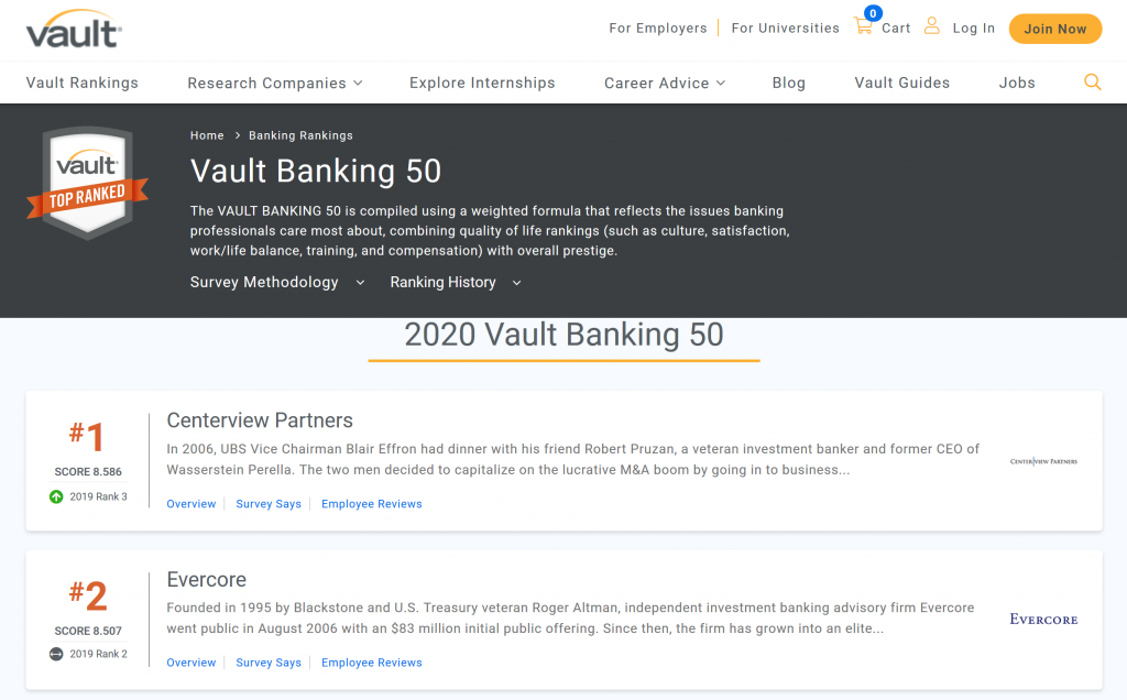
With that disclaimer as backdrop, it’s no surprise that Vault.com surveys professionals to rank the top employers in industries like law, consulting, and banking. The rankings they produce are based on surveys that try to measure things like prestige, culture, satisfaction, work/life balance, training, and compensation.
Vault rankings are created using “a weighted formula that reflects the issues professionals care most about”, such as prestige, culture, and satisfaction (source)
Obviously, the inputs (“prestige” and “culture”) are inherently abstract and highly subjective, so the output (rankings) is likely to be noisy and subjective as well. That said, I was interested to see how rankings, specifically in banking, had changed over time, so I compiled the Top 50 lists from 2011 to 2020.
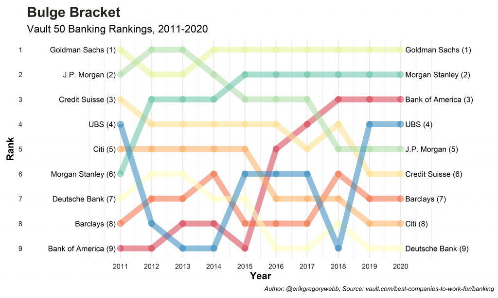
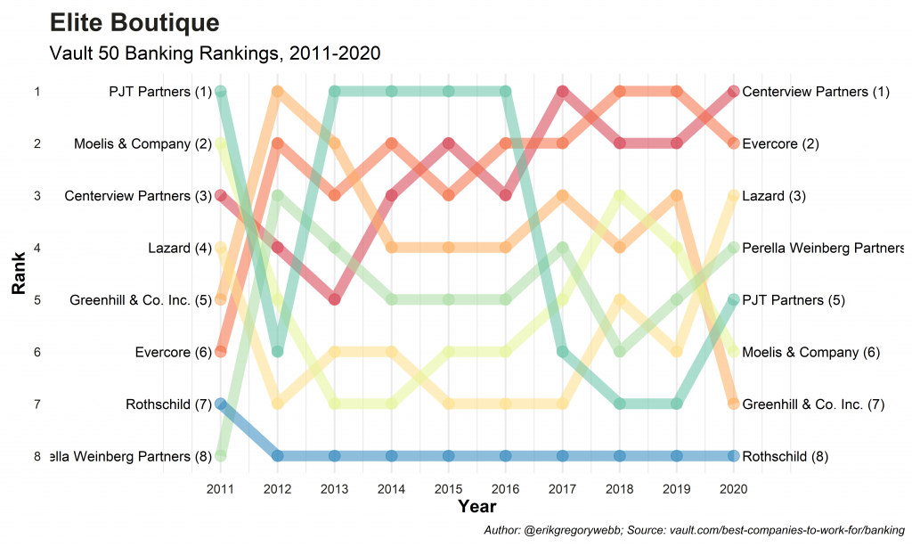
The lists are composed of companies across the banking spectrum, from bulge bracket firms like Goldman Sachs and Morgan Stanley to elite boutiques like Centerview and Evercore to middle market banks like Piper Sandler and Raymond James.
Below are the results for the bulge bracket and elite boutique segments, along with a few observations, based on loose categories suggested by mergersandinquisitions.com.
Dominance of GS: Over the ten year period, Goldman only dipped below #1 briefly, in 2012-13.
Decline of JPM: Despite clenching the #1 spot in 2012-13, JPM declined in the following years, landing at #5 in 2020.
Growth of BAML: Starting in #9 in 2011, BAML’s rank steadily improved over time, hovering at #3 in 2020.
I compiled this data manually, but used r and ggplot to clean and filter the data and create the charts. You can find the full repo on Github here.
Import, Define ggplot Theme
Plot
Export
Thanks for reading! Feel free to check out my other blog posts or click a tag below to see related blog posts.
Finding new music you like can be tough. In my experience,there’s no single discovery mechanism that delivers consistently. I usually rely on a mix of sources: websites like Pitchfork or Genius, subreddits like popheads or hiphodheads, and curated playlists like Get Turnt or Hot Rhythmic. Lately, I’ve found new favorites through a Spotify feature called “Fans Also Like”.
FANS ALSO LIKE – A Spotify music discovery feature
Listed on each artist page, the “Fans Also Like” section is an algorithmically populated discovery feature built using a metric called “artist similarity”. This metric is based on shared fans, meaning the more fans two artists have in common, the higher their similarity score.
“Artist similarity is probably the second-most important piece of data we extract from listening patterns—after popularity. It’s the data behind radio, genres, and Discover pages.”
The cool thing is that Spotify exposes this discovery algorithm via API. After authenticating and supply an artist id, the API will return a list of 20 similar artists. Obviously, this is a huge win for music data nerds everywhere.
In this post, I’ll leverage Spotify’s “similar artists” API to build interactive network charts, visualizing how artists are linked together, as measured by the similarity of their fans.
Walkthrough
To access the Spotify API, you’ll need a Spotify account (free or premium), and a registered application. To make things easy, I used the spotipy library in Python, which supports all of the features of the Spotify Web API.
Next, leaning on the the spotipy library to do the heavy lifting, I can retrieve the artist and “similar artist” data with two lines, passing the artist id to the artist and artist_related_artists functions.
Here’s a sample of the result when we query Spotify for the artists most similar to Drake, according to listener behavior:
Name
Popularity
Follower Count
Big Sean
87
7,113,709
J. Cole
90
10,379,858
Jeremih
84
4,094,532
Wale
80
2,457,939
Rick Ross
86
3,839,127
The list of similar artists is returned in order of ranked similarity score, meaning that according to the listener data, Drake is most similar to Big Sean, J.Cole, and Jeremih. Surprising? Let’s make the list more visual by creating an interactive plot using Flourish.
It’s a fun visual, but you’d find these same faces if you looked at “Fans Also Like” on Drake’s artist page. Let’s take it a step further and query the API for similar artists for the artists similar to Drake. Then we’ll start to get a sense of the pop-rap landscape.
Right off, it looks like Jeremih is the odd one out, with none of his peer artists overlapping with the rest of the group. In contrast, Big Sean overlaps three of five, J.Cole, Wale, and Rick Ross, with Drake.
Let’s see how things look when we pull in the full dataset, with each of Drake’s top 20 most similar artists and each of their 20 most similar artists.
How could we use this data to find new music? Counting the number of times an artist appeared across the second iteration of similar artists, below are the top artists to check out if you’re a Drake fan:
This has been one approach to understanding “community” in rap music. Another would be to analyze collaboration between artists and the frequency of features shared. However you find new music, “Fans Also Like” is a fantastic tool to explore new artists, and even genres.
You can find the full code to create the dataset used here and the dataset itself here.
A good way to show family and friends you care is remembering their birthday. It seems simple enough but in practice, birthday tracking for anyone beyond immediate family and very close friends can be time consuming. Thankfully, you can automate that!
While outsourcing birthday check-in duties does feel a bit impersonal, you can always follow up on the generic message after getting a reply. This post is a tutorial for building a birthday text bot using Twilio.
The first step to building a birthday bot is storing the list of birthdays and contact information somewhere. In this example, I’ve used Coda.io to store name, birthday, and phone number. While I’d prefer to use Google Sheets, Coda’s API interface makes it very easy to import data into the Python environment. Authentication occurs via a bearer token and the API returns a JSON file.
After a bit of unpacking and cleaning, we have a birthday data frame like the one below (this is dummy data, for obvious privacy reasons).
Next, since this code will be deployed to a server and run on a daily schedule, we need to determine which, if any, of our family or friends is celebrating their birthday today.
Finally, we need to tap into the power of Twilio to send the actual SMS message. Twilio is a really cool API service that allows you to programmatically make phone calls and send or receive text messages.
twilio.com
The actual code required to make the birthday bot come to life only requires about eight lines of code. After supplying an account identifier and authentication token, the message client takes as input the body of your text, your Twilio number, and the recipient’s phone number.
That’s it! Let’s see what the message looks like on the recipient’s end.
Very slick. By connecting a database (Coda.io) to a messaging API (Twilio), we’ve created a simple birthday text service, capable of earning you the reputation of most thoughtful friend. Enjoy!
A few weeks ago, a family member asked me to make them a Spotify playlist with recent rap hits. To avoid including anything excessively profane, I’d pull up the song lyrics on genius.com and manually search for potentially offensive words or phrases. Looking to streamline this process (and have a bit of fun with Shiny Apps), I built a simple tool that quickly measures profanity in any song, based on lyrics from genius.com.
The app is embedded below, but you can find a full-screen version here. Here are some sample songs to try out:
“The London”: https://genius.com/Young-thug-the-london-lyrics
“Money in the Grave”: https://genius.com/Drake-money-in-the-grave-lyrics
Building the App
The first step was to create a list of offensive words to check song lyrics against. The list I used was by developed by Luis von Ahn. As he notes on his resource page, “the list contains some words that many people won’t find offensive, but it’s a good start for anybody wanting to block offensive or profane terms on their site.”
Next, I needed to develop a function to scrape the lyrics from genius.com, tidy the text into a data frame format, and summarize the profanity by count in descending order.
Finally, I needed an interface for users to interact with. Luckily, the shiny package makes this easy. After importing the profanity list, writing the genius.com scrape function, and building the Shiny app interface locally, I was ready to deploy it to shinyapps.io.
Voila! Now I have a basic tool to quickly summarize profanity in any song found on genius.com.
Hopefully this will come in handy next time I need to put together a “family friendly” mix for events, parties, or road trips. You can find the GitHub repo for this project here, and can access the Shiny app directly here.
Using a data set from the Pew Research Center, this post is about unpacking trends in world religion. The data set contains estimated religious compositions by country from 2010 to 2050.
Sourcing the Data
Made readily available via Github, the file was easy to import into the R environment. Reshaping the data (wide to long format) using the tidyverse “gather” function simplifies plotting down the road.
After reshaping, the data resembles the table below:
Visualizations
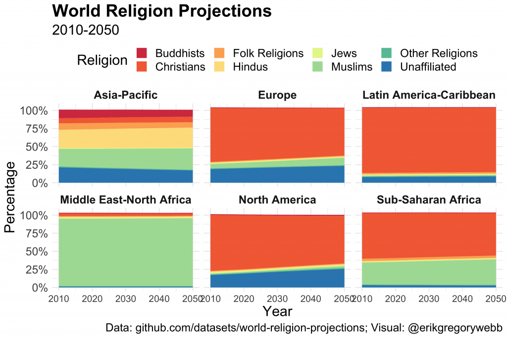
Let’s start by visualizing religious composition by region over time.
A few observations:
Asia-Pacific has the least concentrated religious mix, with a “rainbow” assortment of Hindus, Muslims, and Buddhists.
Christianity is on the decline in North American and Europe.
Simultaneously, the percentage of people reporting to be “unaffiliated” with any religion is growing in North America and Europe.
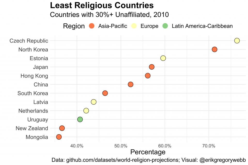
Next, let’s take a look at the least religious countries.
Any patterns of interest?
Most of the least religious countries are in Europe and Asian.
The Czech Republic tops the list with 76% unaffiliated, beating communist North Korea by a full five percentage points.
50%+ of the China, Hong Kong, and Japan population is non-religious.
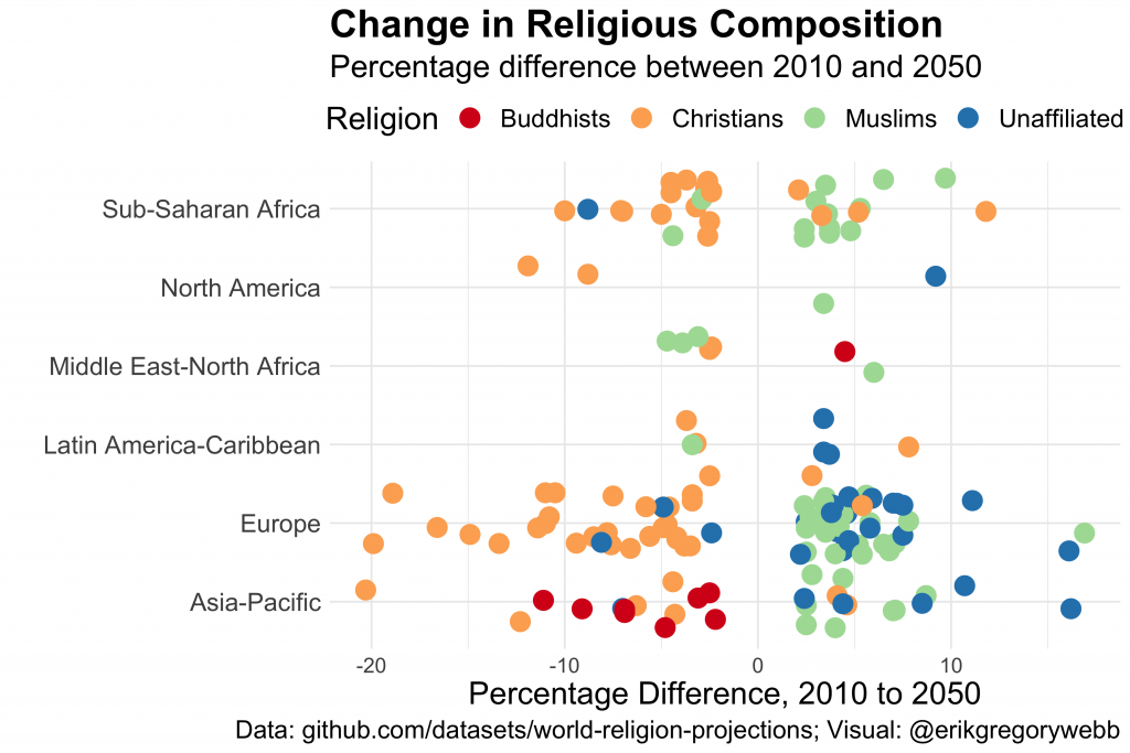
Lastly, what will change between 2010 and 2050?
For simplicity, I’ve only included differences greater or less than 2%.
Again, we see evidence of a decline in the percentage of Christians globally, although it appears to be most concentrated in Europe and Sub-Saharan Africa.
Meanwhile, a larger portion of the population in places like Europe and Asia-Pacific is expected to be Muslim or non-religious.
Conclusion
This was a good exercise in brainstorming ways to slice a seemingly simple data set in pursuit of insights. You can find the data set for your own analysis here, or find the code that produced the visuals here.
In the long run, I think cryptocurrencies will be more valuable than they are today, on average. The investment strategy consistent with that belief is to buy and hold (disclaimer below). However, considering a record of considerable volatility, could a crypto enthusiast be smarter about when to buy, in pursuit of a “bargain”?
This post outlines the process of building a simple crypto “bargain buy” alert system using Python, which sends a notification when a given cryptocurrency (BTC, XRP, ETH, etc.) appears “cheap” relative to historical prices. I use CoinAPI for current and historical cryptocurrency pricing and the Slack API for iOS and web push notifications.
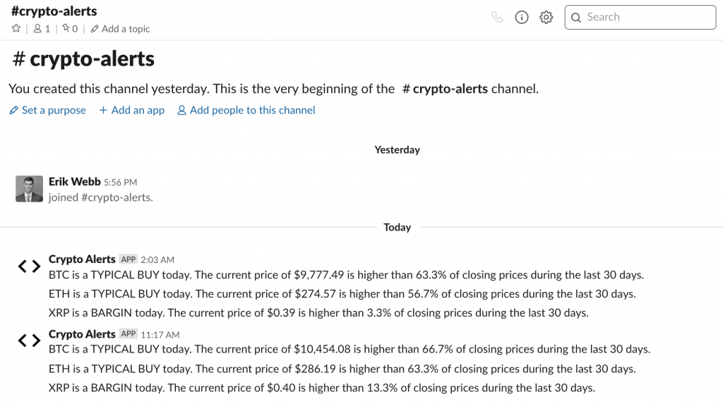
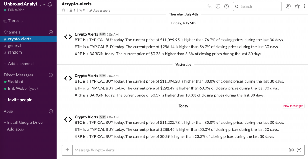
My “Crypto Alerts” Slack bot notifies me of “bargain” opportunities daily
The true focus here is not the specific strategy (i.e. determining the right time to buy) but rather, demonstrating how APIs can power the creation of new and valuable services.
I broke the alert system process into four pieces:
Retrieve the crypto’s current price (CoinAPI)
Retrieve the crypto’s historical price data (CoinAPI)
Determine if current price is a “bargain”
Summarize findings via push notification (Slack API)
CoinAPI offers a entry-tier API key with 100 free daily calls
After writing the script in Python, I deployed it to PythonAnywhere and scheduled it to run daily. With that overview in place, let’s dive in and walk through the details!
Code Walkthrough
As usual, we’ll start by bringing in the necessary libraries. We’ll use the request library to make the API calls (GET from CoinAPI and POST to the Slack API), the pandas library to organize the JSON response.
To start, we send a request to CoinAPI to retrieve the current price of the cryptocurrency, measured in USD.
To retrieve historical exchange rates, we’ll modify the URL and specify that we’d like daily values for the last 30 days. For simplicity, we can save the results into a pandas data frame.
Now that we have the current price and a historical benchmark, we can take a stab at determining if the cyrpto is a “bargain”.
My approach here is unsophisticated. If the current price is less than the 20% percentile of prices from the last 30 days, it’s considered a bargain. If it’s greater than the 80% percentile, it’s a “rip-off”.
This goes without saying, but this strategy won’t make you a Bitcoin millionaire! However, it does provide a basic alert bot framework.
When I ran this code while testing, at a price of $11,706, BTC was labeled as a rip-off. Here’s a sample of the message the bot produces:
BTC is a RIP-OFF today. The current price of $11,706.27 is higher than 83.3% of closing prices during the last 30 days.
Finally, the last piece of the alert system is to distribute the trading insight via a push notification. Luckily, this is pretty easily accomplished using the Slack API.
To leverage this free resource, I created a new domain and registered an application. This supplied the required authentication token.
Once automated through Python Anywhere, the messages look like this inside of my “crypto-alerts” channel. They are also conveniently pushed to my iPhone via the Slack mobile app.
You can find the complete script here. Thanks for reading!
Disclaimer: This content is for informational purposes only. Nothing contained here constitutes a solicitation, recommendation, endorsement, or offer to buy or sell any securities or other financial instruments (including cryptocurrencies) in this or in in any other jurisdiction.
Even though it’s been around for years, I just recently discovered Shark Tank, the show where hopeful entrepreneurs pitch business ideas to a panel of wealthy investors, or “sharks”. I usually wonder if there’s a method to the deal-making madness, especially when a pitch that resonates with me falls flat on the sharks.
In this post, I take my fandom to a deeper level by using episode descriptions from Wikipedia to understand what kinds of pitches have the highest chance of being offered a deal. In the process, I’ll use tools like web scraping, natural language processing, and API calls to gather, transform, enhance, and visual the data.
I’ve divided my workflow for this project into four steps:
Obtain episode-level descriptions via web scraping
Reshape data from episode-level to pitch-level
Enhance data by categorizing descriptions via uClassify API
Visualize key trends by season and pitch categories
“Follow the green, not the dream” – Shark & Billionaire Mark Cuban
1. Obtain episode-level descriptions via web scraping
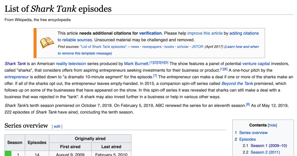
This analysis is possible because of a Wikipedia page that contains short descriptions of every pitch delivered on Shark Tank.
Wikipedia: List of Shark Tank Episodes
The first step is to extract this information via the rvest package in R, looping over each of the nine tables (corresponding to nine seasons) within the page.
Next we’ll do a bit of cleaning, simplifying column naming conventions, and adjusting the data types for the air date and viewership fields.
2. Reshape data from episode-level to pitch-level
In its current form, we won’t be able to detect any patterns with this data since the descriptions are bundled at the episode-level, like this:
“Crooked Jaw” a mixed martial arts clothing line (NO); “Lifebelt” a device that prevents the car from starting without the seat belt being fastened (NO); “A Perfect Pear” a gourmet food business (YES);
We need to “un-nest” the descriptions so that each row contains a single pitch. This is easily accomplished using the unnest function from tidyr.
Now we have a clean dataset, ready to enhance and analyze. Here’s a sample of the data structure, highlighting a few variables:
no_overall
pitch_description
deal
1
a pie company
YES
2
an implantable Bluetooth device requiring surgery to insert the device into the user's head
NO
3
an electronic hand-held device for waiting rooms
NO
4
a plastic elephant-shaped device that helps parents give small children oral medicine
YES
5
a packing and organizing service based on an already successful business called College Hunks Hauling Junk
NO
6
a mixed martial arts clothing line
NO
7
a device that prevents the car from starting without the seat belt being fastened
NO
8
a gourmet food business
YES
9
a Post-It note arm for laptops
NO
10
a musical way to teach students Shakespeare
YES
3. Enhance data by categorizing descriptions via API
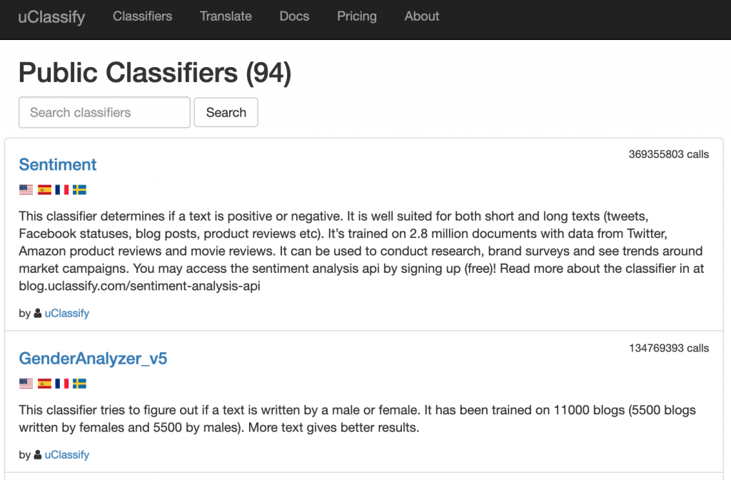
How can we systematically analyze what kind of pitches are more likely to be offered a deal when all we have is a brief text description? Rather than build my own NLP model from scratch to categorize pitches, I used uClassify, which offers “Classification as a Service” (CAAS).
Much like Google Cloud’s Natural Language API, uClassify provides on-demand NLP services via API. To categorize the Shark Tank pitches, I used the free “Topics” and “Business Topics” classifiers.
Let’s see how this was implemented in the R code:
These functions construct a URL with my personal API key, the classifier API name, and the text (pitch description) to be categorized. A GET call then returns a JSON with a list of categories and “match” scores.
For example, take pitch #803, “Thrive+”, which has this description: “capsules that reduce alcohol’s negative effects.” The category with the highest “match” score was Health, followed closely by Science. By categorizing the pitch descriptions, we’ll be more equipped to uncover some key elements of successful Shark Tank pitches.
Cheers (formally Thrive+) Landing Page
4. Visualize key trends by season and pitch categories
Now for the fun part! After compiling, cleaning, and enhancing our dataset, we’re ready to visualize and model the data. First, let’s take a look at Shark Tank’s popularity over time, measured in TV viewership (in millions).
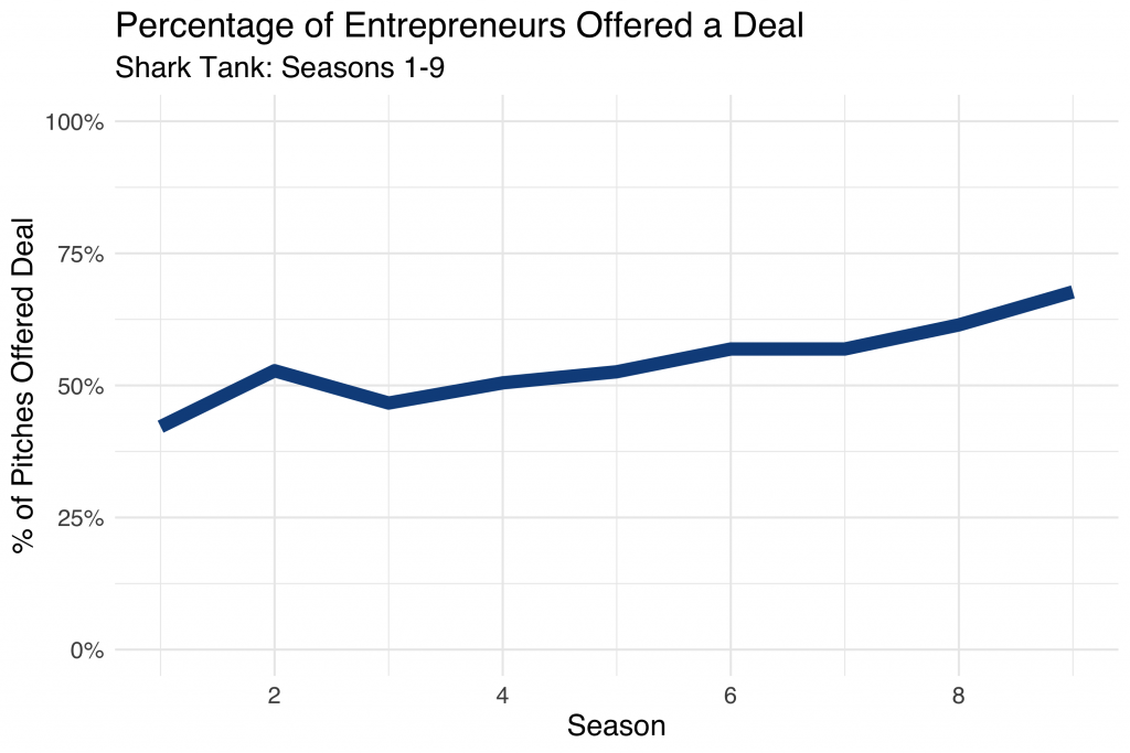
Even without the fitted line, it’s easy to see a rise and fall in popularity, with the peak around 2015 with 7.5 million viewers. Next, let’s look at how willing sharks were to make deals over the course of the show, across nine seasons:
During Season 1, less than 50% of pitches were offered a deal from the sharks. By season 9, deals were made over 65% of the time! I wonder if this had anything to do with sliding viewership.
Let’s dig a bit deeper and start looking at characteristics of successful pitches. Using the tidytext methodology, I determined which words within the pitch descriptions were most often associated with a strong response from the sharks (for better or worse).
Word
Deal
No Deal
Net
clothing
7
15
-8
portable
10
3
+7
bags
7
1
+6
cooking
7
1
+6
designed
16
10
+6
ice
1
7
-6
car
6
1
+5
cleaning
6
1
+5
hair
11
6
+5
healthy
5
0
+5
Clothing is mentioned in 22 pitch descriptions, 70% of which were unsuccessful! On the flip side, when the pitch included something “portable”, the sharks were willing to make a deal 10 out of 13 times. If you make it onto Shark Tank, don’t mention ice! For whatever reason, almost 90% of those pitches resulted in no deal with the sharks.
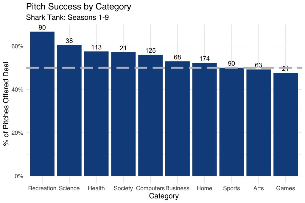
Now let’s see what else we can learn by using the categories generated from the uClassify API classifiers:
Here we summarize pitch success by category, with the total number of pitches within the category represented above each bar. The dashed grey line represents the 50% cutoff, where a pitch within a given category is equally likely to be accepted or rejected.
Notice how over 65% of deals classified as “Recreation” were offered a deal by the sharks over the course of the nine seasons. It looks like “Game” entrepreneurs didn’t snag funding quite as easily!
Conclusion
This has been a fun and quick way to explore some of the nuance in the world of Shark Tank deal-making. Truthfully, the dataset we created was pretty limited. Adding in information like which shark (or sharks) made the deal, for how much, and for what percentage of equity would add more precision compared to simply knowing if a deal was made or not.
In addition, access to full pitch transcripts (rather than simplistic descriptions of ~10 words or less) would be much more helpful in accurately classifying the pitches into meaningful categories.
You can find the complete R code here and the final dataset here, both hosted on GitHub. Thanks for reading!
StreetEasy, NYC’s leading real estate marketplace, makes some fantastic housing data freely available through its data dashboard. Among the datasets available for download is a monthly breakdown of housing inventory by borough and neighborhood over the last 8 years. In this post I’ll use the gganimate package in R to visualize the ebb and flow of rental housing availability in NYC. If the law of supply and demand holds, this should inform ideal times for apartment hunting.
Rental Inventory Over Time
Let’s first visualize the number of rental units on the market over time by borough. This is a monthly view, from January 2010 – December 2018.
Here we see StreetEasy’s growth as marketplace year over year, together with distinct seasonal variation. Let’s explore seasonality next.
Average Rental Inventory by Month
We’d expect some flavor of seasonality with real estate. In the US it’s estimated that 80% of moves occur between April and September. Let’s see if the same pattern is true in NYC.
Sure enough, we observe a “peak season” with an influx of rental units coming onto the market from May to September, although the trend is strongest in Manhattan.
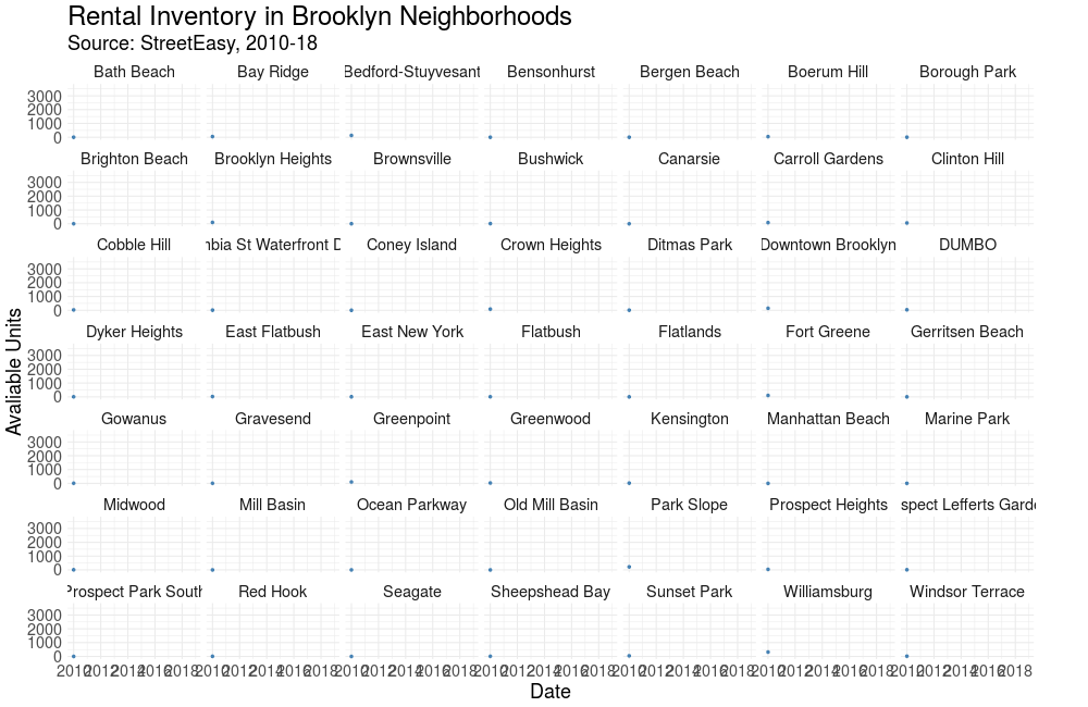
Rental Inventory in Brooklyn’s Neighborhoods
Finally, let’s visualize how housing availability has fluctuated on StreetEasy’s marketplace in each of Brooklyn’s neighborhoods over time.
Using face_wrap from ggplot2, we can easily observe the trend in each neighborhood simultaneously.
Conclusion & Appendix
Kudos to StreetEasy for making this dataset open to the public. There’s certainly more to explore and analyze in their data dashboard. Also, I find gganimate a really useful addition to any data storyteller’s toolkit, and I hope to find more opportunities to leverage this package in the future. Thanks for reading!
R Script: Link Data Source: Link [Rental Inventory]
This year my wife and I moved to New York for the start of a new job. Initially overwhelmed by the scope and pace of the NYC housing market, we were given the very generous and unexpected opportunity by a family friend to live in a house north of the city in Westchester County. Built in the early 1930s, the historic home is situated in central Scarsdale, an affluent suburban town known for high-achieving schools and extravagant real estate.
As a graduate student of historic preservation, my wife has been especially enthralled by the rich styles and architecture of the houses within the Scarsdale village limits. Naturally, we frequently discuss and analyze the homes we pass on walks and runs, her comments generally centered around history and architecture, mine on economics and valuation.
Sourcing the Data
Wishing to analyze the houses of Scarsdale in a more systematic way, I began to experiment with the Zillow API. Disappointed by both accessibility and content, I continued to search for a superior data source. Soon after, I discovered a tool developed by the Village of Scarsdale to search property information by road name and wrote a Python script to scrape the data. Curious to know if additional variables were available, I contacted the Scarsdale Village administration and was sent an Excel file with the complete set of residential properties, rich with detail and with few missing values (5,000+ rows, 100+ columns).
The dataset includes the address of each residential property, but for visualization purposes, I needed geographic coordinates (latitude, longitude). Luckily, the Google Maps API provides this exact functionality, known as geocoding. Having some experience with this API, it was simple to write a Python script to retrieve the geographic coordinates for each of the 5,000 properties.
After writing an R script to scrub the data (creating more descriptive variable names, filtering, removing duplicates), I was ready to visualize the real estate data of America’s most affluent town. You can find both the raw and cleaned datasets here.
Mapping the Data
After considering the many potential ways to map the properties, I settled on three key views: Year Built, Total Assessed Value, and Sales Date.
After some research, I discovered the folium library, which leverages the mapping strengths of the leaflet.js library within the Python ecosystem to provide Tableau-like functionally. The timing was ideal considering my free Tableau college subscription recently expired!
1. Year Built
With (a few) homes built as early as the 1600s and (some) as recently as 2018, this view shows clusters of homes built in similar time periods and paints a picture of development over time.
Here, the color spectrum plots blue for older houses and red for newer houses. Drag to interact with the map and click on a dot to view the address and year built.
Note the layers of development along the Saxon Woods Golf course border and the concentration of older homes in the Greenacres area.
In this heatmap, the brighter the dot the higher the assessed value. Clicking on a circle reveals the total assessed value for the current tax year as well as the square footage of the home.
Which neighborhoods are hot on the market? This view maps the data according to sales date, with more recent sales colored in green. No clear trend emerges here, with a fairly equal distribution across the village. Clicking on a dot reveals the latest sales date and the number of years since sale.
We’ll now dive into how these maps were created. As usual, we start by calling the necessary libraries. Beyond the essential pandas and numpy libraries, I use folium for map creation and matplotlib.cm for color assignment.
In order to visualize a feature such as assessed value or years since last sales date, I needed to be able to bucket the values and assign each bucket a color.
The function below achieves that need, allowing the user to specify the number of buckets and a color spectrum. BI software such as Tableau replicates this kind of functionality, but with superior algorithms that scale for large datasets.
Finally, below is the framework used to create each of the maps. A dot is created for each of the properties, colored according to the bucket assigned and labeled by year built, total assessed value, square footage, or sales date.
You can find the complete code to replicate these maps here and the dataset here. Thanks for reading!