Blog

Speaker Gender Ratios in LDS General Conference

This weekend was LDS General Conference, a semiannual meeting where leaders speak to church members worldwide. After following the Twitter #GeneralConference hashtag, I became interested in the frequency of women speakers during past conferences. Using Python, I scrapped 40+ years of speaker data from LDS.org to understand the speaker gender ratio trend over time. Below is the code used and a graphic illustrating my findings.

Over the past 47 years, on average, women have comprised about 10% of the speakers per conference.

You can find the GitHub gist here and the full dataset here.

Using the Google Maps API to Visualize Chase’s Presence in Utah

I’ve been a happy Chase customer since 2010. I’ve appreciated the investment in their mobile platform and was excited about the recent You Invest announcement, allowing customers to trade 100 stocks and ETFs a year for free. With 5,100+ branches and 16,000 ATMs+ nationwide, Chase has a strong national footprint.

In this post, I use Python to recreate the map below for my home state of Utah, scrapping branch and ATM information from Chase.com and obtaining geographic coordinates using the Google Maps geocoding API.

chase-footprint
Chase branches in the U.S. in 2010. Source: Wikipedia

Before going further, I’d invite you to read Chase.com’s Terms of Use as well as Roberto Rocha’s article about the ethics of web scrapping. To avoid excessive server demands (although an unlikely issue for Chase), we’ll explicitly space out requests, made easy with Python’s time sleep method.

Scrapping Branch & ATM Information with Selenium

As usual, we’ll begin by calling the necessary libraries.

Next, we need to pass the driver a URL. Here I’ve used the Utah URL. This could easily be adapted to other states by changing the last two letters of the link.

Also note the executable path, which is pointed to the directory where my ChromeDriver is located. You can download the driver here.

When this code finishes running, the “locations” list contains location names, such as the following Utah cities:

We then convert these locations into Chase.com URLs.

The links now look like this:

The function below represents the process of scrapping the data for each location.

We’ll apply the function to each location URL to extract the corresponding branch and ATM information.

Finally, we’ll clean the information we’ve scrapped and organize it into tidy columns.

Here a sample of what the final dataset looks like:

LocationAddressType
Bountiful510 S 200 W Bountiful, UT 84010Branch
Farmington Station Park100 N Station Pkwy Farmington, UT 84025Branch
Brigham Young University800 E Campus Dr Provo, UT 84602ATM
Fashion Place6255 S State St Murray, UT 84107Branch

Geocoding Branch Address via Google Maps API

Per Google’s Get Started article, geocoding is the process of converting addresses into geographic coordinates, like latitude and longitude. Once we have a longitude and latitude combination, we can plot the branch and ATM locations on a map using Tableau or R.

Here is the Python code used to accomplish the geocoding:

Please note that you’d need to insert your own Google Cloud API key to make the code run. Finally, let’s visualize some of the data points with R!

Here’s the code to create this visualization:

You can view the data here and the complete code here. Thanks for reading!

Analyzing Drake’s Catalog Using Spotify’s API

I’ve been a Drake fan since 2009 when I first heard “Best I Ever Had” from So Far Gone. Over the last decade, I’ve watched Drake transform into a global rap and pop superstar. This weekend I saw Drake live in Brooklyn as part of the Aubrey & the Three Migos tour. What better way to celebrate than by analyzing his catalog using Spotify’s API? I’ve broken the celebration into two parts, getting the data and analyzing the data. Click here if you’d rather skip the code and jump into the analysis.

Getting the Data

In this post, I use Spotipy, “a lightweight Python library for the Spotify Web API”. Let’s start by calling the necessary libraries.

Next, we need to authenticate and connect to the API. To do so, we need a “client id” and “client secret”. To obtain them, visit the Spotify Developer Dashboard here and create an application. In the code snippet below, replace the client id and client secret variables with your own.

There are a few potential ways to create a dataset of Drake’s catalog. We could have first obtained a list of the artist’s albums and then looped through each album track. Instead, I used a playlist by ‘100 percent’ which claims to have, “all of Drake, all in one place.” This collection of 219 songs (15+ hours) contains “every appearance currently on Spotify updated with each new release.” Great! We’ll now write a function to retrieve the ids for each track of this playlist.

With the list of track ids, we can now loop over each id and obtain track information such as track name, album, release date, length, and popularity. More importantly, Spotify’s API allows us to extract a number of “audio features” such as danceability, energy, instrumentalness, and tempo. Without going into how these measures are determined, we’ll use them to understand how Drake’s style has evolved over time.

We’ll now loop over the tracks, applying the function, and save the dataset to a .csv file.

Here’s what the raw dataset looks like:

You can find the complete script to obtain this data here or download the dataset here.

Analyzing the Data

Let’s quickly clean a few variables in preparation for analysis. We’ll first convert the song length from milliseconds to minutes. Second, since the artist field captured the principal song artist, let’s create a boolean variable called “feature” which indicates whether or not Drake is the principal artist. Let’s also create a “year” variable using the release date for easy aggregation and grouping. Finally, we’ll reference the Drake discography Wikipedia page to create a “type” variable to distinguish between singles, extended plays (EP), mixtapes, studio albums, and feature tracks.

And now for some analysis. To begin, I’ve embedded a Tableau worksheet below which provides an overview of each Drake song for four core measurements:  danceability, energy, speechiness, and tempo.

This worksheet allows you to filter by type and to highlight a track within that type. I’d recommend clicking on the “expand” symbol in the lower right-hand corner for a better look.

A quick description of these four audio features, from the Spotify API Endpoint Reference:

Danceability: Describes how suitable a track is for dancing based on a combination of musical elements including tempo, rhythm stability, beat strength, and overall regularity. A value of 0.0 is least danceable and 1.0 is most danceable.

Energy: A measure from 0.0 to 1.0 and represents a perceptual measure of intensity and activity. Typically, energetic tracks feel fast, loud, and noisy. For example, death metal has high energy, while a Bach prelude scores low on the scale.

Speechiness: Detects the presence of spoken words in a track. The more exclusively speech-like the recording (talk show, audiobook, poetry), the closer to 1.0 the attribute value. Values between 0.33 and 0.66 describe tracks that may contain both music and speech, either in sections or layered, including such cases as rap music.

Tempo: The overall estimated tempo of a track in beats per minute (BPM).

Tracks Over Time

With those definitions clarified, let’s move onto a few visualizations. We’ll start with the number of tracks over time.

In this chart, we see that Drake has provided fans a fairly constant stream of new jams since 2008. In 2012 and 2014, Drake only jumped onto other artists’ song, releasing none of his own. In 2015, Drake blessed us with a doubleheader: If You’re Reading This It’s Too Late and What a Time to Be Alive plus additional singles and features for a total of 34 songs.

This can be seen more clearly in the next chart:

tracks-over-time-type

Track Length

I recently read a Pitchfork article (highly recommended, great visualizations) that analyzed the length of hip-hop records over the last 30 years. Drake is notorious for long albums, with his latest double-sided project coming in just under 90 minutes. Keeping in mind that there may be a strategic, streaming-oriented purpose, let’s take a look at how both album length and song length have trended over time.

The answer to the question posed in that Pitchfork article, “Are Rap Albums Really Getting Longer?” is abundantly clear here, at least in Drake’s case. His five studio albums have each progressively become longer. Some might call this a blessing, others a curse. What about average track length?

While Drake’s albums appear to be getting longer, his songs are, on average, getting shorter. Over the past decade, average song length has decreased more than a minute, from 4.8 minutes in 2008 to 3.6 minutes in 2018. Maybe this is another effect of the transition to streaming, as music streaming is now the industry’s biggest revenue source.

Danceability & Energy

It’s pretty common for artists to “go pop” on the road to wider reach and popularity. Measuring the danceability metric for Drake’s songs over time might be a good way to test for a shift towards pop appeal. Shown below is average danceability and energy over time.

There’s a pretty clear upward trend in danceability, with a simultaneous decline in energy.

This holds true when we separate songs Drake is featured on versus his own, but his more pronounced on featured songs.

Top Collaborators

Finally, who does Drake like to work with? Here we measure the number of features by artist.

top-collaborators

The top three artists are all current or former Young Money acts. Beyond that, it’s clear Drake has worked with artists across a large spectrum of rap and R&B artists, from Rick Ross to Jaime Foxx.

Conclusion

APIs can be a great source of unique and interesting datasets. In addition to the information presented here, I’d be interested in expanding the dataset to include song recording location, principal producer, lyrical content, and the number of streams the track has obtained.

You can find the full, interactive version of the Tableau charts here and the dataset here.

Uncovering Insights via Google Sheets Query

The Google Sheets query function brings some of the power of SQL to spreadsheets. I recently discovered the power of this tool when building some personal finance dashboards. In this post, I’ll walk through three examples of the query function to explore a CrunchBase dataset of startup companies, which I found on Tableau’s resource page. To learn the basics of this function I’d recommend reading one of the following articles:

The CrunchBase dataset contains information about 49,000+ startups including the startup name, website, market, status, funding, and location. The most recent funding in this dataset occurred in early 2015. The data, as well as the query examples below, can be found in this Google Sheet.

Note: The query statement is formed using column letters. If I want to reference the “market” column I would refer to it as “E”, as shown below.

With that in mind, here’s a list of the variables we have to work with and their corresponding column letter in the Google Sheet.

  • A: permalink
  • B: name
  • C: homepage_url
  • D: category_list
  • E: market
  • F: status
  • G: funding_total_usd
  • H: country_code
  • I: state_code
  • J: region
  • K: city
  • L: funding_rounds
  • M: founded_at
  • N: founded_month
  • O: founded_quarter
  • P: founded_year
  • Q: first_funding_at
  • R: last_funding_at
  • S: time_to_funding

In the examples below I’ll share the query, a visualization, and a brief explanation. Let’s jump into it!

1. Number of Startups by State

select I, count(A) where (H = 'USA' and I <> '') group by I order by count(A) desc label I 'State', count(A) 'Number of Startups'

As expected, California is home to by far the largest number of startups. New York trails in distant second with less than a third as many startups as California.

2. Number of CA & NY Startups Over Time

select P, count(P) where ((I = 'NY' or I = 'CA') and P > 1989 and P < 2014) group by P pivot I label P 'Year'

Has California always held the lead over New York? This query allows us to compare the number of startups founded overtime in the two states.

It appears that California has been in the lead for some time!

3. Total Funding by Market

select E, sum(G), count(G) where E <> '' group by E order by sum(G) desc label E 'Market', sum(G) 'Total Funding', count(G) 'Number of Startups'

Pro-tip for aspiring entrepreneurs: consider Biotechnology! With a staggering total of 73+ billion in funding, this market is by far the largest in this dataset.

There’s so much more to dig into with this dataset. What other things would you explore? How would you translate them into a query?

The Hunt for Housing in NYC: A Data-Driven Approach

This summer my wife and I relocated to New York City in preparation for the start of my new job. Housing in Manhattan and the surrounding boroughs is notoriously expensive, so I decided to pursue a data-driven approach to our apartment search. I wrote a Python script to scrape 9,000+ apartment listings on Craigslist for zip codes in the five boroughs: Manhattan, Bronx, Brooklyn, Queens, and Staten Island. I then visualized the median rent by zip code in Tablaeu. Check out the dashboard here!

Gathering the Data

Before digging into some housing insights, let’s walk through the process used to obtain the data. First, I obtained data about the organization of New York City’s boroughs, neighborhoods, and zip codes from a New York State Department of Health website. I then leveraged the structure of Craigslists’s URLs to construct a vector of links to search for apartments in each of the zip codes. Here’s what the URL to search for apartments with the zip code 10453 looks like:

https://newyork.craigslist.org/search/aap?postal=10453

Let’s see what that looks like in code.

The ‘nyc-zip-codes.csv’ file referenced above can be found here. Next, I wrote a function to extract the pertinent information from each listing from each of these links. I extracted the listing title, posting date, monthly rent, and the number of bedrooms, when available.

This is what the function returns when fed the sample link for zip code 10453.

At this point, we just need a way to loop through each zip code and compile the data the function returns.

After cleaning the data and removing duplicates, we have about 9,400 listings to work with.

Analyzing the Data

Let’s start with the big picture and then zoom in. Below we have the median rental price of listings by borough. Manhattan is by far the most expensive place to live, followed in distant second by Brooklyn. Queens, Staten Island, and the Bronx are actually somewhat comparable, with median rent in Queens only $250 higher than median rent in the Bronx.

How does rent vary in the five boroughs by the number of bedrooms the unit has? Filtering the data to include only units with 1 to 4 bedrooms, Manhattan is still the most expensive for each number of bedrooms.


Note that the bracketed, italicized numbers above show the number of listings for each borough and bedroom combination.

My wife and I had hoped to find a 2-bedroom apartment in a safe neighborhood with a 30-minute commute to Midtown for $2,000 or less. But, as you can see in the image below depicting median 2-bedroom rent by zip code in Queens, that may be a tough find!

Now, what else would I have liked to add to this analysis? Since one major consideration in the hunt for housing is commute time, how about a distance-adjusted median rental price metric for each zip code? This is something I’ll tackle in a future post.

Conclusion

Ultimately, my wife and I found housing in Scarsdale through a family friend and didn’t end up living in any of the five boroughs! Luckily, by feeding the script a different set of zip codes and modifying the Craigslist URL structure, I’ll be able to replicate this data-driven process in future apartment searches.

Find the complete code here, hosted as a Gist on GitHub.

Check out my other data projects here.

Complete Python Selenium Web Scraping Example

Introduction

I recently listed a couple of items for sale on a Craigslist-like site called KSL Classifieds. It’s a rich marketplace to buy and sell almost anything. This is what a listing looks like:

ad-example

I instinctively started thinking about how to collect information about listings in this marketplace in a systematic way.  Why might this kind of autotomized data collection be valuable? Here are two possible use cases:

  • Listing optimization. We could analyze how features of a listing (number of pictures, description length, listing category/subcategory, etc.) are related to outcomes such as the number of views, if the item is “favorited” by users, or whether or not the item was sold. This kind of data-driven listing optimization could drive sales for sellers.
  • Automated Item Search. There’s value for buyers as well. Suppose I’m looking for something specific, like a wakeboard for family boating outings. I could easily automate a script to scrape all wakeboard listings daily and send me the information via email, simplifying the search process.

Walkthrough

Let’s jump into the walkthrough. At a high level, we know we want our web scraping script to take a KSL Classified URL as input and output a CSV containing neatly-arranged data from each listing. Here’s what the starting page might look like:

search-example

Given this page, we need to find all the links to listings, navigate to each listing page, and then extract the desired information. Each listing contains the following features:

  • Title
  • Location (City, State)
  • Time Posted
  • Price
  • Number of Views
  • Number of Favorites
  • Description
  • Seller Information

With that as background, let’s get into the code. We’ll start by calling the libraries.

Next, we’ll write a function to extract all the listing links from a search result page like the one above.

Note that I’m using “ChromeDriver”. It can be downloaded here. Below is what the output of our function looks like. We now have a vector of links to specific listings.

get-listing-links-exampleNow we need to iterate through each of these listings and extract the desired information. Below is a function called getListingContent() which takes a listing link and return the title, location, time since listing posting, price, views, favorites, description, seller, and the listing URL.

Again, here’s what the output of this function would look like:

get-listing-content-example

Pretty slick eh? Now let’s combine these two functions!

Here we’re only going to loop through the first ten of the listing links gathered by getListingLinks(). After the loop, we’ll neatly arrange the extracted data into a Pandas DataFrame.

get-listings-example

To finish things off, we’ll clean the data. This includes reformatting the “price” variable and changing “views” and “favorites” from strings to numbers.

Finally, let’s tie it all together with the main() function:

Nice work! We can now pass a link to main() and it will generate a tidy CSV file with information about the listing from that page. You can find the complete scraper code here. Below are some resources that proved helpful to me in creating this example:

Credit Card Advice

David Robinson, Chief Data Scientist at DataCamp, once tweeted:

When you’ve written the same code 3 times, write a function. When you’ve given the same advice 3 times, write a blog post.

I’ve recently given advice to a few family members about selecting a credit card so, in the spirit of David’s tweet, I’ve compiled some tips and information about credit cards.

Tips

1. To establish good credit, treat your credit card like a debit card. In other words, it’s good practice to only spend money on the card you know you have in your bank account. Paying off the card balance once (or more) per period is an important factor in establishing a high credit score.

2. Another important factor is the percent utilization of your credit limit. Your first card may have a credit limit of $1,000-2,000 but you should never get close to that limit. In fact, it’s recommended you only use 10-20% of your credit limit at a time. If you have a $1,000 credit limit, spend $150 on the card, pay it off with money from your bank account, and repeat.

3. Compare the rewards each card offers. Since I treat my credit cards like a debit card the only reason I use them is to (1) establish good credit and (2) earn rewards. The rewards can take many forms (cash back, points, miles, etc.) and are earned differently for different purchases (ex. 1% cash back on groceries, 3% cash back on gas) so it’s worth it to carefully compare the offerings.

4. Almost all credit card providers now offer a free way to monitor your credit score. It’s a good idea to check your credit score about once a quarter. That way once you need serious credit (to buy a car or home) you won’t have any surprises or find out that someone has taken loans in your name and ruined your credit.

My Cards

Discover [Link]

My wife and I both have a Discover card. It was a great card to start with because it was specifically targeted to college students with little to no income. We each had a credit line of $1,000. This card gives us unlimited 1% cash back on all purchases. I also got $20 each semester for good grades. To date, I think we’ve earned about $100 with cash back.

American Express [Link]
This was the second card I got. They offered more credit (about $10,000) and use a point system rather than cash back. There’s also a 20% “extra points benefit” if you exceed a certain number of transactions in a cycle.

Capital One “Venture” [Link]
This is our most recent card and the one who use for everything now. Since we are now interested in finding a way to pay for travel home, we wanted a card that offers good travel rewards. We get 2 miles for every dollar spent and earned 50,000 miles for spending $3,000 in the first three months. The link above takes you to page with more information about the card.

What cards do you use? What advice do you have about using credit wisely?

Interactive Investment Tool with R Shiny

R Shiny is a fantastic framework to quickly develop and launch interactive data applications. I recently wrote some investing advice and was looking for a way to illustrate two case studies. Building on an RStudio template, I created a tool to visualize the return of an investment over time, allowing the user to modify each parameter and observe its effect:

Click here for the full-page (non-embedded) version.

Find the full code here or below:

library(FinCal)
library(ggplot2)
library(tidyr)
library(shinythemes)
library(scales)

# Define UI for application that draws a histogram
ui <- shinyUI(fluidPage(theme = shinytheme("spacelab"),
  # Application title
  titlePanel("The Potential for Growth: Two Case Studies"),
  p('An interactive tool to accompany the ', a(href = 'https://unboxed-analytics.com/life-hacking/fundamentals-of-investing/', '"Fundamentals of Investing"'), 'post.'),
  
  # Sidebar with a slider input for number of bins
  sidebarLayout(
    sidebarPanel(
      numericInput(
        inputId = "rate",
        label = "Yearly Rate of Return",
        value = .06,
        min = .01,
        max = .15,
        step = .01
      ),
      p("Represented as a decimal."),
      p(".06 = 6%"),
      numericInput(
        inputId = "years",
        label = "Number of Years",
        value = 43,
        min = 3,
        max = 50,
        step = 1
      ),
      numericInput(
        inputId = "pv",
        label = "Initial Outlay",
        value = 2000,
        min = 1000,
        max = 100000,
        step = 1000.
      ),
      numericInput(
        inputId = "pmt",
        label = "Monthly Contribution",
        value = 0,
        min = 0,
        max = 10000,
        step = 100
      ),
      numericInput(
        inputId = "type",
        label = "Payment Type",
        value = 0,
        min = 0,
        max = 1,
        step = 1
      ),
      p("Indicates if payments occur at the end of each period (Payment Type = 0) or if payments occur at the beginning of each period (Payment Type = 1).")
      ),
    
    mainPanel(plotOutput("finPlot"),
              p("The grey line represents PRINCIPAL and the blue line represents PRINCIPAL + INTEREST."),
              p("Case 1: Suppose you have $2,000 to invest. You use that money to purchase a low-cost, tax-efficient, diversified mutual fund offering an approximate yearly return of 6%."),
              p("You purchase the mutual fund on your 22nd birthday and don’t check your account until your 65th birthday on the day of retirement. After 43 years, you would have over $26,200! Your money has doubled four times."),
              p("Case 2: Suppose again you have $2,000 today to invest. You purchase shares of the same mutual and now, in addition to the initial investment, purchase $100 of additional shares each month. [Adjust the 'Monthly Contribution' sidebar parameter]"),
              p("How much would you have at the end of 43 years? Over $268,400! You have passively created wealth through the market."))
  )
))

# Define server logic required to draw a histogram
server <- shinyServer(function(input, output) {
  output$finPlot <- renderPlot({

    # processing
    total <- fv(r = input$rate/12, n = 0:(12*input$years), pv = -input$pv, pmt = -input$pmt, type = input$type)
    principal <- seq(input$pv, input$pv + (input$years*12)*(input$pmt+.000000001), input$pmt + .000000001)
    interest <- total - principal
    df <- data.frame(period = 0:(12*input$years), total, principal)
    
    # plotting
    ggplot(df, aes(x = period)) + 
      geom_line(aes(y = total), col = "blue", size = .85) +
      geom_line(aes(y = principal), col = "black", size = .85) +
      labs(x = "Period",
           y = "") + 
      scale_y_continuous(labels = dollar) +
      theme(legend.position="bottom") +
      theme(legend.title = element_blank()) +
      theme_minimal()
  })
})

# Run the application
shinyApp(ui = ui, server = server)

Fundamentals of Investing

The Potential for Growth: Two Case Studies

Suppose you have $2,000 today to invest. You use that money to purchase a low-cost, tax-efficient, diversified mutual fund offering a yearly return of 6%.  You purchase the mutual fund on your 22nd birthday and don’t check your account until your 65th birthday on the day of retirement.  After 43 years, you would have over $26,200! Your money has doubled four times.

case-study-1

Now suppose you again have $2,000 to invest. You purchase shares of the same mutual fund. Now, in addition to the initial investment, you purchase $100 of additional shares each month. How much would you have at the end of 43 years? Over $268,400! You have passively created wealth through the market.

Check out this interactive tool for a visual representation of these two cases.

Vision & Goals

Investing is not an end in itself; it is a means of reaching your financial and personal goals. The most common investing goal is saving for a comfortable retirement. You can invest for other goals too: a home down-payment, children’s college, travel, future medical care, or a car.

budget

My personal vision to have enough saved and invested by the age of 45 to have a monthly income of $6,000 from my investments. It won’t come easy: I’ll need to have saved and invested $1,139,000 by then!

Before You Invest

Before you start pouring money into any investment, step back and make sure the rest of your financial life is in order.

First, reduce or eliminate debt. Does it make sense to earn 6% annually on an investment when you pay 24% annually for credit cards or other forms of debt? Second, create an emergency fund worth 3-6 months of expenses. Unexpected events can be stressful and costly. Emergencies take many shapes and sizes such as job loss, medical or dental emergency, unexpected home repairs, or car troubles.

Big Picture

There’s so much investing advice on the internet that it can be hard to condense it all into a few core principles.

The following phrase encapsulates my investing philosophy and serves as a reminder of four fundamentals of investing:

I will pursue low-cost, tax-efficient investments that form a diversified, long-term portfolio.

1. Low-Cost: The Expense Ratio

The cost of an investment largely depends on whether it’s actively or passively managed. Some people are willing to pay a financial advisor an expense ratio of 1-3% to actively manage their investments. Passively managed funds, like index funds that are determined by a computer, are much cheaper.  Look for funds (investments) with expenses ratios in the range of .1 to .3%. This means you’re paying between $1 and $3 for every $1,000 invested. Don’t let your returns be eaten up by fees!

2. Tax-Efficient: Roth vs. Traditional IRA

Tax breaks are a way for the government to incentivize “desirable” behavior. For example, the IRS will let you deduct mortgage loan interest when filing taxes because they’d like to reward home ownership. Because the government also wants you to save for retirement, there are “tax-sheltered” investment vehicles that reward you for saving.

While there are many types of investment vehicles, two kinds to be aware of are the Roth and Traditional IRA (Individual Retirement Account). The image below shows the key difference between the two:

The questions becomes, which is best for me? I use a Roth IRA because I anticipate having a low marginal tax rate when I’m young (when I’m relatively poor) and a high marginal tax rate when I retire (when I hope to be more wealthy).  Another diagram for clarification:


3. Diversified: Asset Classes

Diversification is your best defense against risk. To be diversified you should invest in different companies, industries, and perhaps even countries that won’t be subject to the same economic factors or risks. This is easily achieved by purchasing a mutual fund that consists of hundreds of companies!

It’s good to be aware that there are several broad categories of assets: cash (and cash equivalents), bonds, and stocks. Diversification usually involves investing in some assets from each category.

4. Long-Term: Passive Approach

Invest for the long run; use a buy-and-hold strategy! There are no “get-rich-quick” schemes that work. Avoid short-term trading. Short-term trading is expensive and incurs transaction costs and taxes. Plan for a time-horizon of 40+ years. Dips and fluctuations in the market will even out over time.

Remember: I will pursue low-cost, tax-efficient investments that form a diversified, long-term portfolio.

Specific Fund Suggestion

To conclude, here’s a specific example of what to look for when considering an investment. VTTSX is a Vanguard mutual fund with a low expense ratio that automatically adjusts asset allocation as you approach retirement. With 42 years until 2060, this fund is currently mostly made up of stocks, which have higher risk but offer a greater return. As the target date approaches, the fund will swap stocks for bonds to lower the overall risk. The only downside of this fund is the minimum investment threshold, which is $1,000.

Key Terms to Understand

Investing: the act of committing money to an endeavor (a business, project, real estate, etc.) with the expectation of obtaining an additional income or profit. Investing refers to long-term commitment, as opposed to trading or speculating, which are short-term; it is not a get-rich-quick scheme. You can make an investment at a bank, broker, or insurance company.

Asset: A resource with economic value. There are many kinds of assets. Some examples: shares of Apple stock, a US Treasury Bill, a foreign currency such as the Peso, or Coca Cola’s Coke formula, or a mall parking lot.

Asset Class: Categories of assets (investments) that are similar in risk, volatility, and return. The major asset classes are cash and cash equivalents, fixed income (bonds), and equities (stocks). Successful investing largely depends on asset class, rather than asset, selection.

Portfolio: The collection of assets held by an investor. For example, suppose an investor owns $250 worth of US T-bills and $750 worth of Google stock. We would say that this investors portfolio contains 25% bonds and 75% stocks.

Diversification: Investors reduce risk by building a portfolio with different asset classes. For example, rather than buying only stocks, wise investors will also purchase bonds, which tend to perform well when stocks perform poorly.

Return: Different types of investments post different rates of returns. Investments make a return by providing the investor interest, dividends, or capital gains. Returns are the gain or loss generated on an investment and are usually expressed as a percentage. A typical annual return on a moderately aggressive portfolio might range from 7-9%.

Expense Ratio: Institutions (banks, brokers) charge a fee for you to invest. The expense ratio represents the percentage of assets deducted each fiscal year for fund expenses. For example, one Vanguard Mutual fund has an expense ratio of 0.15%. This means It costs $1.5 to invest $1,000.

Mutual Fund: Mutual funds give small investors access to professionally managed portfolios of equities, bonds and other securities. Mutual funds are a great choice for early investors.

Disclaimer: This information is intended for an audience of emerging investors and does not constitute professional advice.

Analyzing iPhone Usage Data in R

I’m constantly thinking about how to capture and analyze data from day-to-day life. One data source I’ve written about previously is Moment, an iPhone app that tracks screen time and phone pickups. Under the advanced settings, the app offers data export (via JSON file) for nerds like me.

Here we’ll step through a basic analysis of my usage data using R. To replicate this analysis with your own data, fork this code and point the directory to your ‘moment.json’ file.

Cleaning + Feature Engineering

We’ll start by calling the “rjson” library and bringing in the JSON file.

library("rjson")
json_file = "/Users/erikgregorywebb/Downloads/moment.json"
json_data <- fromJSON(file=json_file)

Because of the structure of the file, we need to “unlist” each day and then combine them into a single data frame. We’ll then add column names and ensure the variables are of the correct data type and format.

df <- lapply(json_data, function(days) # Loop through each "day"
{data.frame(matrix(unlist(days), ncol=3, byrow=T))})

# Connect the list of dataframes together in one single dataframe
moment <- do.call(rbind, df)

# Add column names, remove row names
colnames(moment) <- c("minuteCount", "pickupCount", "Date")
rownames(moment) <- NULL

# Correctly format variables
moment$minuteCount <- as.numeric(as.character(moment$minuteCount))
moment$pickupCount <- as.numeric(as.character(moment$pickupCount))
moment$Date <- substr(moment$Date, 0, 10)
moment$Date <- as.Date(moment$Date, "%Y-%m-%d")

Let’s create a feature to enrich our analysis later on. A base function in R called “weekdays” quickly extracts the weekday, month or quarter of a date object.

moment$DOW <- weekdays(moment$Date)
moment$DOW <- as.factor(moment$DOW)

With the data cleaning and feature engineering complete, the data frame looks like this:

Minute CountPickup CountDateDOW
131542018-06-16Saturday
53462018-06-15Friday
195642018-06-14Thursday
91522018-06-13Wednesday

For clarity, the minute count refers to the number of minutes of “screen time.” If the screen is off, Moment doesn’t count listening to music or talking on the phone. What about a pickup? Moment’s FAQs define a pickup as each separate time you turn on your phone screen. For example, if you pull your phone out of your pocket, respond to a text, then put it back, that counts as one pickup.

With those feature definitions clarified, let’s move to the fun part: visualization and modeling!

Visualization

I think good questions bring out the best visualizations so let’s start by thinking of some questions we can answer about my iPhone usage:

  1. What do the distributions of minutes and pickups look like?
  2. How does the number of minutes and pickups trend over time?
  3. What’s the relationship between minutes and pickups?
  4. Does the average number of minutes and pickups vary by weekday?

Let’s start with the first question, arranging the two distributions side by side.

g1 <- ggplot(moment, aes(x = minuteCount)) +
  geom_density(alpha=.2, fill="blue") +
  labs(title = "Screen Time Minutes",
       x = "Minutes",
       y = "Density") +
  theme_minimal() + 
  theme(plot.title = element_text(hjust = 0.5))

g2 <- ggplot(moment, aes(x = pickupCount)) +
  geom_density(alpha=.2, fill="red") +
  labs(title = "Phone Pickups",
       x = "Pickups",
       y = "Density") +
  theme_minimal() + 
  theme(plot.title = element_text(hjust = 0.5))

grid.arrange(g1, g2, ncol=2)

On average, it looks like I spend about 120 minutes (2 hours) on my phone with about 50 pickups. Check out that screen time minutes outlier; I can’t remember spending 500+ minutes (8 hours) on my phone!

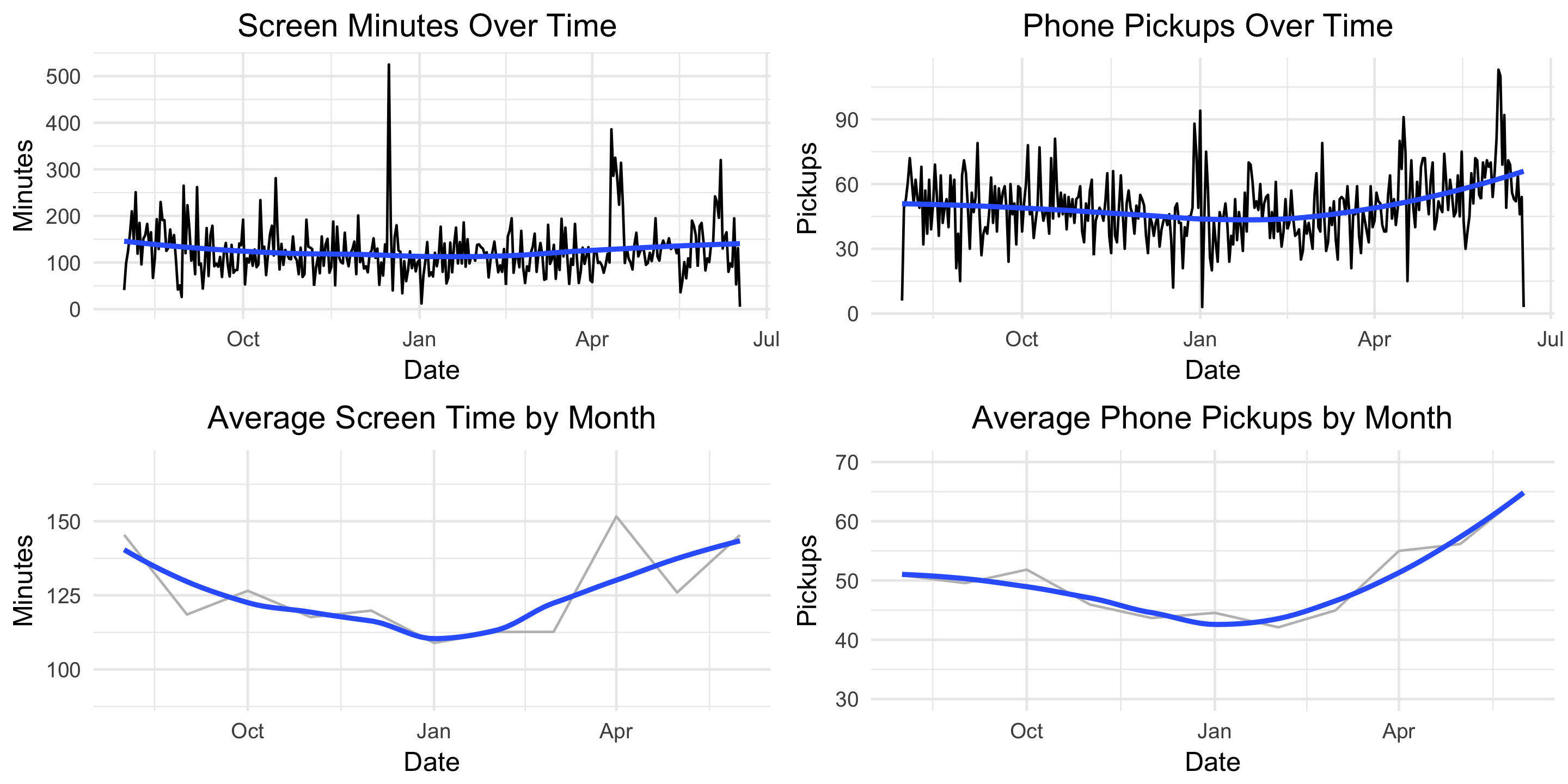
Next, how does my usage trend over time?

g4 <- ggplot(moment, aes(x = Date, y = minuteCount)) +
  geom_line() +
  geom_smooth(se = FALSE) +
  labs(title = "Screen Minutes Over Time ",
       x = "Date",
       y = "Minutes") +
  theme_minimal() +
  theme(plot.title = element_text(hjust = 0.5))

g5 <- ggplot(moment, aes(x = Date, y = pickupCount)) +
  geom_line() +
  geom_smooth(se = FALSE) +
  labs(title = "Phone Pickups Over Time ",
       x = "Date",
       y = "Pickups") +
  theme_minimal() +
  theme(plot.title = element_text(hjust = 0.5))

grid.arrange(g4, g5, nrow=2)

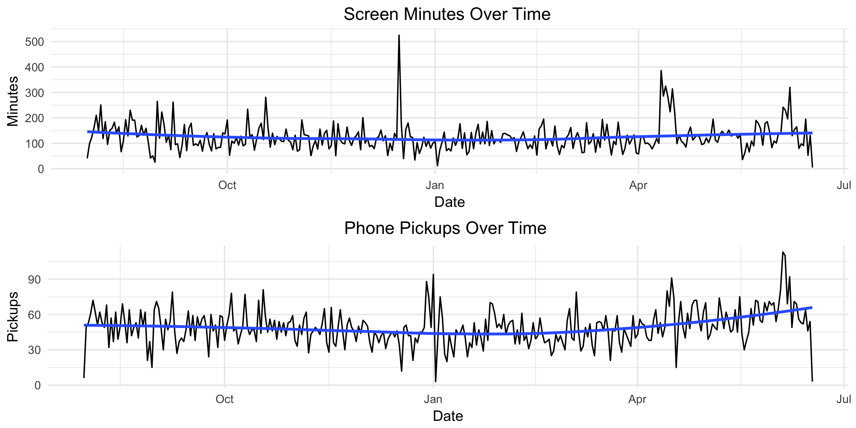
Screen time appears fairly constant over time but there’s an upward trend in the number of pickups starting in late March. Let’s remove some of the noise and plot these two metrics by month.

moment$monyr <- as.factor(paste(format(moment$Date, "%Y"), format(moment$Date, "%m"), "01", sep = "-"))

bymonth <- moment %>%
  group_by(monyr) %>%
  summarise(avg_minute = mean(minuteCount),
            avg_pickup = mean(pickupCount)) %>%
  filter(avg_minute > 50) %>% # used to remove the outlier for July 2017
  arrange(monyr)

bymonth$monyr <- as.Date(as.character(bymonth$monyr), "%Y-%m-%d")
g7 <- ggplot(bymonth, aes(x = monyr, y = avg_minute)) + 
  geom_line(col = "grey") + 
  geom_smooth(se = FALSE) + 
  ylim(90, 170) + 
  labs(title = "Average Screen Time by Month",
       x = "Date",
       y = "Minutes") +
  theme_minimal() +
  theme(plot.title = element_text(hjust = 0.5))

g8 <- ggplot(bymonth, aes(x = monyr, y = avg_pickup)) + 
  geom_line(col = "grey") + 
  geom_smooth(se = FALSE) + 
  ylim(30, 70) + 
  labs(title = "Average Phone Pickups by Month",
       x = "Date",
       y = "Pickups") +
  theme_minimal() +
  theme(plot.title = element_text(hjust = 0.5))

grid.arrange(g7, g8, nrow=2)

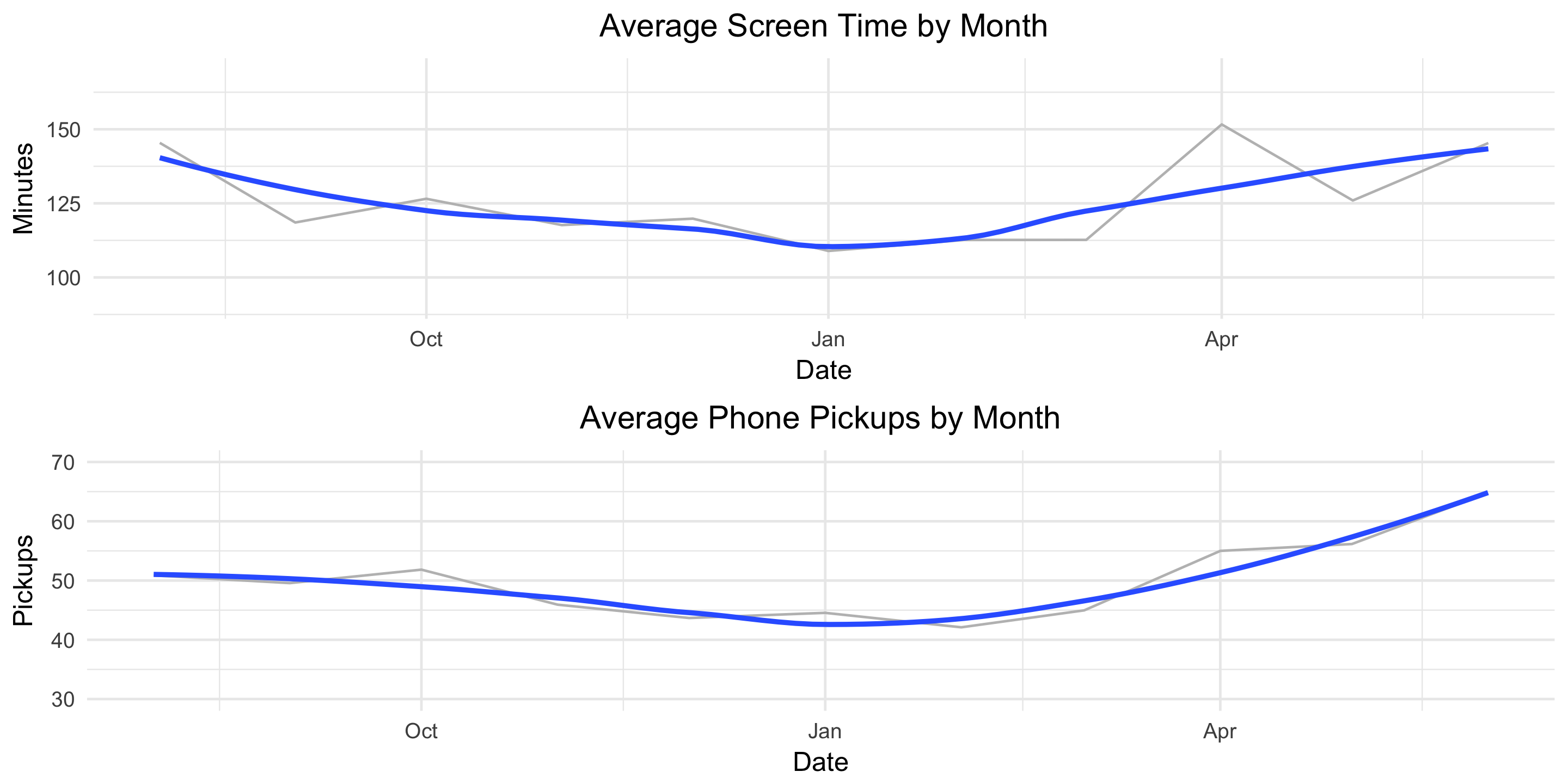
This helps the true pattern emerge. The average values are plotted in light grey and overlayed with a blue, smoothed line. Here we see a clear decline in both screen-time minutes and pickups from August until January and then a clear increase from January until June.

Finally, let’s see how our usage metrics vary by day of the week. We might suspect some variation since my weekday and weekend schedules are different.

byDOW <- moment %>%
  group_by(DOW) %>%
  summarise(avg_minute = mean(minuteCount),
            avg_pickup = mean(pickupCount)) %>%
  arrange(desc(avg_minute))

g10 <- ggplot(byDOW, aes(x = reorder(DOW, -avg_minute), y = avg_minute)) + 
  geom_bar(stat = "identity", alpha = .4, fill = "blue", colour="black") +
  labs(title = "Average Screen Time by DOW",
       x = "",
       y = "Minutes") +
  theme_minimal() +
  theme(plot.title = element_text(hjust = 0.5))

g11 <- ggplot(byDOW, aes(x = reorder(DOW, -avg_pickup), y = avg_pickup)) + 
  geom_bar(stat = "identity", alpha = .4, fill = "red", colour="black") +
  labs(title = "Average Phone Pickups by DOW",
       x = "",
       y = " Pickups") +
  theme_minimal() +
  theme(plot.title = element_text(hjust = 0.5))

grid.arrange(g10, g11, ncol=2)

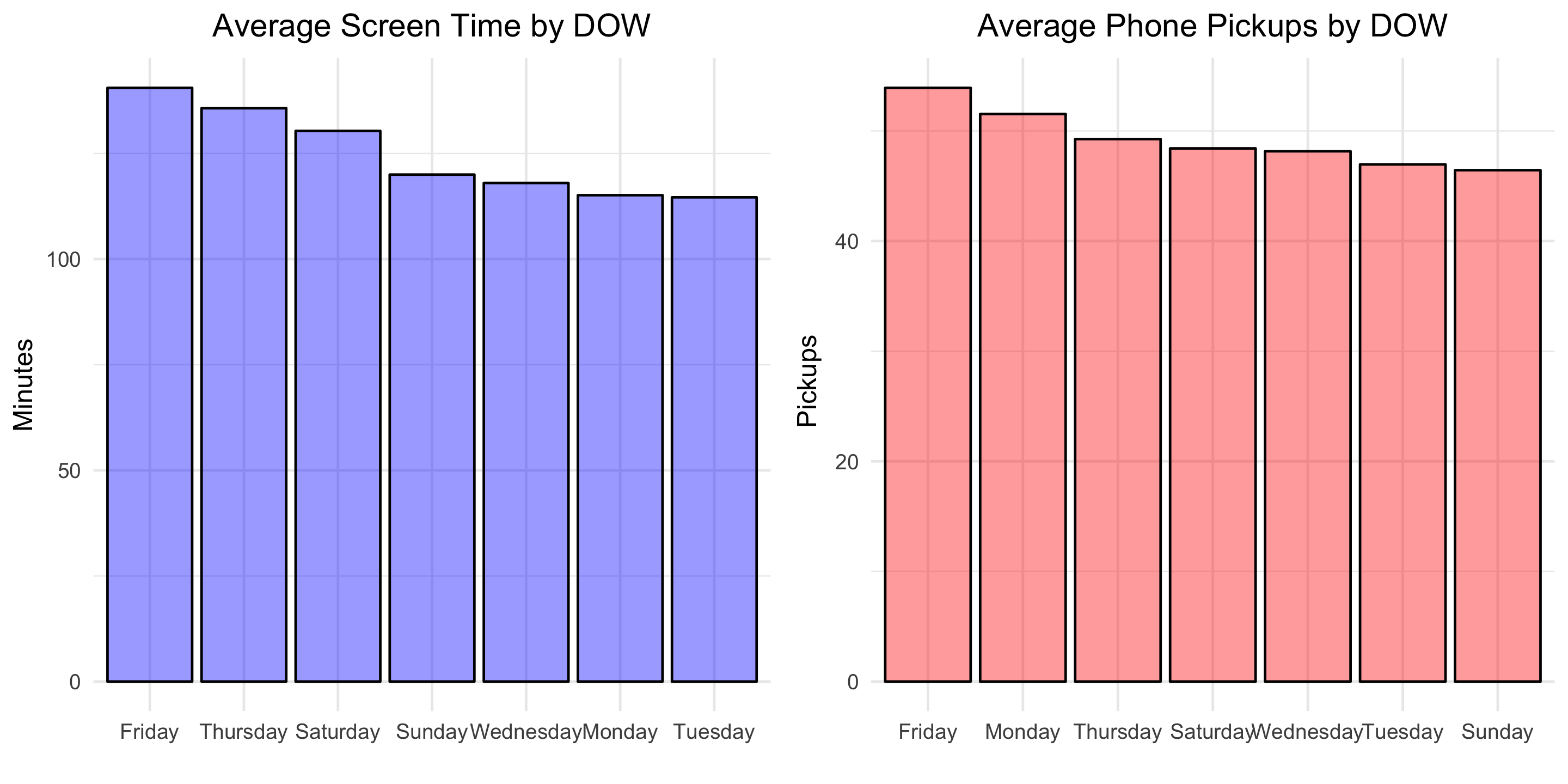
Looks like self-control slips in preparation for the weekend! Friday is the day with the greatest average screen time and average phone pickups.

Modeling

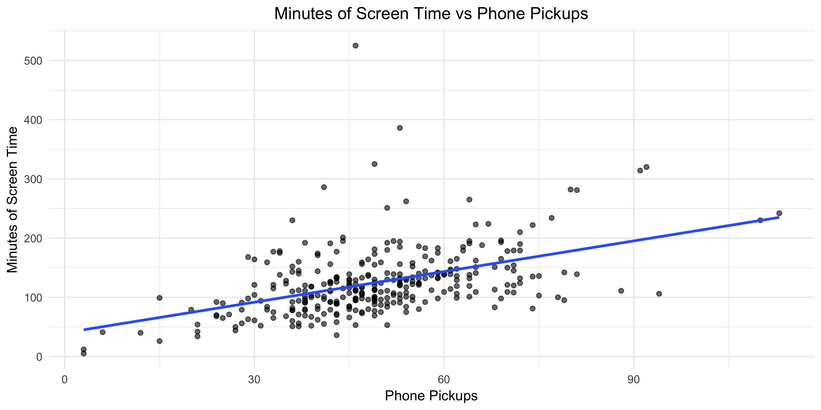
To finish, let’s fit a basic linear model to explore the relationship between phone pickups and screen-time minutes.

fit <- lm(minuteCount ~ pickupCount, data = moment)
summary(fit)

Below is the output:

Coefficients:
            Estimate Std. Error t value Pr(>|t|)    
(Intercept)  39.9676     9.4060   4.249 2.82e-05 ***
pickupCount   1.7252     0.1824   9.457  < 2e-16 ***
---
Signif. codes:  0 ‘***’ 0.001 ‘**’ 0.01 ‘*’ 0.05 ‘.’ 0.1 ‘ ’ 1

Residual standard error: 50.07 on 320 degrees of freedom
Multiple R-squared:  0.2184,	Adjusted R-squared:  0.216 
F-statistic: 89.43 on 1 and 320 DF,  p-value: < 2.2e-16

This means that, on average, each additional phone pickup results in 1.7 minutes of screen time. Let’s visualize the model fit.

g13 <- ggplot(moment, aes(x = pickupCount, y = minuteCount)) + 
  geom_point(alpha = .6) + 
  geom_smooth(method = 'lm', formula = y ~ x, se = FALSE) +
  #geom_bar(stat = "identity", alpha = .4, fill = "blue", colour="black") +
  labs(title = "Minutes of Screen Time vs Phone Pickups",
       x = "Phone Pickups",
       y = "Minutes of Screen Time") +
  theme_minimal() +
  theme(plot.title = element_text(hjust = 0.5))

You can find all the code used in this post here. Download your own Moment data, point the R script towards the file, and Voila, two dashboard-type images like the one below will be produced for your personal enjoyment.

What other questions would you answer?

css.php