Blog

Lessons from the Tank: Analyzing 800+ Shark Tank Pitches

Even though it’s been around for years, I just recently discovered Shark Tank, the show where hopeful entrepreneurs pitch business ideas to a panel of wealthy investors, or “sharks”. I usually wonder if there’s a method to the deal-making madness, especially when a pitch that resonates with me falls flat on the sharks.

In this post, I take my fandom to a deeper level by using episode descriptions from Wikipedia to understand what kinds of pitches have the highest chance of being offered a deal. In the process, I’ll use tools like web scraping, natural language processing, and API calls to gather, transform, enhance, and visual the data.

I’ve divided my workflow for this project into four steps:

  1. Obtain episode-level descriptions via web scraping
  2. Reshape data from episode-level to pitch-level
  3. Enhance data by categorizing descriptions via uClassify API
  4. Visualize key trends by season and pitch categories
“Follow the green, not the dream” – Shark & Billionaire Mark Cuban

1. Obtain episode-level descriptions via web scraping

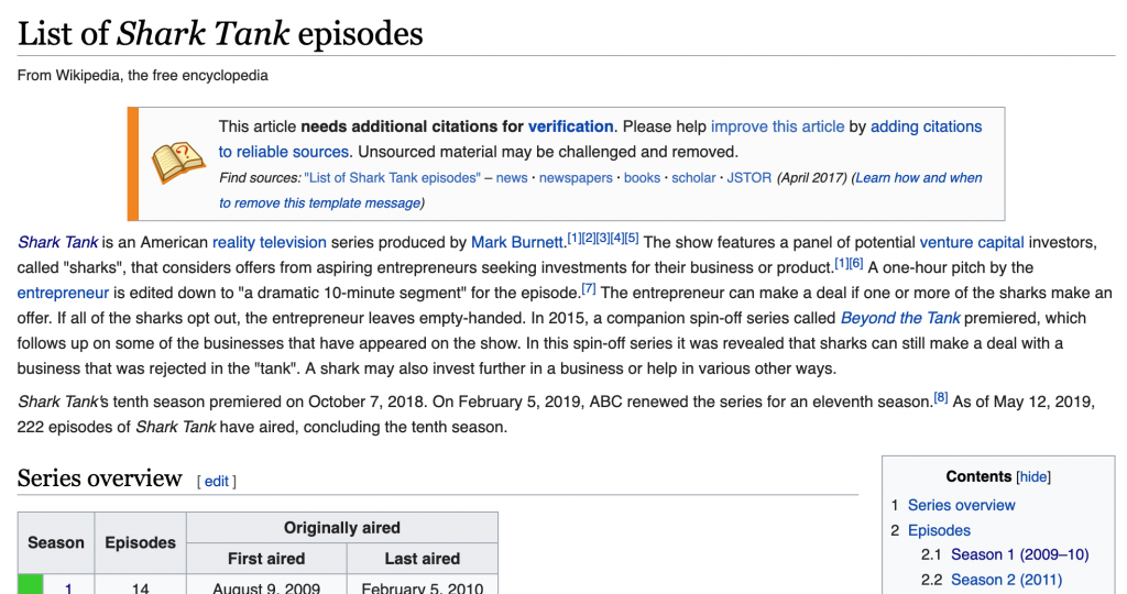
This analysis is possible because of a Wikipedia page that contains short descriptions of every pitch delivered on Shark Tank.

Wikipedia: List of Shark Tank Episodes

The first step is to extract this information via the rvest package in R, looping over each of the nine tables (corresponding to nine seasons) within the page.

Next we’ll do a bit of cleaning, simplifying column naming conventions, and adjusting the data types for the air date and viewership fields.

2. Reshape data from episode-level to pitch-level

In its current form, we won’t be able to detect any patterns with this data since the descriptions are bundled at the episode-level, like this:

“Crooked Jaw” a mixed martial arts clothing line (NO); “Lifebelt” a device that prevents the car from starting without the seat belt being fastened (NO); “A Perfect Pear” a gourmet food business (YES);

We need to “un-nest” the descriptions so that each row contains a single pitch. This is easily accomplished using the unnest function from tidyr.

Now we have a clean dataset, ready to enhance and analyze. Here’s a sample of the data structure, highlighting a few variables:

no_overallpitch_descriptiondeal
1a pie companyYES
2an implantable Bluetooth device requiring surgery to insert the device into the user's headNO
3an electronic hand-held device for waiting roomsNO
4a plastic elephant-shaped device that helps parents give small children oral medicineYES
5a packing and organizing service based on an already successful business called College Hunks Hauling JunkNO
6a mixed martial arts clothing lineNO
7a device that prevents the car from starting without the seat belt being fastenedNO
8a gourmet food businessYES
9a Post-It note arm for laptopsNO
10a musical way to teach students ShakespeareYES

3. Enhance data by categorizing descriptions via API

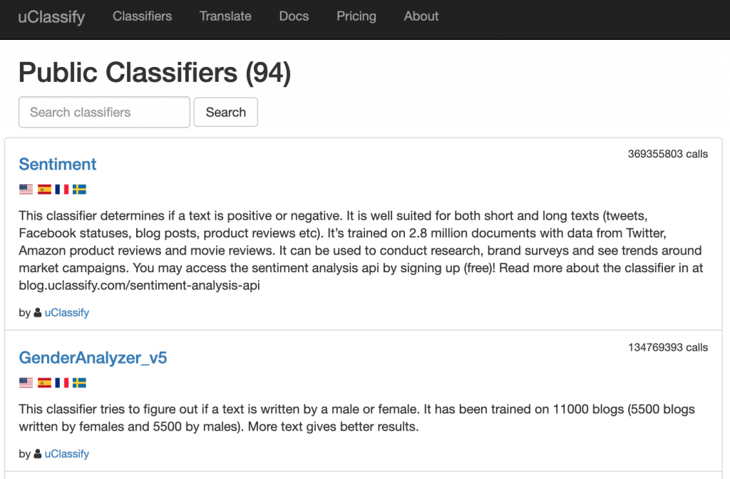
How can we systematically analyze what kind of pitches are more likely to be offered a deal when all we have is a brief text description? Rather than build my own NLP model from scratch to categorize pitches, I used uClassify, which offers “Classification as a Service” (CAAS).

Much like Google Cloud’s Natural Language API, uClassify provides on-demand NLP services via API. To categorize the Shark Tank pitches, I used the free “Topics” and “Business Topics” classifiers.

Let’s see how this was implemented in the R code:

These functions construct a URL with my personal API key, the classifier API name, and the text (pitch description) to be categorized. A GET call then returns a JSON with a list of categories and “match” scores.

For example, take pitch #803, “Thrive+”, which has this description: “capsules that reduce alcohol’s negative effects.” The category with the highest “match” score was Health, followed closely by Science. By categorizing the pitch descriptions, we’ll be more equipped to uncover some key elements of successful Shark Tank pitches.

Cheers (formally Thrive+) Landing Page

4. Visualize key trends by season and pitch categories

Now for the fun part! After compiling, cleaning, and enhancing our dataset, we’re ready to visualize and model the data. First, let’s take a look at Shark Tank’s popularity over time, measured in TV viewership (in millions).

Even without the fitted line, it’s easy to see a rise and fall in popularity, with the peak around 2015 with 7.5 million viewers. Next, let’s look at how willing sharks were to make deals over the course of the show, across nine seasons:

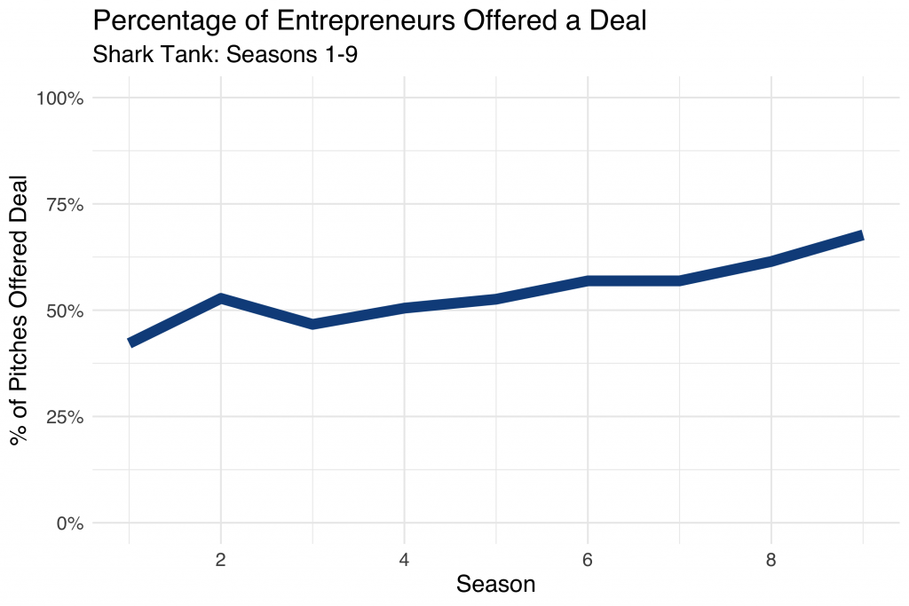
During Season 1, less than 50% of pitches were offered a deal from the sharks. By season 9, deals were made over 65% of the time! I wonder if this had anything to do with sliding viewership.

Let’s dig a bit deeper and start looking at characteristics of successful pitches. Using the tidytext methodology, I determined which words within the pitch descriptions were most often associated with a strong response from the sharks (for better or worse).

WordDealNo DealNet
clothing715-8
portable103+7
bags71+6
cooking71+6
designed1610+6
ice17-6
car61+5
cleaning61+5
hair116+5
healthy50+5

Clothing is mentioned in 22 pitch descriptions, 70% of which were unsuccessful! On the flip side, when the pitch included something “portable”, the sharks were willing to make a deal 10 out of 13 times. If you make it onto Shark Tank, don’t mention ice! For whatever reason, almost 90% of those pitches resulted in no deal with the sharks.

Now let’s see what else we can learn by using the categories generated from the uClassify API classifiers:

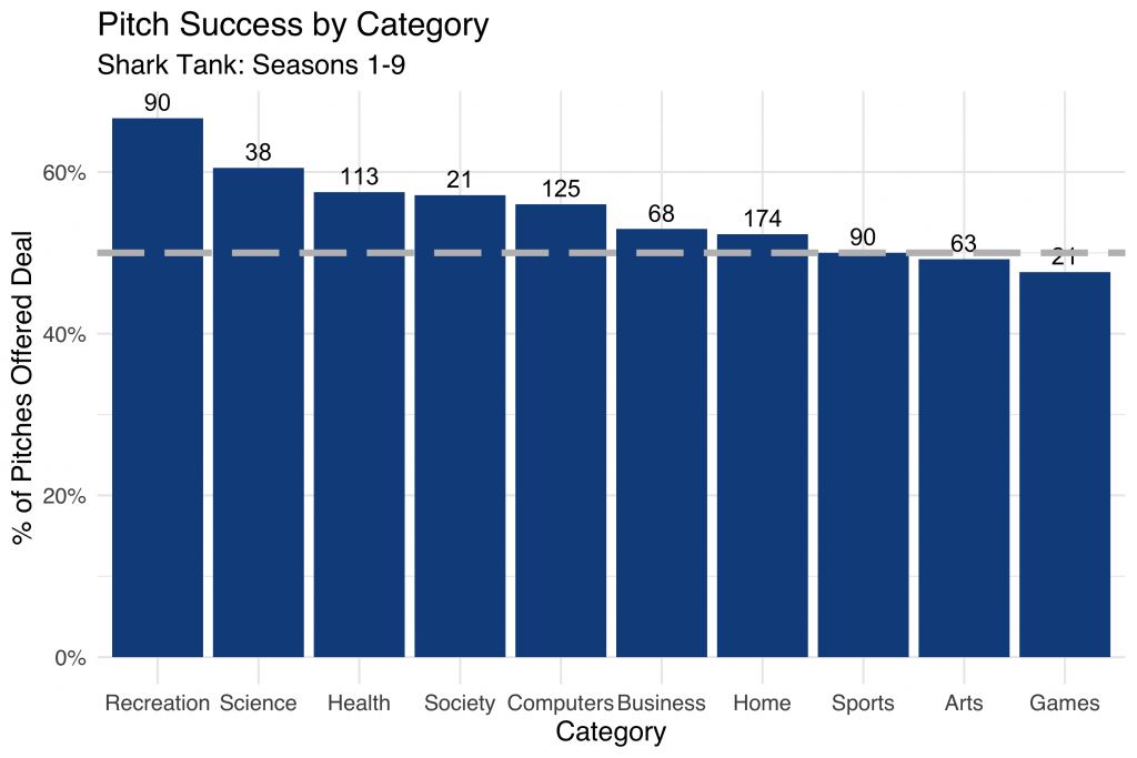
Here we summarize pitch success by category, with the total number of pitches within the category represented above each bar. The dashed grey line represents the 50% cutoff, where a pitch within a given category is equally likely to be accepted or rejected.

Notice how over 65% of deals classified as “Recreation” were offered a deal by the sharks over the course of the nine seasons. It looks like “Game” entrepreneurs didn’t snag funding quite as easily!

Conclusion

This has been a fun and quick way to explore some of the nuance in the world of Shark Tank deal-making. Truthfully, the dataset we created was pretty limited. Adding in information like which shark (or sharks) made the deal, for how much, and for what percentage of equity would add more precision compared to simply knowing if a deal was made or not.

In addition, access to full pitch transcripts (rather than simplistic descriptions of ~10 words or less) would be much more helpful in accurately classifying the pitches into meaningful categories.

You can find the complete R code here and the final dataset here, both hosted on GitHub. Thanks for reading!

Choosing the Right Hospital: Exploratory Analysis in R

With our baby’s due date quickly approaching, my wife and I needed to find a hospital for delivery. Hoping to contribute something meaningful to the decision, I found data published by the state of New York on labor and delivery metrics. By visualizing measures like percentage of cesarean deliveries, I narrowed the list of hospitals within our county.

Despite my belief in “data-driven” decision-making, I understand that in the real world, most decisions are part art, part science, requiring a mix of qualitative and quantitative factors. That being said, in this post, I describe how I leveraged publicly-available data to help choose a hospital for my wife’s delivery.

Data Overview

The dataset spans a ten-year period, from 2008 to 2016, with data for 146 hospitals in 52 counties. Four general categories of metrics are present:

  • Anesthesia & Analgesia       
  • Characteristics of Labor & Delivery
  • Infant Feeding Method
  • Route & Method

Since I lack the subject matter expertise to understand something like the difference between paracervical and pudendal anesthesia, some of the value of the dataset is lost. Despite the knowledge gaps, I’ll next visualize some of the more straightforward measures of labor and delivery to uncover insights about hospital quality.

Visualization & Analysis

First item of discussion: Where are most babies born in Westchester County?

In 2016, the most babies were born at the White Plains Hospital Center.

Volume may matter. Hospitals who deliver more babies may be exposed a wider spectrum of complications and be prepared to deliver treatment accordingly. On the other hand, large-scale operations likely produce strict standardized policies and procedures, with little room for customized delivery plans.

How has the volume of births change over the 10-year period? 

Every hospital seems to be trending flat or down, which may be a reflection of more general demographic trends.

Next up, let’s examine which hospitals work with midwives. This was an important consideration in our decision process.

Pretty clear. Phelps Memorial and Hudson Valley Hospitals are midwife friendly, with 40%+ of births attended by a midwife.

Is there any relationship between births attended by midwifes and other labor outcomes?

It appears that mid-wife friendly hospitals enjoy a lower c-section rate, although I’m not implying that one causes the other. It would take more than a scatter plot to tease out the true nature of that relationship.

Let’s take a closer look at c-section rates by hospital over time.

There was a long stretch of time at Lawrence hospital where more cesarean sections were performed than vaginal births. Easy red flag!

This simple analysis was informative and eye-opening. With the list significantly narrowed, it’s time to tour the facilities, read reviews, and speak with medical providers to make the final decision.

Here’s a link to the code and data. Thanks for reading!

Visualizing NYC Housing Trends with gganimate in R

StreetEasy, NYC’s leading real estate marketplace, makes some fantastic housing data freely available through its data dashboard. Among the datasets available for download is a monthly breakdown of housing inventory by borough and neighborhood over the last 8 years. In this post I’ll use the gganimate package in R to visualize the ebb and flow of rental housing availability in NYC. If the law of supply and demand holds, this should inform ideal times for apartment hunting.

Rental Inventory Over Time

Let’s first visualize the number of rental units on the market over time by borough. This is a monthly view, from January 2010 – December 2018.

Here we see StreetEasy’s growth as marketplace year over year, together with distinct seasonal variation. Let’s explore seasonality next.

Average Rental Inventory by Month

We’d expect some flavor of seasonality with real estate. In the US it’s estimated that 80% of moves occur between April and September. Let’s see if the same pattern is true in NYC.

Sure enough, we observe a “peak season” with an influx of rental units coming onto the market from May to September, although the trend is strongest in Manhattan.

Rental Inventory in Brooklyn’s Neighborhoods

Finally, let’s visualize how housing availability has fluctuated on StreetEasy’s marketplace in each of Brooklyn’s neighborhoods over time.

Using face_wrap from ggplot2, we can easily observe the trend in each neighborhood simultaneously.

Conclusion & Appendix

Kudos to StreetEasy for making this dataset open to the public. There’s certainly more to explore and analyze in their data dashboard. Also, I find gganimate a really useful addition to any data storyteller’s toolkit, and I hope to find more opportunities to leverage this package in the future. Thanks for reading!

R Script: Link
Data Source: Link [Rental Inventory]

Mapping Scarsdale Real Estate Data with Python

This year my wife and I moved to New York for the start of a new job. Initially overwhelmed by the scope and pace of the NYC housing market, we were given the very generous and unexpected opportunity by a family friend to live in a house north of the city in Westchester County. Built in the early 1930s, the historic home is situated in central Scarsdale, an affluent suburban town known for high-achieving schools and extravagant real estate.

As a graduate student of historic preservation, my wife has been especially enthralled by the rich styles and architecture of the houses within the Scarsdale village limits. Naturally, we frequently discuss and analyze the homes we pass on walks and runs, her comments generally centered around history and architecture, mine on economics and valuation.

Sourcing the Data

Wishing to analyze the houses of Scarsdale in a more systematic way, I began to experiment with the Zillow API. Disappointed by both accessibility and content, I continued to search for a superior data source. Soon after, I discovered a tool developed by the Village of Scarsdale to search property information by road name and wrote a Python script to scrape the data. Curious to know if additional variables were available, I contacted the Scarsdale Village administration and was sent an Excel file with the complete set of residential properties, rich with detail and with few missing values (5,000+ rows, 100+ columns).

The dataset includes the address of each residential property, but for visualization purposes, I needed geographic coordinates (latitude, longitude). Luckily, the Google Maps API provides this exact functionality, known as geocoding. Having some experience with this API, it was simple to write a Python script to retrieve the geographic coordinates for each of the 5,000 properties.

After writing an R script to scrub the data (creating more descriptive variable names, filtering, removing duplicates), I was ready to visualize the real estate data of America’s most affluent town.  You can find both the raw and cleaned datasets here.

Mapping the Data

After considering the many potential ways to map the properties, I settled on three key views: Year Built, Total Assessed Value, and Sales Date.

After some research, I discovered the folium library, which leverages the mapping strengths of the leaflet.js library within the Python ecosystem to provide Tableau-like functionally. The timing was ideal considering my free Tableau college subscription recently expired!

1. Year Built

With (a few) homes built as early as the 1600s and (some) as recently as 2018, this view shows clusters of homes built in similar time periods and paints a picture of development over time.

Here, the color spectrum plots blue for older houses and red for newer houses. Drag to interact with the map and click on a dot to view the address and year built.

Note the layers of development along the Saxon Woods Golf course border and the concentration of older homes in the Greenacres area.

Full Page Map: Link

2. Assessed Value

In this heatmap, the brighter the dot the higher the assessed value. Clicking on a circle reveals the total assessed value for the current tax year as well as the square footage of the home.

Full Page Map: Link

Sales Date

Which neighborhoods are hot on the market? This view maps the data according to sales date, with more recent sales colored in green. No clear trend emerges here, with a fairly equal distribution across the village. Clicking on a dot reveals the latest sales date and the number of years since sale.

Full Page Map: Link

Code Appendix

We’ll now dive into how these maps were created. As usual, we start by calling the necessary libraries. Beyond the essential pandas and numpy libraries, I use folium for map creation and matplotlib.cm for color assignment.

In order to visualize a feature such as assessed value or years since last sales date, I needed to be able to bucket the values and assign each bucket a color.

The function below achieves that need, allowing the user to specify the number of buckets and a color spectrum. BI software such as Tableau replicates this kind of functionality, but with superior algorithms that scale for large datasets.

Finally, below is the framework used to create each of the maps. A dot is created for each of the properties, colored according to the bucket assigned and labeled by year built, total assessed value, square footage, or sales date.

You can find the complete code to replicate these maps here and the dataset here. Thanks for reading!

Scraping Stack Overflow Salaries with Python

I recently discovered a salary calculator on Stack Overflow. The tool takes inputs like role, location, and education and outputs salary predictions at the 25th, 50th, and 75th percentile.

Salary Calculator Interface

Based on the results of the annual developer survey, the calculator seems like an interesting way to study the marginal impact of expereince and education on earnings. As a recent undergraduate, I might be interested in understanding the impact of graduate degrees on income potential.

Calculator Output

To extract Data Scientist salary data (or extrapolated data) from the tool, I wrote a Python script using Selenium to loop through 350+ different combinations of location, education and expereince.

Results

There are many reasons to exercise skepticism when analyzing this data, like self-selection bias inherent to surveys. It’s obviously very unlikely that a data scientist responded from each location, education, and experience combination. Even if they did, salaries are likely to vary widely. To strengthen any insight derived from this analysis, I’d also collect data from sources like Glassdoor or Indeed, especially before making any significant education or relocation decisions!

With that long disclaimer in mind, below I visualize the scraped data with an interactive Tableau dashboard. You can filter by years of expereince and location to understand salary levels by education level:

One disappointment I had was realizing that much of the data returned from the calculator was the same across locations. The same salaries were also returned across expereince and education levels for graduate and postgraduate degrees. Despite the data shortcomings, this was an interesting exercise in automating data extract from web forums using Selenium. Thanks for reading!

Appendix

Python Script: Link
R Script: Link
Dataset: Link
Tableau Dashboard: Link

Visualizing Pocket Articles with R

Every day I see dozens of things online I don’t have time to read or view in the moment. With Pocket I save news articles, blog posts, talks, or tutorials for later viewing. Pocket allows me to organize things I’ve saved with tags and eliminates the need to send links to myself or bookmark web pages.

Pocket downloads the content for offline reading and presents the text in a reader mode free of ads. I usually save several articles a day and then read them on my commute home out of the city. Simply said, Pocket is the best way to store and catalog anything you read on your phone or computer.

Over the last 2 years I’ve saved just shy of 2,000 links, encompassing a variety of content. Luckily, Pocket has a handy export interface, generating an HTML file with a list of saved links. In this post I’ll extract insights from these links in R, using link domain and topic frequency to assess my interests.

Getting Started

To start, let’s call the required packages.

As an overview, I use rvest to extract the HTML page content, urltools to transform the links to a working dataset, dplyr to manipulate the data, tidytext to tokenzen the link content, stringr to filter out numbers from the links, and wordcloud2 to visualize the word frequencies.

Next, I import the HTML file and extract the links. The url_parse function easily transforms the list of links into a data frame, with columns like scheme, domain, and path. For example, the Wired article below is broken into scheme (https), domain (www.wired.com), and path (2017/03/russian-hacker-spy-botnet/).

https://www.wired.com/2017/03/russian–hacker-spy-botnet/

Top Domains

Now the fun begins. I’m first interested in knowing which domains I read and save the most. In the snippet below, I group and count by the domain, and select the top 20%.

To visualize the result, I use the wordcloud2 package, developed by Dawei Lang, to create a word cloud.

Looks about what I expected, a good mix of business and technology content sources, such as Wired, Medium, NY Times, and Business Insider. Although I’d like to understand how the content I save has changed over time, the Pocket export doesn’t include a timestamp of when the article was saved.

Topic Frequency

Next up, I take a tidytext approach to the list of link paths to analyze the topics I seem to be interested in. Using the unnest_tokens function, I create a data frame where each row is a word. With anti_join, I quickly remove common “stop” words, such as “the”, “of”, and “to”.

In order to create the word cloud to visualize topic prevalence, I first need to count word frequencies. Here I also removed several “noisy” words common in link paths, such as “click”, “news”, and “comments”.

Data comes out on top! Here technology terms and topics like Python and AI are clearly visible, along with a sprinkling of other interests and hobbies like music (Drake, Spotify).

This was a fun and simple way to implement the principles I’ve learned reading Julia Silge and David Robinson’s book, Text Mining with R.

Extracting Public Transactions from Venmo API with R

Public by default, your Venmo transactions are surprisingly accessible to anyone with an internet connection. Although Venmo has removed functionality to query historical transactions, it’s public API still provides a real-time snapshot view of transactions processed through the system, including usernames and payment subjects (though not the amount sent or received). Try it for yourself here.

With that said, it was straight-forward to collect a bit of data from this API using R. The bulk of the script was needed to parse the JSON file returned by the API to extract interesting information. In this post, I’ll highlight sample data from the API in an effort to expose the kind of information being openly shared. If you use Venmo, follow these instructions to change your transactions to private by default.

Sample Data

Using the API, I collected data from 1,250 payments. From each of these transactions, I was able to view the following information:

  • Payment Id
  • Payment Date, Time
  • Payment Message
  • Sender & Receiver Name, Username
  • Sender & Receiver Profile Photo
  • Sender & Receiver Venmo Account Creation Date

For example, on January 1, 2019 Scott Perkinson sent Patrick Miller an undisclosed payment for “Caroline Bachelorette Party & Wine tasting”. That same day, Kerry McCarthy paid Anna McCarthy for “Barbie dream house furniture.” You can’t make this stuff up.

Bottom line, privacy is important, and you should take any available steps to limit how your information is shared. If you use Venmo, start by making your payments private by default. You can find the datasets I compiled here and the R code to access the API here.

Visualizing Baby Name Popularity Trends with R

From the earliest days of our marriage, my wife and I talked about baby names. Your name is a core part of your identity, so choosing the right name for your child feels like a weighty affair. Now, with a baby on the way, the topic surfaces in conversation more than ever.

Like always, I turned to data to assist with the decision process. Using a dataset provided by the Social Security Administration, I created functions with R to visualize and compare the popularity of names over time.

There are two functions: the comparison of two names over time and the comparison of a name against a birth year over time. Below is sample implementation:

I first compared the popularity of the spelling of my name, Erik, to the more common spelling, Eric.

Erik has never been as popular as Eric, although both are currently down from their 1970 – 1990 peak.

Next, I compared the popularity of my name in the context of my birth year. It looks like my parents named me around the start of the decline in popularity.

How does my name compare with my wife’s?

What can I say? She’s always been more popular. What about the names of my six sisters? (including sisters-in-law).

Finally, let’s take a look at the most popular boy and girl names of 2017, Liam and Emma.

This was a fun and simple way to interact with publicly available baby name data. You can find the dataset here and the code to create the functions here.

Web Photo Archiving with R

My wife and two of her sisters ran cross-country and track in high school. I recently learned that their team website, which hosts thousands of event photos from the past 10 years, is being shut down. Wanting to save my mother-in-law from the unimaginably tedious task of manually downloading each image, I wrote a script in R to automate the process. 

The website has a page for each season with links to event photo albums. For example, in the 2012 season, there are 81 photos albums and 10,000+ photos. 

Each photo album contains somewhere between 80 and 150 photos. I needed to design the script to loop through and download each photo from each photo album.

In other words, I needed a way to pass a URL like the one below into the “file.download” function to save an image to my computer.

old.runtwolf.com/CC2012/Camp1/images/img_0973.jpg

Code Walkthrough

Let’s start by calling the two necessary packages: rvest and dplyr. These both form part of tidyverse, a collection of packages created by Hadley Wickham that share a common design philosophy. 

After downloading the season overview page with the list of photo albums, I used html_nodes and grepexpr to extract and clean the list of album names to form a list of album URLs. 

Finally, I looped through each photo album, replicating the folder structure locally, and downloading each of the .JPEG files.

After all was said and done, I had downloaded 100,005 images from 759 photo albums across 9 XC seasons.

The final step was the upload the images to the cloud for easy sharing and storage. Luckily, the googledrive package allowed me to upload the images via a script rather than manual bulk upload.

Assuming each image would have taken 20 seconds to download, label, and upload, the manual process would have taken ~500 hours, non-stop! Writing the scripts and monitoring the download and upload process took about 8 hours, for a net time saved of ~492 hours.  

You can find the complete code here and archived photos here. 

Thank you to Jen Fitzgarrald for capturing so many wonderful images over the past decade. 

css.php