With over 15 million listeners, Spotify’s RapCaviar has been called “the most influential playlist in music.” RapCaviar is curated by Spotify’s editorial team and updated daily to represent the latest and greatest hip-hop and rap tracks.
For the last year, I’ve saved a daily snapshot of the playlist using the Spotify API to empirically determine the biggest rappers in hip hop today. In this post, we’ll use hard data to approximate influence, hustle, and longevity for rap’s biggest names during 2023.
Methodology
To collect the data, I scheduled a Python script to run daily to (1) hit Spotify’s API to collect the RapCaviar track list and (2) save the resulting data frame as a .csv file to an S3 bucket. After pulling down and combining all daily files from S3 using an R script, the tidied dataset contains 11 fields:
| Field Name | Sample Value |
| Playlist Id | 37i9dQZF1DX0XUsuxWHRQd |
| Playlist Name | RapCaviar |
| Track Playlist Position | 2 |
| Track Name | Mad Max |
| Track Id | 2i2qDe3dnTl6maUE31FO7c |
| Track Release Date | 2022-12-16 |
| Track Added At | 2022-12-30 |
| Artist Track Position | 1 |
| Artist Name | Lil Durk |
| Artist Id | 3hcs9uc56yIGFCSy9leWe7 |
| Date | 2023-01-02 |
After the cleaning and duplication process, the dataset contains 469 total tracks with 271 distinct artists represented across 351 distinct playlist snapshots between January 1 to December 27, 2023.
Metrics
Influence
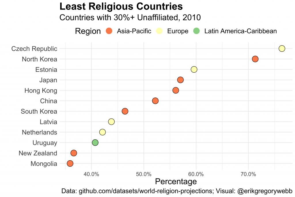
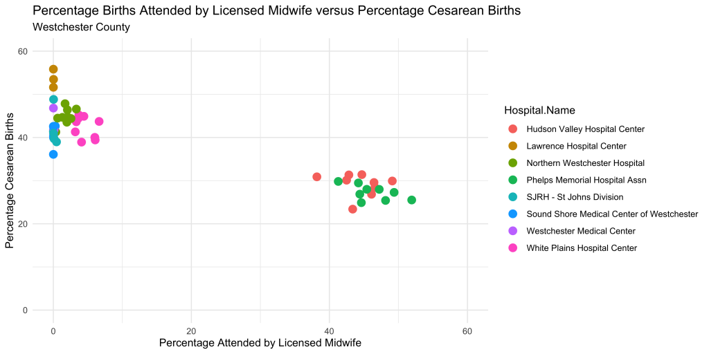
Let’s start with influence: what percent of available days was a given artist represented on the playlist? For example, if an artist appeared in 50 of the 351 possible daily snapshots, their “influence” score would be 14.2%.
Here are the top ten rappers ranked by this influence metric, for 2023:
| Name | Days Represented | Percent of Available |
| Drake | 351 | 100% |
| Future | 351 | 100% |
| Gucci Mane | 351 | 100% |
| Travis Scott | 351 | 100% |
| 21 Savage | 344 | 98% |
| Kodak Black | 330 | 94% |
| Yeat | 328 | 93% |
| Latto | 311 | 89% |
| Lil Uzi Vert | 309 | 88% |
| Quavo | 302 | 86% |
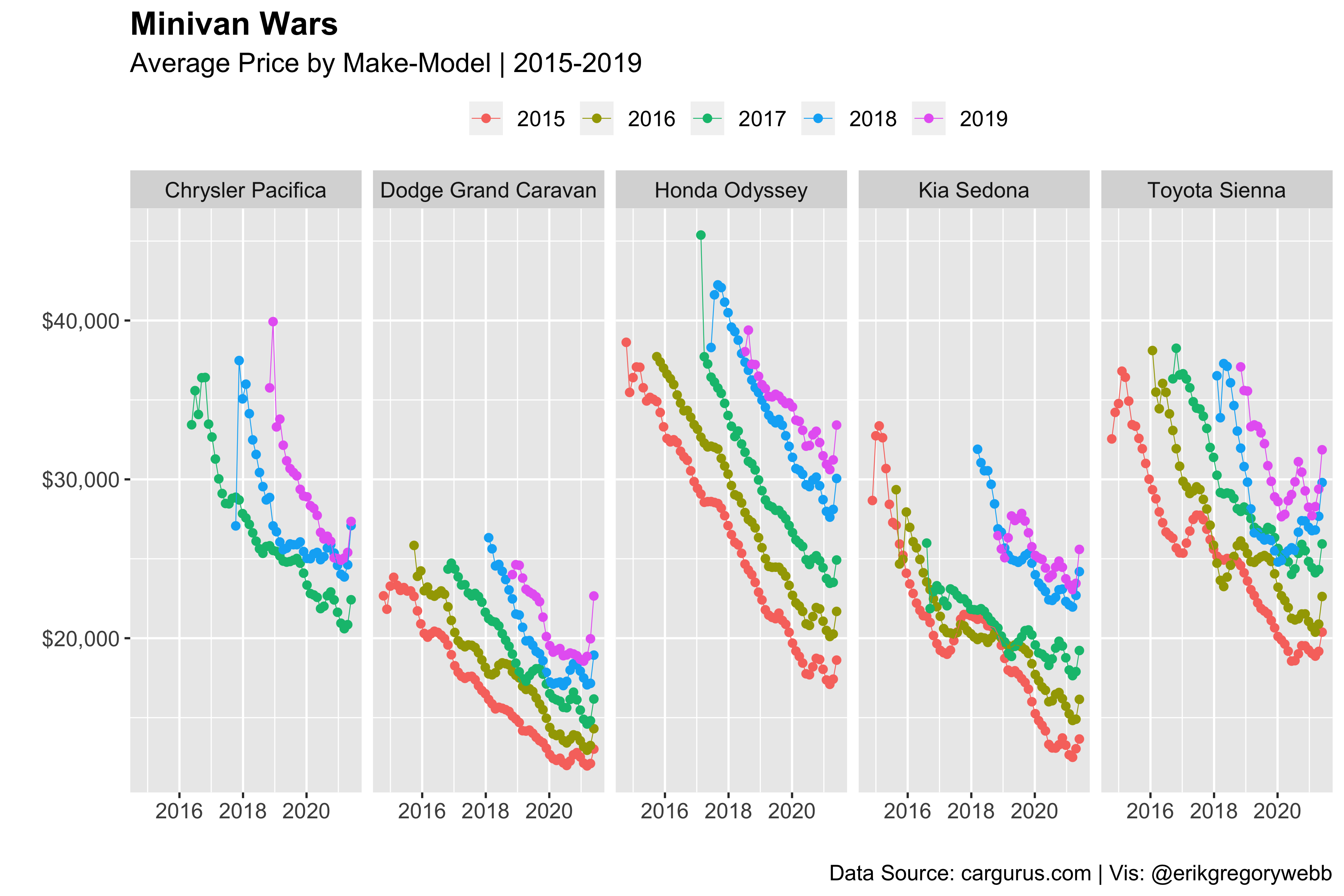
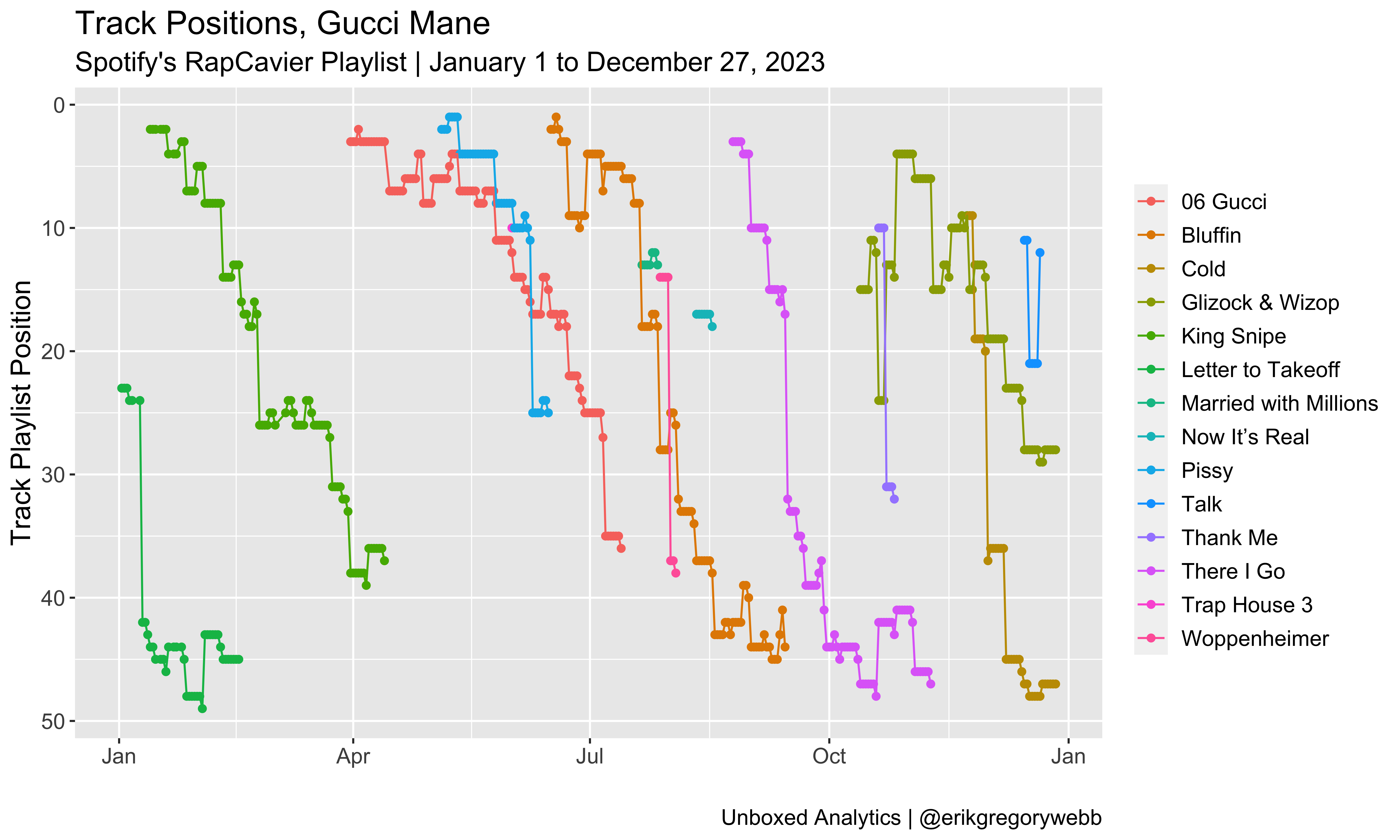
Impressively, four artists yielded sufficient influence to maintain a presence on the playlist every day of the year: Drake, Future, Gucci Mane, and Travis Scott. Here’s a visual representation of their dominant year:
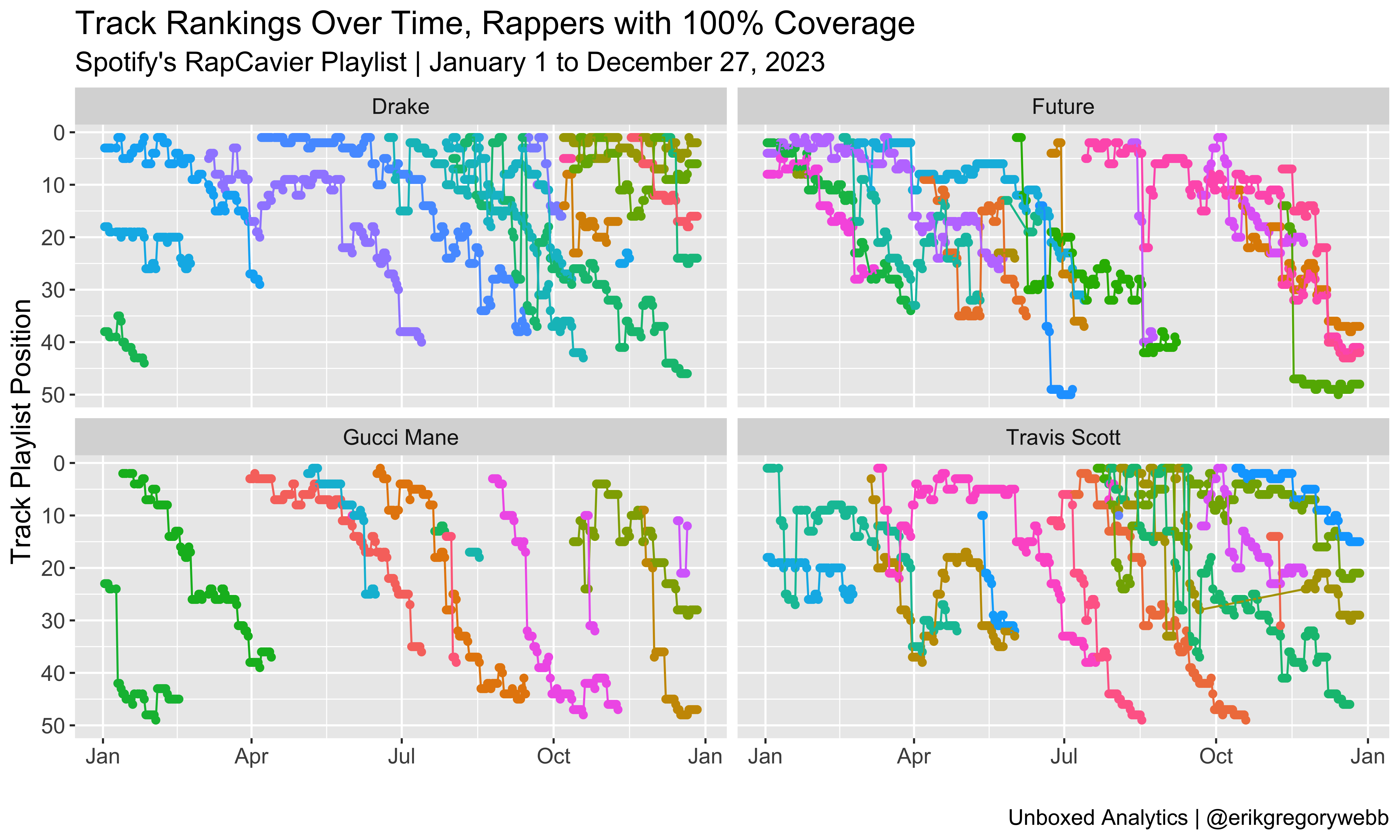
Each colored line represents a unique track. With the y-axis reversed, the chart shows how new tracks enter the playlist positioned near the top and then descend over time. The biggest surprise to me is Gucci Mane, who managed to maintain his presence on the playlist via 14 distinct tracks released throughout the year:
Notably, 21 Savage was only a week short of full coverage, coming in at 98%.
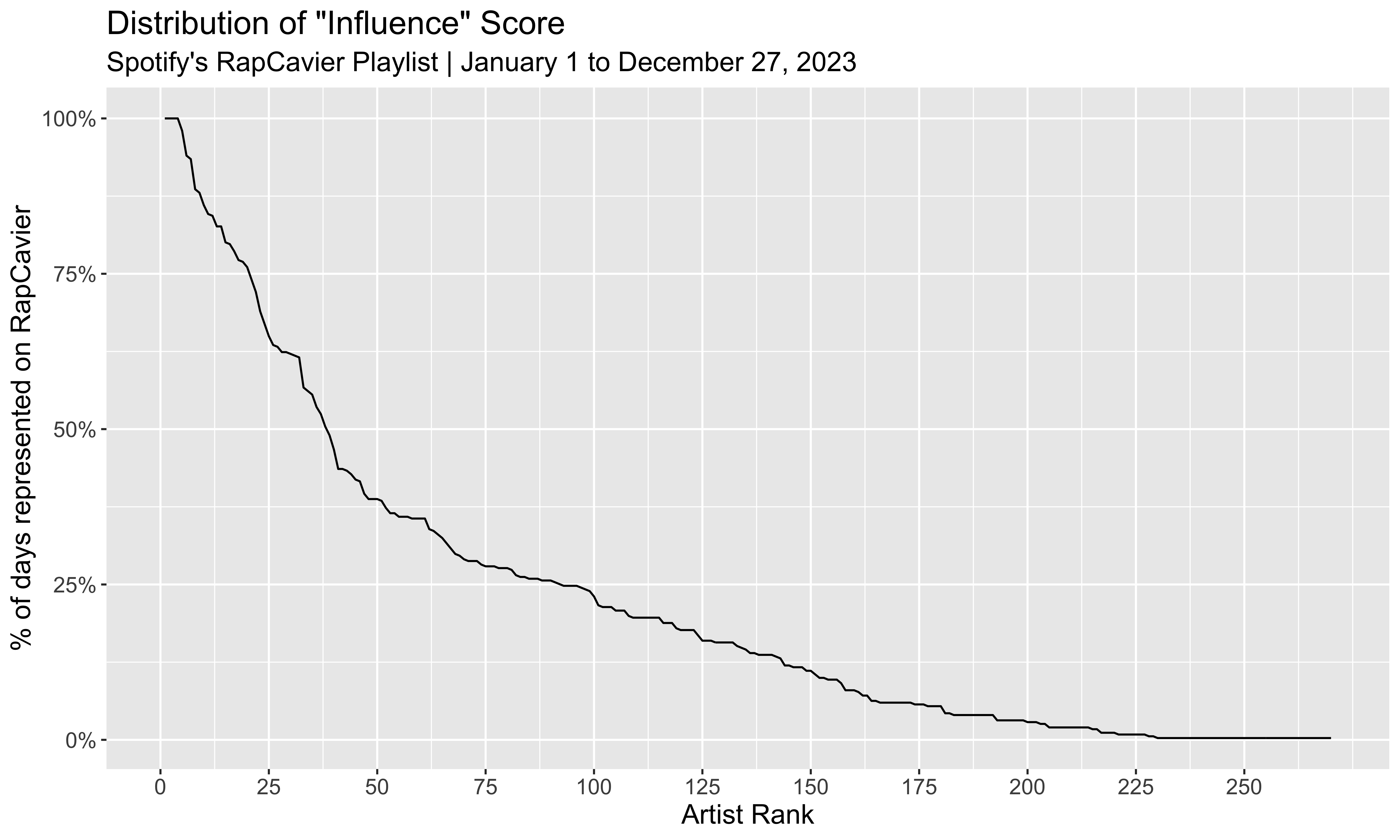
Looking at the distribution of influence scores for all artists appearing at least once during the year, 38 (14%) were present in the RapCaviar playlist more than half of the year:
Density
It’s one thing for an artist to have one of their tracks represented on RapCaviar, but the heavyweights often have several at once. “Density” is calculated as a distinct count of tracks by artist and day.
The highest density score for 2023 was 6, a score achieved by just four rappers:
| Density | Artist | Dates |
| 6 tracks | 21 Savage | Jun 23 – Jul 13 (21 days) |
| 6 tracks | Lil Wayne | Nov 10 – 16 (7 days) |
| 6 tracks | Drake | Oct 7 – 12 (6 days) |
| 6 tracks | Travis Scott | Aug 3 (1 day) |
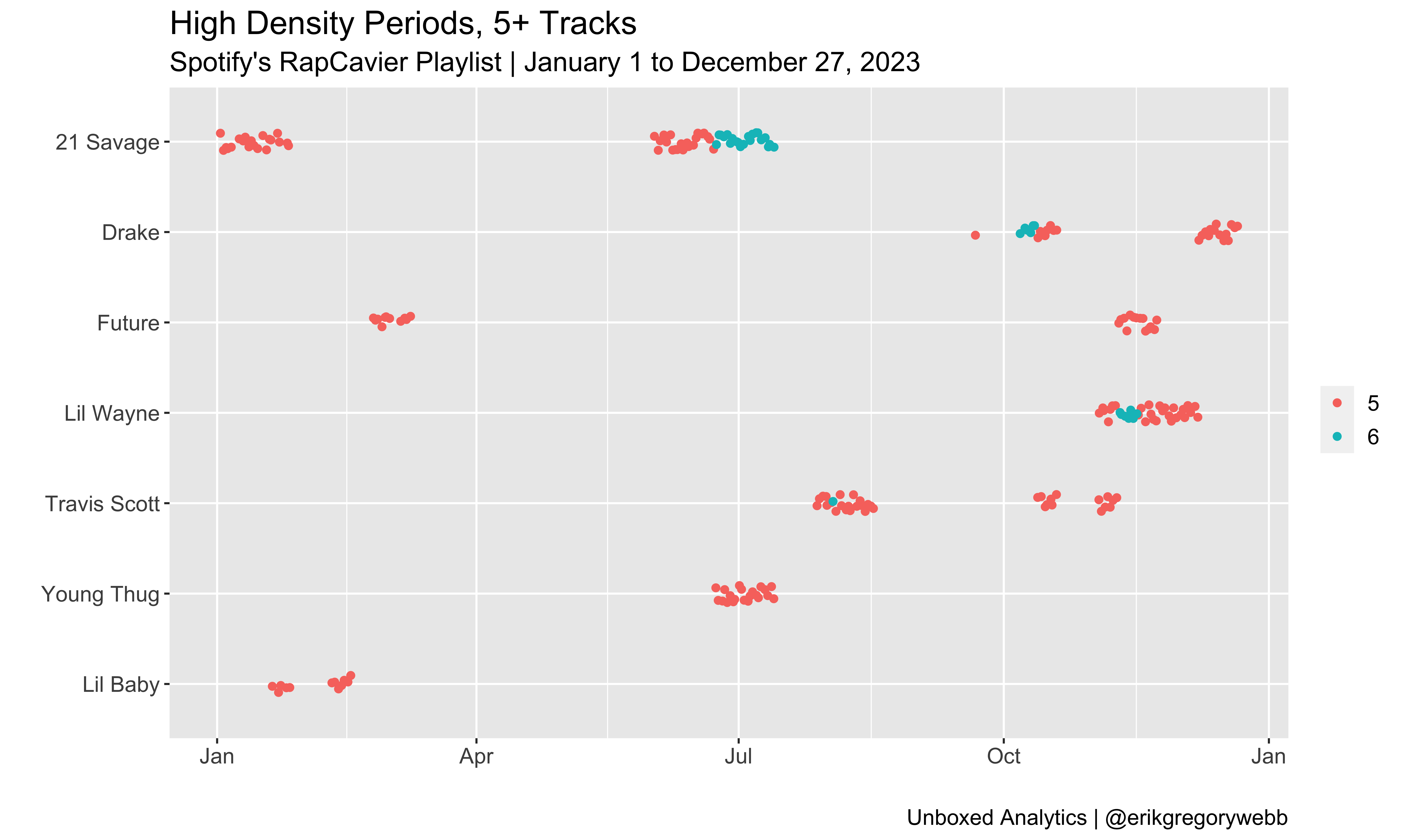
Most impressive is 21 Savage’s dominant 21-day, 6-track run over the summer, preceded by a 20-day, 5-track run. Notably, during the 6-track spree, all six were features or joint tracks:
- Pull Up (feat. 21 Savage)
- Wit Da Racks (feat. 21 Savage, Travis Scott & Yak Gotti)
- Peaches & Eggplants (feat. 21 Savage)
- 06 Gucci (feat. DaBaby & 21 Savage)
- War Bout It (feat. 21 Savage)
- Spin Bout U (with Drake)
Contributing to more than 10% of the playlist’s track count simultaneously is truly impressive (RapCaviar usually has 50 tracks total); rap’s heavyweights are dense.
Longevity
Finally, let’s consider longevity, meaning how long an artist’s tracks remains on the playlist. Here are the top ten songs by lifespan on the RapCaviar track list during ’23:
| Track | Artist | Days | First Day | Last Day |
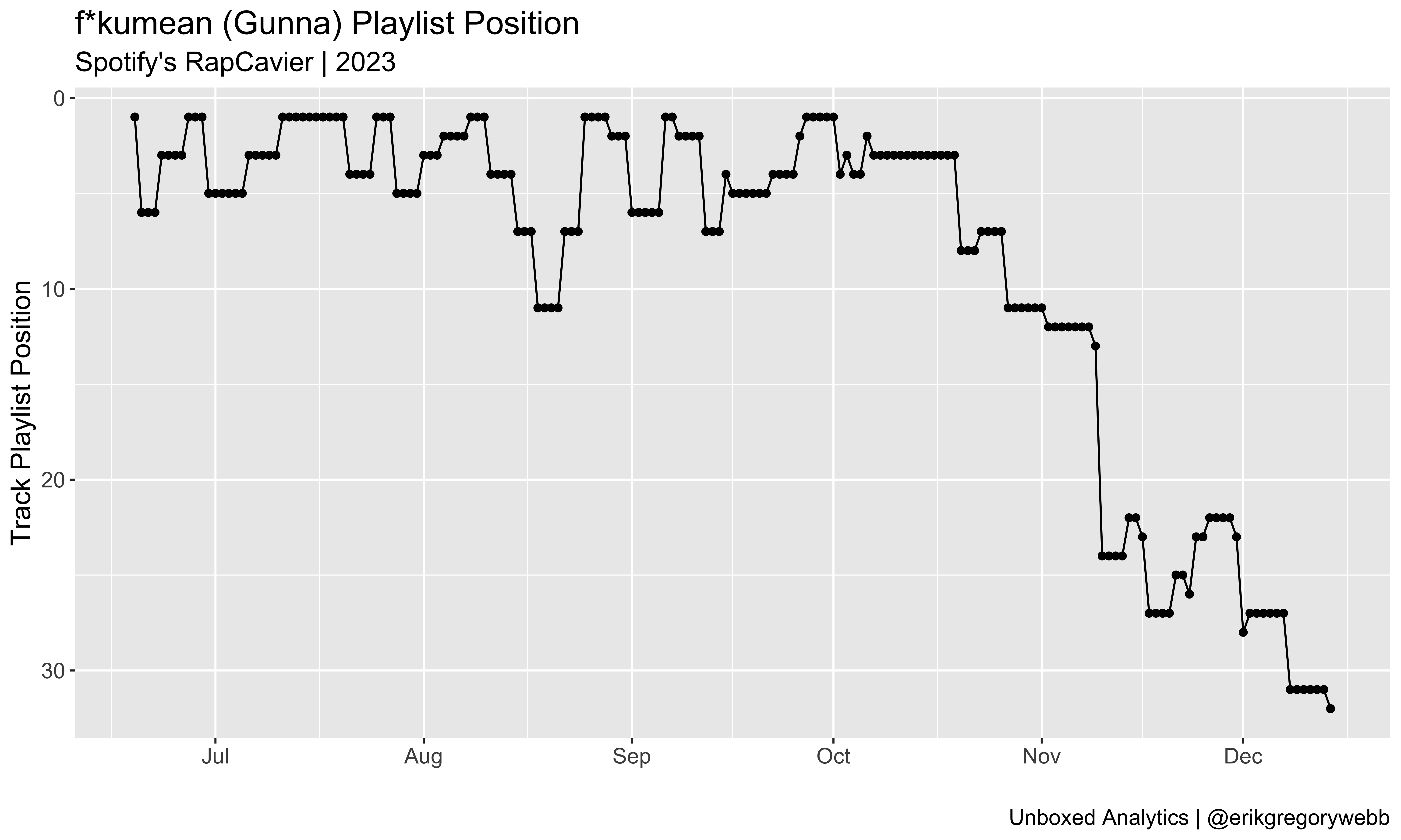
| f*kumean | Gunna | 179 | Jun 19 | Dec 14 |
| Turn Yo Clic Up | Quavo | 167 | Jul 14 | Dec 27 |
| Search & Rescue | Drake | 161 | Apr 7 | Sep 15 |
| 500lbs | Lil Tecca | 159 | Jul 21 | Dec 27 |
| I KNOW ? | Travis Scott | 153 | Jul 28 | Dec 27 |
| Paint The Town Red | Doja Cat | 146 | Aug 4 | Dec 27 |
| MELTDOWN | Travis Scott | 143 | Aug 1 | Dec 21 |
| Private Landing | Don Toliver | 136 | Feb 24 | Jul 13 |
| Superhero | Metro Boomin | 135 | Jan 2 | May 25 |
| All My Life | Lil Durk | 133 | May 12 | Sep 21 |
Importantly, four of the tracks in the top ten are still active (italicized above), so there’s a decent chance Turn Yo Clic Up could outlive f*kumean. Speaking of which, Gunna’s first top-ten solo single managed to spend almost six months on RapCaviar, complete with a position surge in mid-August:
Zooming in, here’s the position history for all of those top ten tracks:
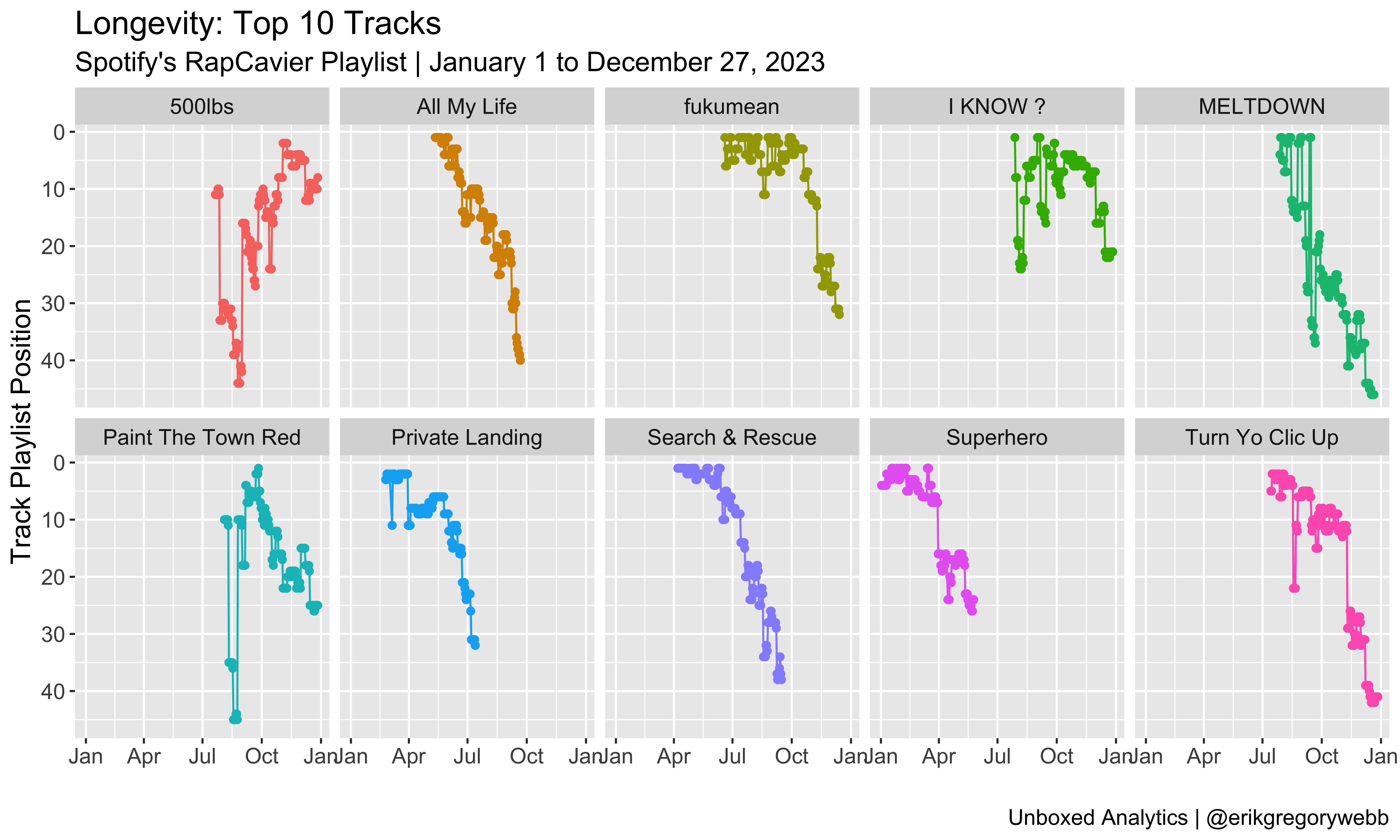
Most of the time, a track will debut on the playlist and then fade out over time, sinking deeper in the set list before falling off. Good examples are All My Life, Private Landing, and Search & Rescue. Hits like 500lbs and Paint The Town Red are more anomalous, with momentum building within the playlist over time.
To close this metric out, let’s look at the top ten rappers with the highest average longevity per track, for those artists with three or more distinct tracks ever appearing on the playlist during the year:
| Name | Median Longevity | Average Longevity | Track Count |
| Gunna | 116 | 103 | 4 |
| Metro Boomin | 92 | 96 | 6 |
| Ice Spice | 96 | 72 | 4 |
| Latto | 75 | 74 | 4 |
| Moneybagg Yo | 75 | 69 | 6 |
| Lil Uzi Vert | 68 | 64 | 8 |
| Don Toliver | 41 | 64 | 5 |
| Toosii | 79 | 63 | 3 |
| Key Glock | 61 | 62 | 4 |
| Sexyy Red | 63 | 62 | 4 |
Conclusion
The influence and density metrics point toward the same heavyweights: 21 Savage, Drake, and Travis Scott. This is intuitive since the two metrics are correlated. The longevity metric shines the spotlight on a different subset of rappers, like Gunna, Metro Boomin, and Ice Spice.
Either way, it was a great year for rap. Thanks for reading!
- Python script (scheduled sourcing)
- R script (combining, cleaning, visualization)
- Raw dataset
- Clean dataset