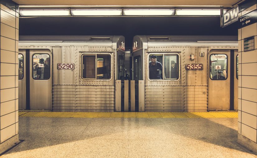
Each morning I make the journey from the suburbs of Westchester County to downtown New York City. In the process, I ride the bus, train, and subway. This post is about quantifying my time spent commuting using IFTTT and R, which will hopefully add some weight to my complaints about the daily grind.
IFTTT is a free web service that “gets all your apps and devices talking to each other.” It allows you to create simple conditional statements to automate everyday tasks. Many of the applets are centered around making your smart home “smarter”, like automatically adjusting the thermostat when you leave home.
Rather than manually log when I leave home and work each day, I automate the tracking using IFTTT. To do so, I set up two “geo-fences“: one for home and one for work. Each time I enter or exit either of those areas, a new row is created in a Google Sheet. After letting this process run in the background for about two months, I have a good sample to work with.
Let’s start by calling the necessary libraries and importing the data. The googlesheets package by Jennifer Bryanmakes makes this easy.
After a quick bit of cleaning, I can calculate commute times by applying some simple logic. IFTTT is triggered every time I leave home or work, like when I grab lunch near the office or run to the grocery store. I only want to measure time when I leave home and then arrive at work or leave work and then arrive home. I check those conditions in a for-loop by comparing the location of event i and i+1.
Now for the fun part. Let’s make a density plot to visualize the distribution of times for both legs of the commute:
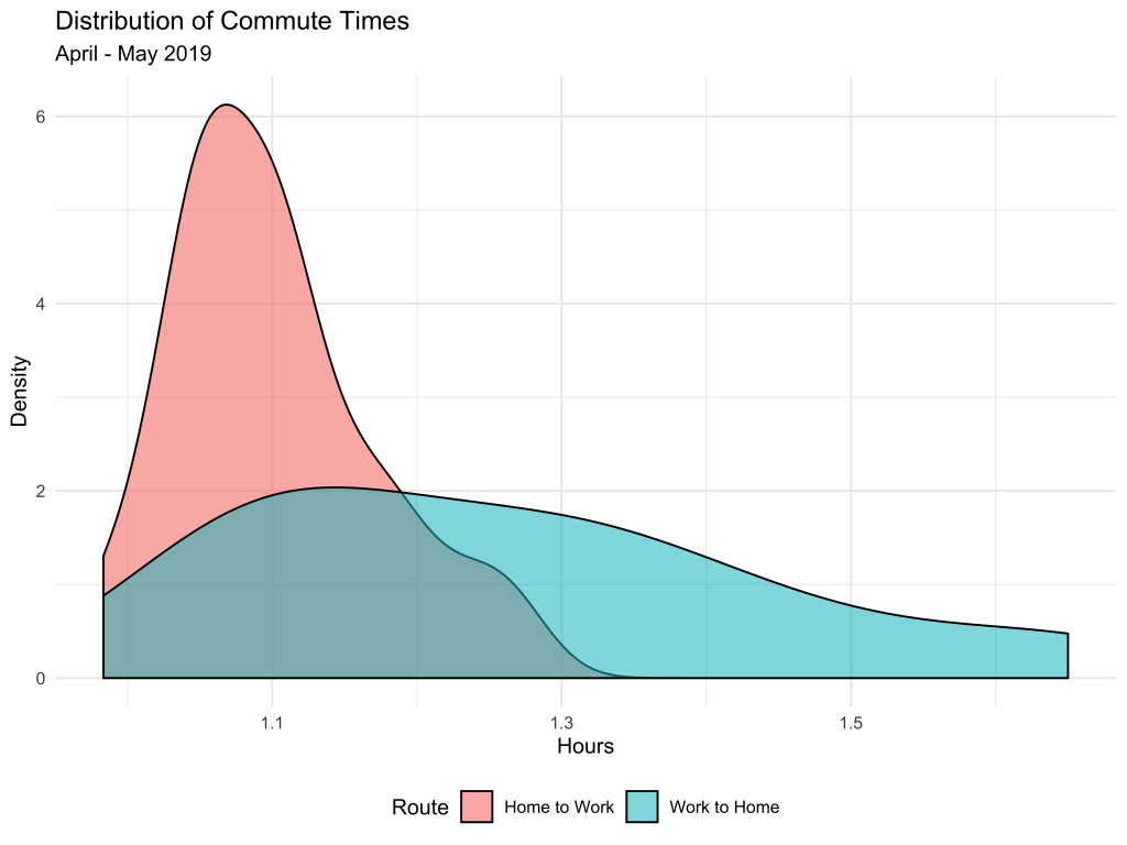
Because I catch the same bus every morning, travel times are more predictable, and more tightly centered around 1.1 hours. On the other hand, I rarely leave work at a consistent time. As a result, there’s more variation in how long it takes to get home, with some quick trips just over one hour and others close to two hours! In the future, I hope to leverage the Google Maps API to find the perfect times to leave work to minimize my commute home.
Thanks for reading! Check out the full code here.