This year my wife and I moved to New York for the start of a new job. Initially overwhelmed by the scope and pace of the NYC housing market, we were given the very generous and unexpected opportunity by a family friend to live in a house north of the city in Westchester County. Built in the early 1930s, the historic home is situated in central Scarsdale, an affluent suburban town known for high-achieving schools and extravagant real estate.
As a graduate student of historic preservation, my wife has been especially enthralled by the rich styles and architecture of the houses within the Scarsdale village limits. Naturally, we frequently discuss and analyze the homes we pass on walks and runs, her comments generally centered around history and architecture, mine on economics and valuation.
Sourcing the Data
Wishing to analyze the houses of Scarsdale in a more systematic way, I began to experiment with the Zillow API. Disappointed by both accessibility and content, I continued to search for a superior data source. Soon after, I discovered a tool developed by the Village of Scarsdale to search property information by road name and wrote a Python script to scrape the data. Curious to know if additional variables were available, I contacted the Scarsdale Village administration and was sent an Excel file with the complete set of residential properties, rich with detail and with few missing values (5,000+ rows, 100+ columns).
The dataset includes the address of each residential property, but for visualization purposes, I needed geographic coordinates (latitude, longitude). Luckily, the Google Maps API provides this exact functionality, known as geocoding. Having some experience with this API, it was simple to write a Python script to retrieve the geographic coordinates for each of the 5,000 properties.
After writing an R script to scrub the data (creating more descriptive variable names, filtering, removing duplicates), I was ready to visualize the real estate data of America’s most affluent town. You can find both the raw and cleaned datasets here.
Mapping the Data
After considering the many potential ways to map the properties, I settled on three key views: Year Built, Total Assessed Value, and Sales Date.
After some research, I discovered the folium library, which leverages the mapping strengths of the leaflet.js library within the Python ecosystem to provide Tableau-like functionally. The timing was ideal considering my free Tableau college subscription recently expired!
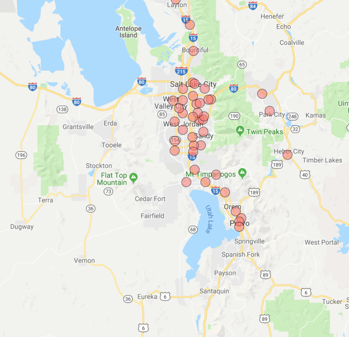
1. Year Built
With (a few) homes built as early as the 1600s and (some) as recently as 2018, this view shows clusters of homes built in similar time periods and paints a picture of development over time.
Here, the color spectrum plots blue for older houses and red for newer houses. Drag to interact with the map and click on a dot to view the address and year built.
Note the layers of development along the Saxon Woods Golf course border and the concentration of older homes in the Greenacres area.
Full Page Map: Link
2. Assessed Value
In this heatmap, the brighter the dot the higher the assessed value. Clicking on a circle reveals the total assessed value for the current tax year as well as the square footage of the home.
Full Page Map: Link
Sales Date
Which neighborhoods are hot on the market? This view maps the data according to sales date, with more recent sales colored in green. No clear trend emerges here, with a fairly equal distribution across the village. Clicking on a dot reveals the latest sales date and the number of years since sale.
Full Page Map: Link
Code Appendix
We’ll now dive into how these maps were created. As usual, we start by calling the necessary libraries. Beyond the essential pandas and numpy libraries, I use folium for map creation and matplotlib.cm for color assignment.
In order to visualize a feature such as assessed value or years since last sales date, I needed to be able to bucket the values and assign each bucket a color.
The function below achieves that need, allowing the user to specify the number of buckets and a color spectrum. BI software such as Tableau replicates this kind of functionality, but with superior algorithms that scale for large datasets.
Finally, below is the framework used to create each of the maps. A dot is created for each of the properties, colored according to the bucket assigned and labeled by year built, total assessed value, square footage, or sales date.
You can find the complete code to replicate these maps here and the dataset here. Thanks for reading!