With our baby’s due date quickly approaching, my wife and I needed to find a hospital for delivery. Hoping to contribute something meaningful to the decision, I found data published by the state of New York on labor and delivery metrics. By visualizing measures like percentage of cesarean deliveries, I narrowed the list of hospitals within our county.
Despite my belief in “data-driven” decision-making, I understand that in the real world, most decisions are part art, part science, requiring a mix of qualitative and quantitative factors. That being said, in this post, I describe how I leveraged publicly-available data to help choose a hospital for my wife’s delivery.
Data Overview
The dataset spans a ten-year period, from 2008 to 2016, with data for 146 hospitals in 52 counties. Four general categories of metrics are present:
- Anesthesia & Analgesia
- Characteristics of Labor & Delivery
- Infant Feeding Method
- Route & Method
Since I lack the subject matter expertise to understand something like the difference between paracervical and pudendal anesthesia, some of the value of the dataset is lost. Despite the knowledge gaps, I’ll next visualize some of the more straightforward measures of labor and delivery to uncover insights about hospital quality.
Visualization & Analysis
First item of discussion: Where are most babies born in Westchester County?
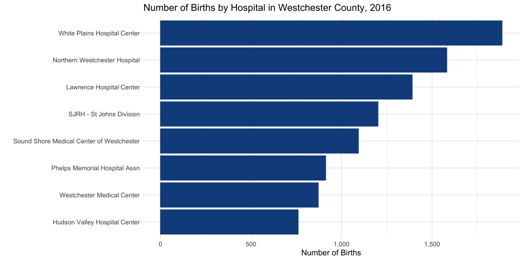
In 2016, the most babies were born at the White Plains Hospital Center.
Volume may matter. Hospitals who deliver more babies may be exposed a wider spectrum of complications and be prepared to deliver treatment accordingly. On the other hand, large-scale operations likely produce strict standardized policies and procedures, with little room for customized delivery plans.
How has the volume of births change over the 10-year period?
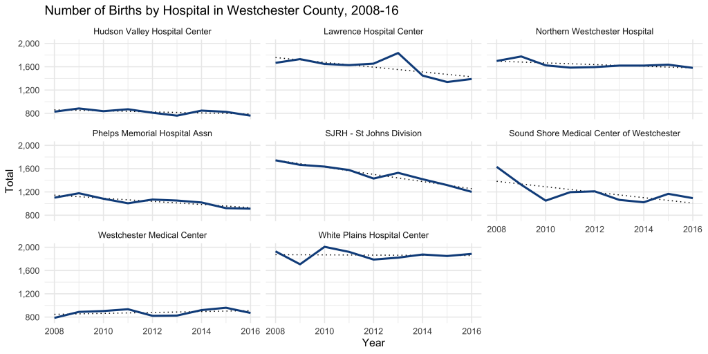
Every hospital seems to be trending flat or down, which may be a reflection of more general demographic trends.
Next up, let’s examine which hospitals work with midwives. This was an important consideration in our decision process.
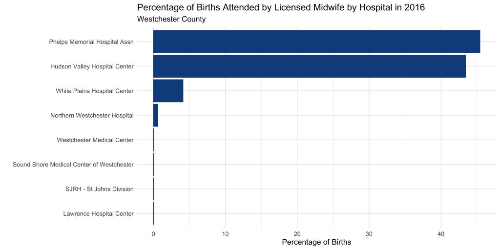
Pretty clear. Phelps Memorial and Hudson Valley Hospitals are midwife friendly, with 40%+ of births attended by a midwife.
Is there any relationship between births attended by midwifes and other labor outcomes?
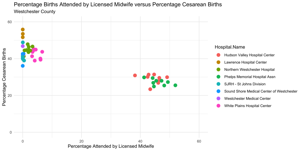
It appears that mid-wife friendly hospitals enjoy a lower c-section rate, although I’m not implying that one causes the other. It would take more than a scatter plot to tease out the true nature of that relationship.
Let’s take a closer look at c-section rates by hospital over time.
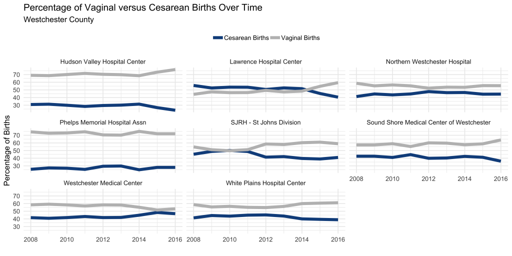
There was a long stretch of time at Lawrence hospital where more cesarean sections were performed than vaginal births. Easy red flag!
This simple analysis was informative and eye-opening. With the list significantly narrowed, it’s time to tour the facilities, read reviews, and speak with medical providers to make the final decision.
I admire you, although I don’t understand what you do it still amazes me